


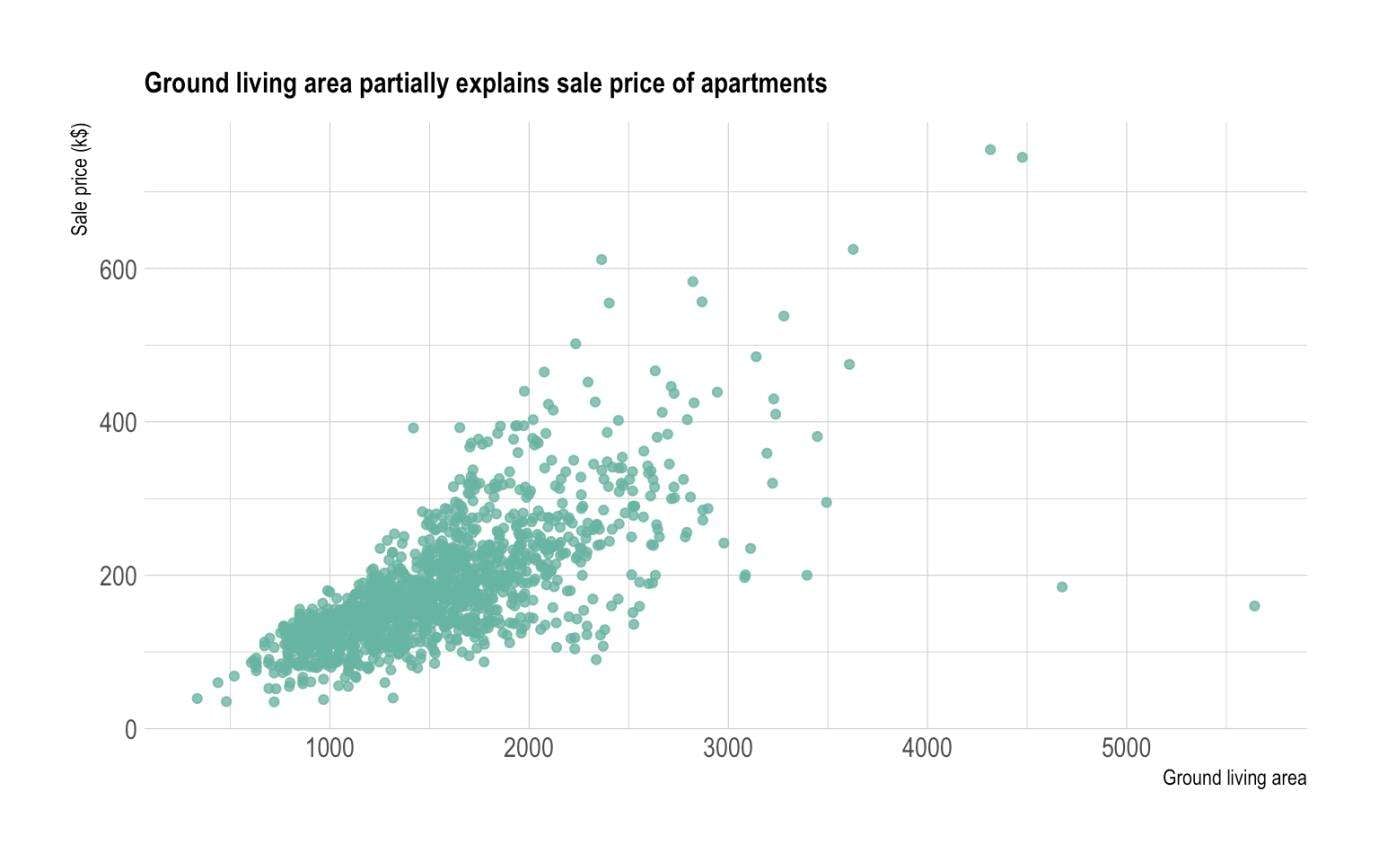
XY scatter charts, also known as scatter plots, are a type of data visualization tool used to display the relationship between two sets of numerical data.
This type of chart is widely used in various fields to analyze and present data in a visual format. Here, we will delve into the key components of XY scatter charts and more.
In this article
Part 1: What Are XY Scatter Charts?
XY scatter charts are graphical representations of data points plotted on a Cartesian coordinate system, with the x-axis representing one variable and the y-axis representing another.
Each data point is represented by a marker, such as a dot or a symbol, at the intersection of the corresponding x and y values. This type of chart is particularly useful for visualizing the correlation or relationship between two variables, allowing for the identification of patterns, trends, and outliers within the data.
Part 2: Key Components of the XY Scatter Chart
There are some key components of the XY scatter chart. Each of these components has its unique characteristics.
X-Axis:
The horizontal axis of the chart represents one of the variables being analyzed. It is typically labeled with the name of the variable and its corresponding units of measurement.
Y-Axis:
The vertical axis of the chart represents the second variable being analyzed. Similar to the x-axis, it is labeled with the variable name and its units of measurement.
Data Points:
Each data point on the chart represents a specific pair of x and y values. These points are plotted according to their respective coordinates on the x and y axes.
Trendline:
A trendline is a line that is added to the scatter plot to visually represent the general trend or pattern in the data. It helps in identifying the direction and strength of the relationship between the variables.
Legend: In cases where multiple datasets are plotted on the same chart, a legend is used to differentiate between the different series or categories of data points.
Part 3: Benefits of Using XY Scatter Charts in Data Visualization
There are numerous benefits of using XY scatter charts in data visualization. This is because they are very effective for visualizing data.
Visualizing Relationships:
XY scatter charts provide a clear and concise way to visualize the relationship between two variables. By plotting the data points on a Cartesian plane, it becomes easier to identify any correlation, clustering, or dispersion within the dataset.
Identification of Outliers:
Scatter plots are effective in identifying outliers or anomalies within the data. Outliers are data points that deviate significantly from the general pattern of the data and can be easily spotted on a scatter plot.
Comparison of Data Sets:
When multiple datasets are plotted on the same chart, XY scatter plots enable easy comparison between the different sets of data. This comparison can reveal similarities, differences, or patterns that may not be apparent when looking at the raw data.
Trend Analysis:
The addition of a trendline to an XY scatter chart allows for the analysis of trends and patterns within the data. This can be particularly useful in forecasting, regression analysis, and identifying potential relationships between the variables.
Part 4: Applications of XY Scatter Plot
There are numerous applications of XY scatter plot. They are used in a wide variety of fields and industries.
- Scientific Research: In scientific research, XY scatter plots are commonly used to visualize the relationship between independent and dependent variables.
- Quality Control and Process Improvement: In manufacturing and engineering, scatter plots are used to analyze the relationship between process variables and the quality of the output. This helps in identifying factors that may affect the quality of the product and in making improvements to the manufacturing process.
- Financial Analysis: In finance, scatter plots are used to analyze the relationship between different financial variables, such as interest rates and stock prices. This analysis can help in making investment decisions and identifying potential risks.
- Social Sciences: In the field of social sciences, scatter plots are used to analyse the relationship between various social and economic indicators, such as income and education levels. This helps in understanding and visualizing complex social phenomena.
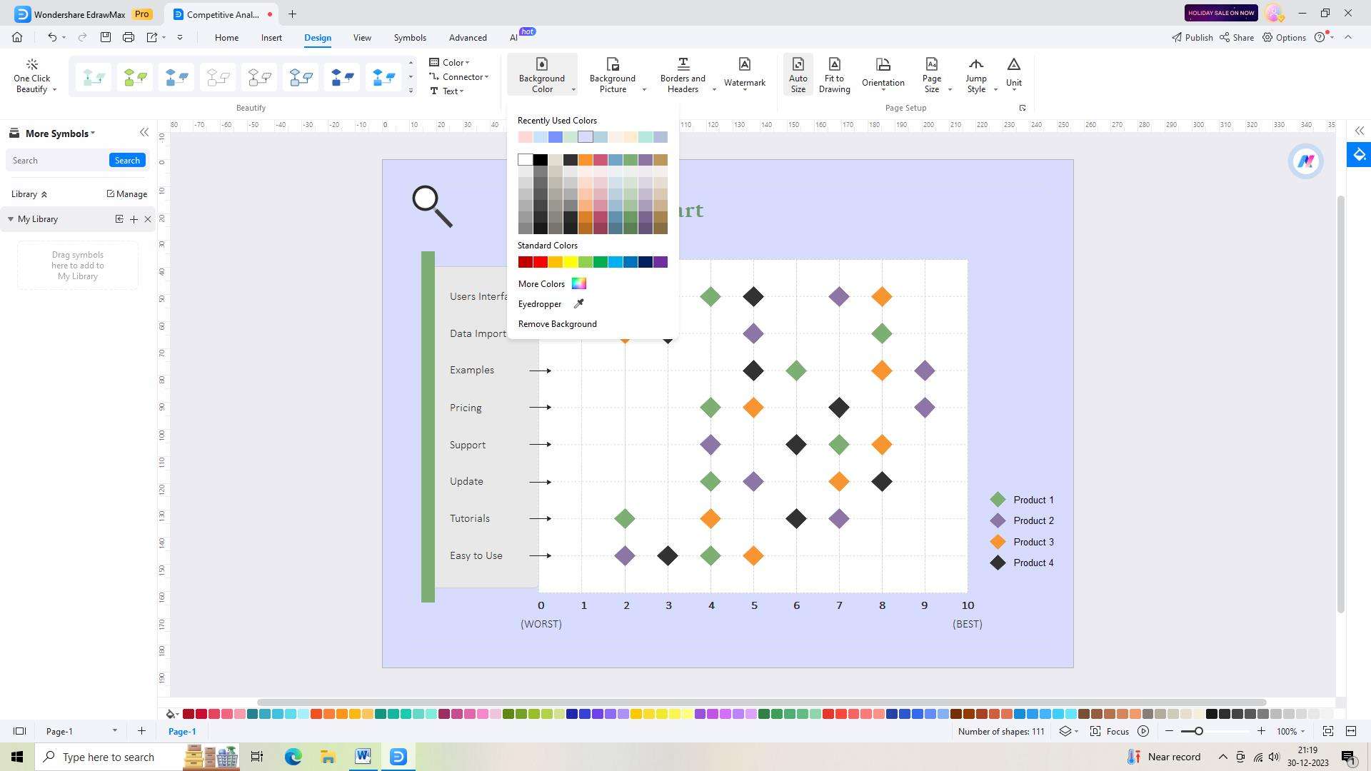
Part 5: Making a Scatter Chart Using Wondershare EdrawMax
Wondershare EdrawMax is a powerful, versatile, and user-friendly software for graphic diagrams.
Its scatter chart maker feature makes it an ideal choice for creating professional analyses or presentations. With the tool, users can quickly and easily create high-quality scatter charts tailored to their specific needs. Its intuitive user-friendly design allows users to customize things like chart labels, chart points, and data displays. These are the steps to create a scatter chart using the tool:
Step 1:
Begin by logging into your EdrawMax account or creating a new account to access the tools and features for chart creation.
Step 2:
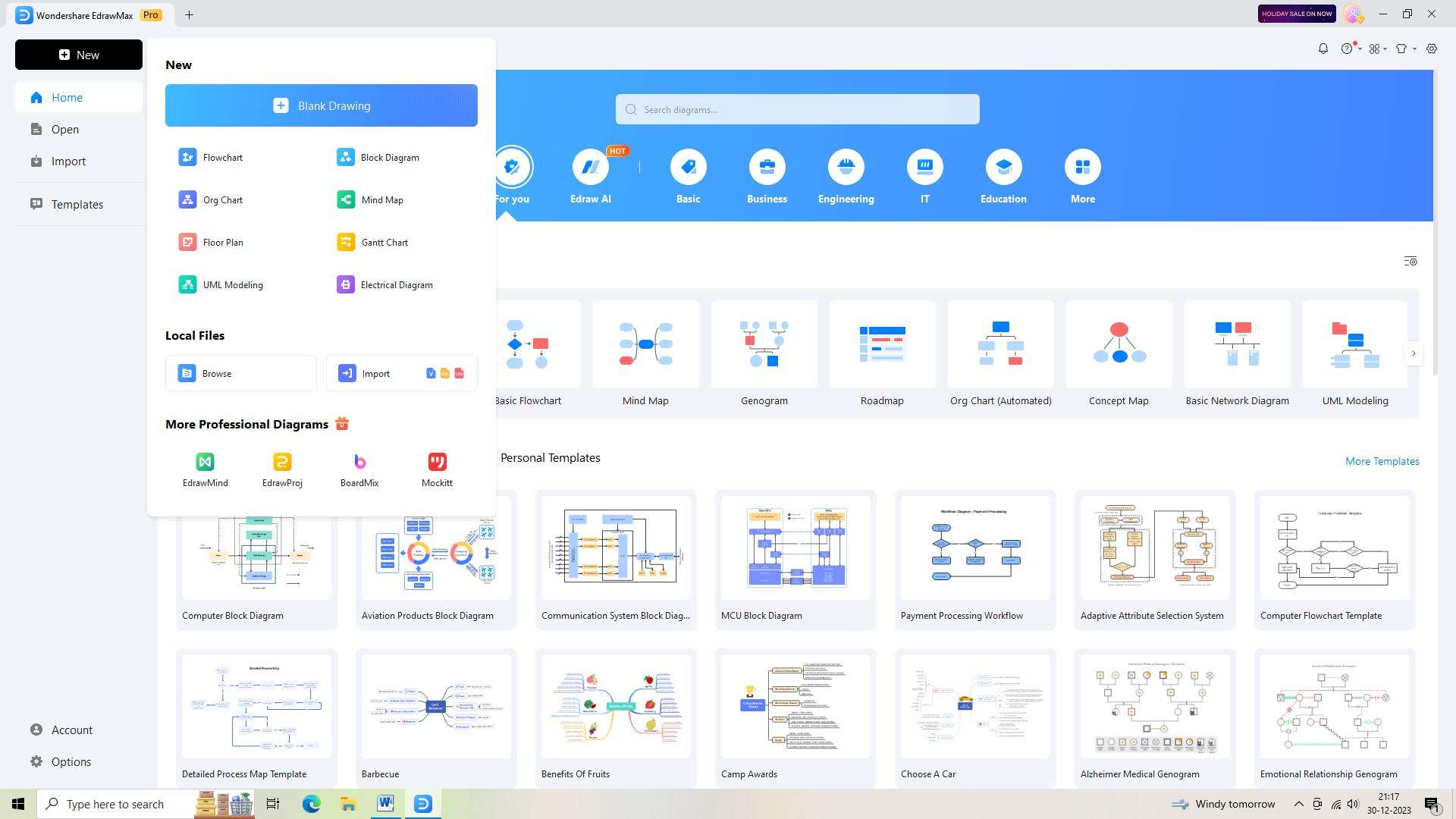
Once logged in, open a new document in EdrawMax by clicking the "+" symbol beside the "New" button.
Step 3:
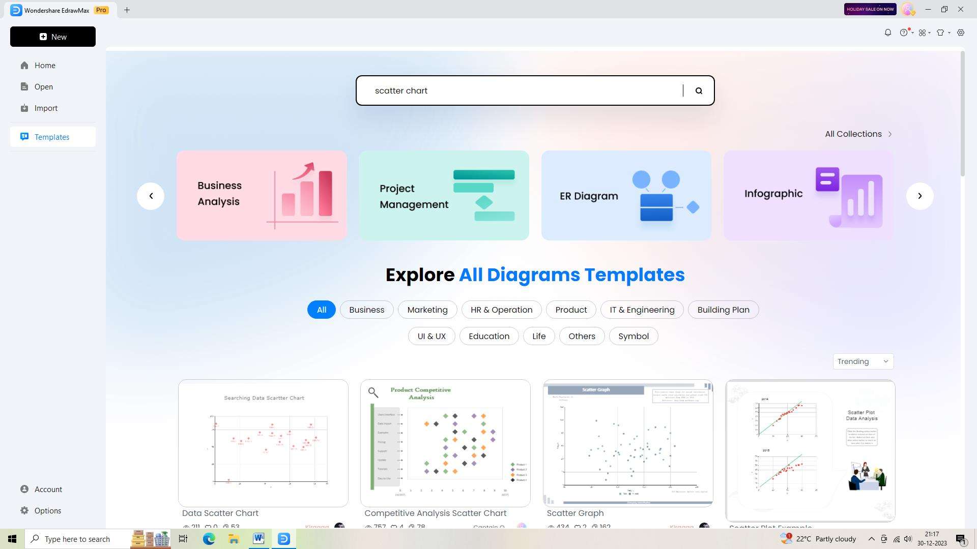
Browse through the extensive collection of templates in EdrawMax to find a suitable scatter chart template that fits your needs.
Step 4:
Customize the chosen template by modifying its elements, adjusting the arrangement, and adding relevant details as required.
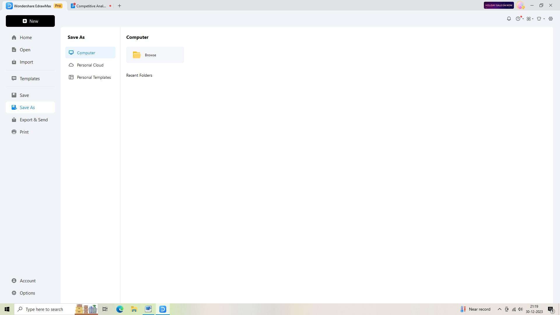
Step 5:
Remember to save your work regularly while working on your scatter chart. Click the "Save" button to ensure your chart is securely saved in your EdrawMax account.
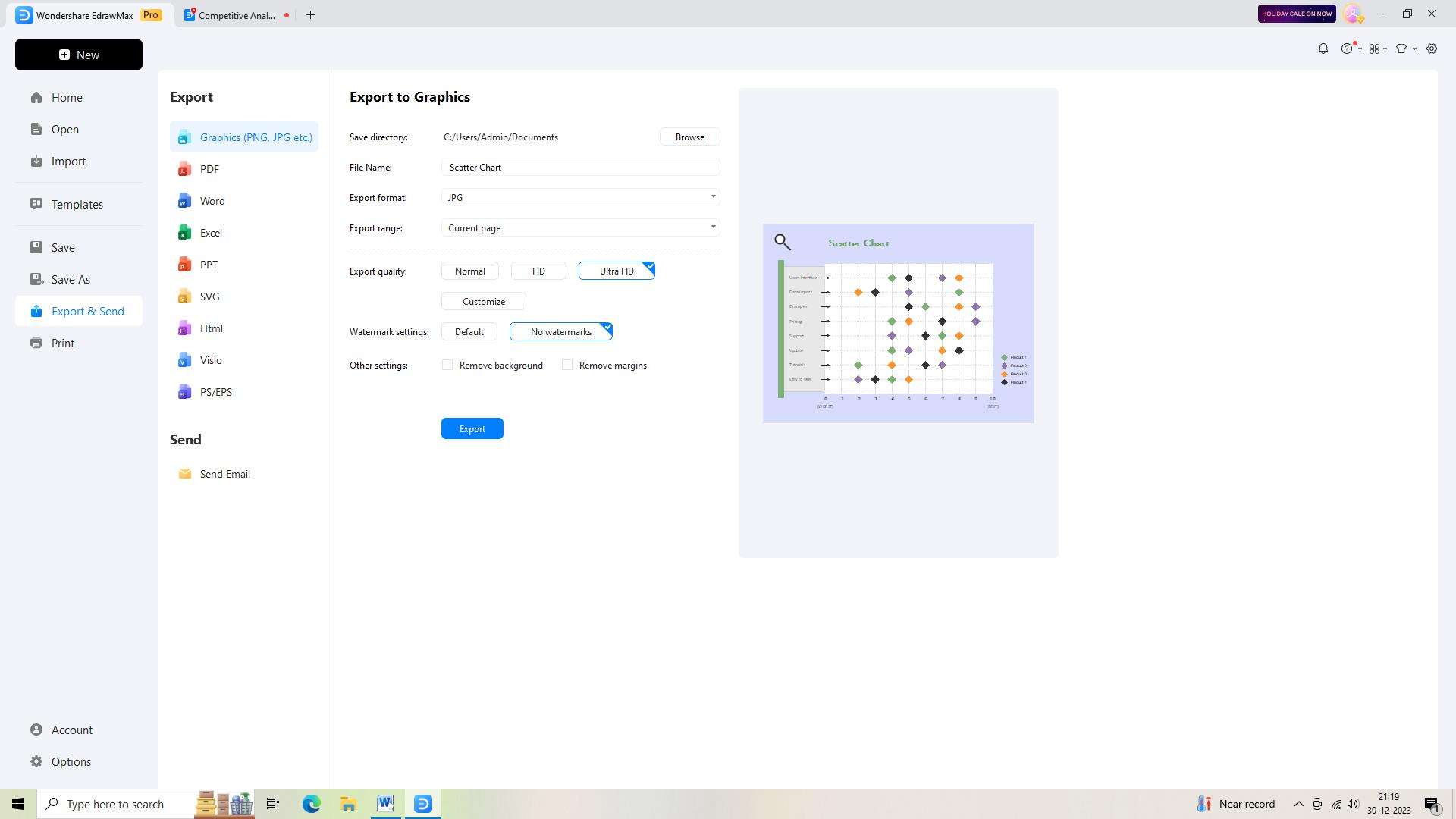
Step 6:
Once you are satisfied with your scatter chart, export it in the desired format to meet your specific requirements.
Conclusion
XY scatter charts are powerful tools for visualizing and analyzing the relationship between two variables. They offer numerous benefits, including the ability to identify patterns, outliers, and trends within the data. Furthermore, their applications span across various fields, making them an indispensable tool for data analysis and visualization.
It's never tough work to make XY scatter plots. Simply visit EdrawMax Online. You can start to make a scatter chart online easily.
AI Diagram Generator
Enter your prompt. Upload files if needed. Generate diagrams, charts, or slides instantly.


