


Amidst today's data-centric landscape, the ability to convey information effectively is paramount. Clustered bar charts, a versatile tool in the data visualization arsenal, empower you to present complex data sets with clarity and impact.
Whether you're a seasoned data analyst or a novice, this guide will take you on a journey through the art of creating compelling clustered bar charts. We'll walk you through each step, sharing expert tips and best practices to transform your data into visually engaging insights.
Contents of this article
What is a Clustered Bar Chart?
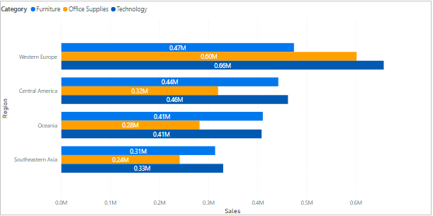
A Clustered Bar Chart is a visual way to show and compare information. It uses bars to represent different categories of data. Each category has its own set of bars, and you can see them side by side. It's like lining up different groups and seeing how they compare in a clear and easy-to-understand way. This chart is great for when you want to see how things vary across different groups or categories.
How to Create a Clustered Bar Chart
Before diving into the process of crafting a Clustered Bar Chart, let's lay the groundwork for effective data visualization. Follow these key steps to create a clear and compelling representation of your data:
Step 1: Quantify the Values
Start by collecting the data you wish to depict. Give numerical values to each category or grouping that you intend to compare on your stacked and clustered bar chart. This initial step lays the groundwork for your visual representation.
Step 2: Prepare a Key to Explain the elements and values
Create a clear and concise key or legend that defines the categories or groups represented by each color in your chart. This ensures that your audience can easily interpret the information presented.
Step 3: Pick the Right Software
Choose a user-friendly and powerful software for creating Clustered Bar Charts. Consider using Wondershare EdrawMax, an intuitive tool that streamlines the process, offering a range of customization options for a professional-looking result. Try EdrawMax today and elevate your data visualization game.
How to Create a Clustered Bar Chart with EdrawMax
Wondershare EdrawMax stands out as the premier choice for crafting Clustered Bar Charts due to its exceptional simplicity and efficiency. With its intuitive interface and user-friendly tools, EdrawMax streamlines the entire process, making it accessible for both beginners and seasoned professionals. Its robust features enable swift data entry and seamless customization, ensuring a hassle-free experience.
From effortlessly quantifying values to preparing clear legends, EdrawMax empowers users to create visually striking Clustered Bar Charts with remarkable ease, ultimately saving time and effort while delivering impressive results.
Here are the steps to create a clustered bar chart with ease by utilizing the advanced capabilities of EdrawMax:
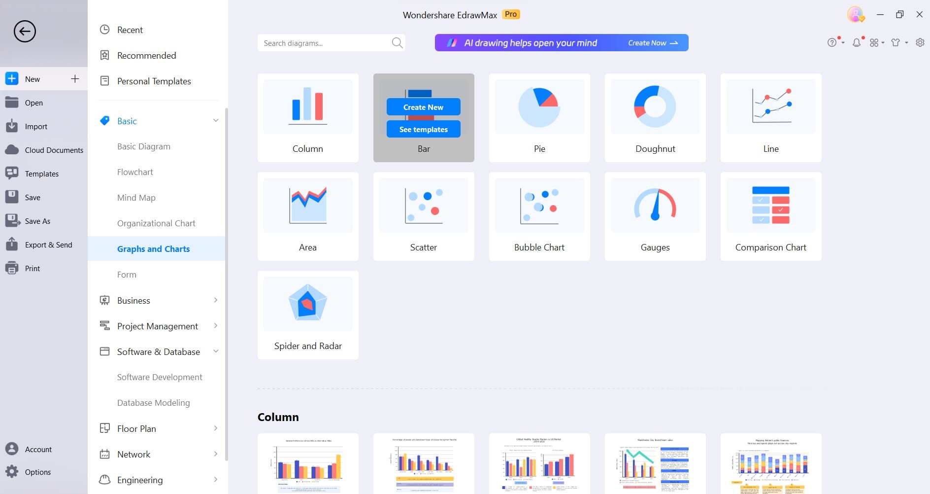
Step 1: Launch EdrawMax and click on "New" from the main menu and then select “Graph and Charts”. Choose “Bar Charts” to get started.
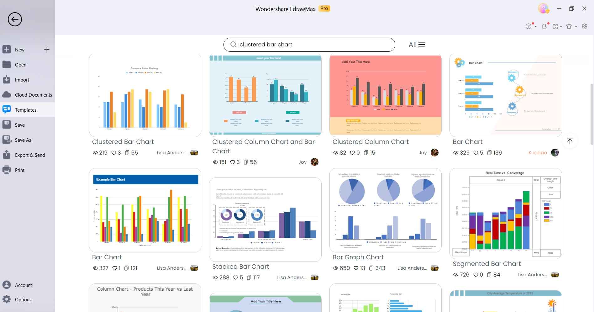
Step 2: Alternatively, if you don’t want to start from scratch then switch to the “Template” section from the main interface. In the template search bar, type "Clustered Bar Chart" and select the desired template from the results.
Step 3: The clustered bar chart will now be exported to the canvas.
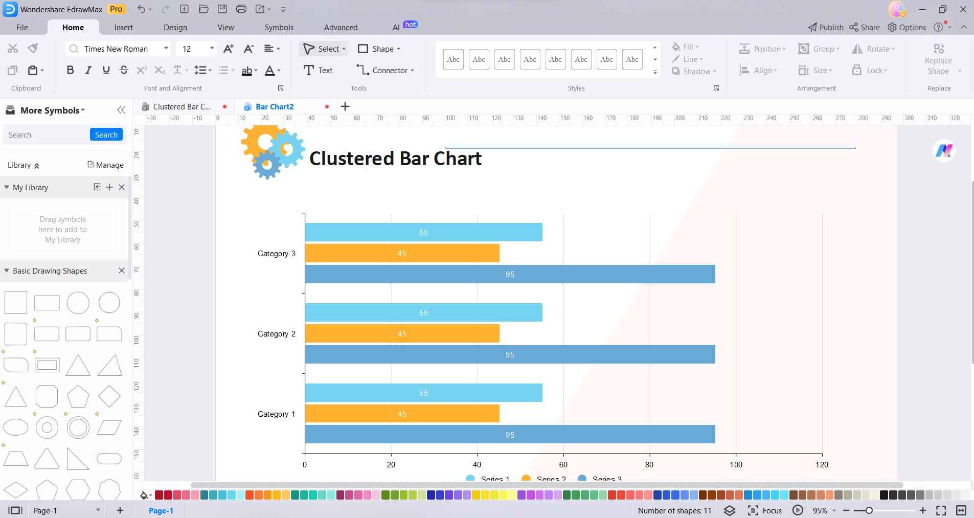
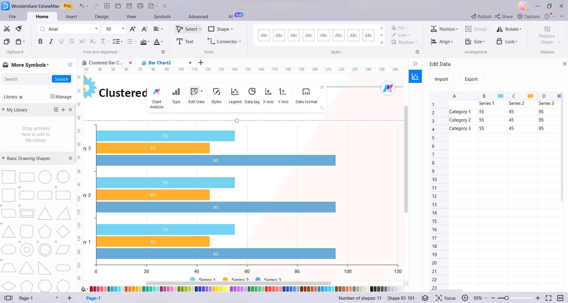
Step 4: Click on the bars and select “Edit Data” to input your data directly. This opens a spreadsheet-like interface on the right where you can enter your data values.
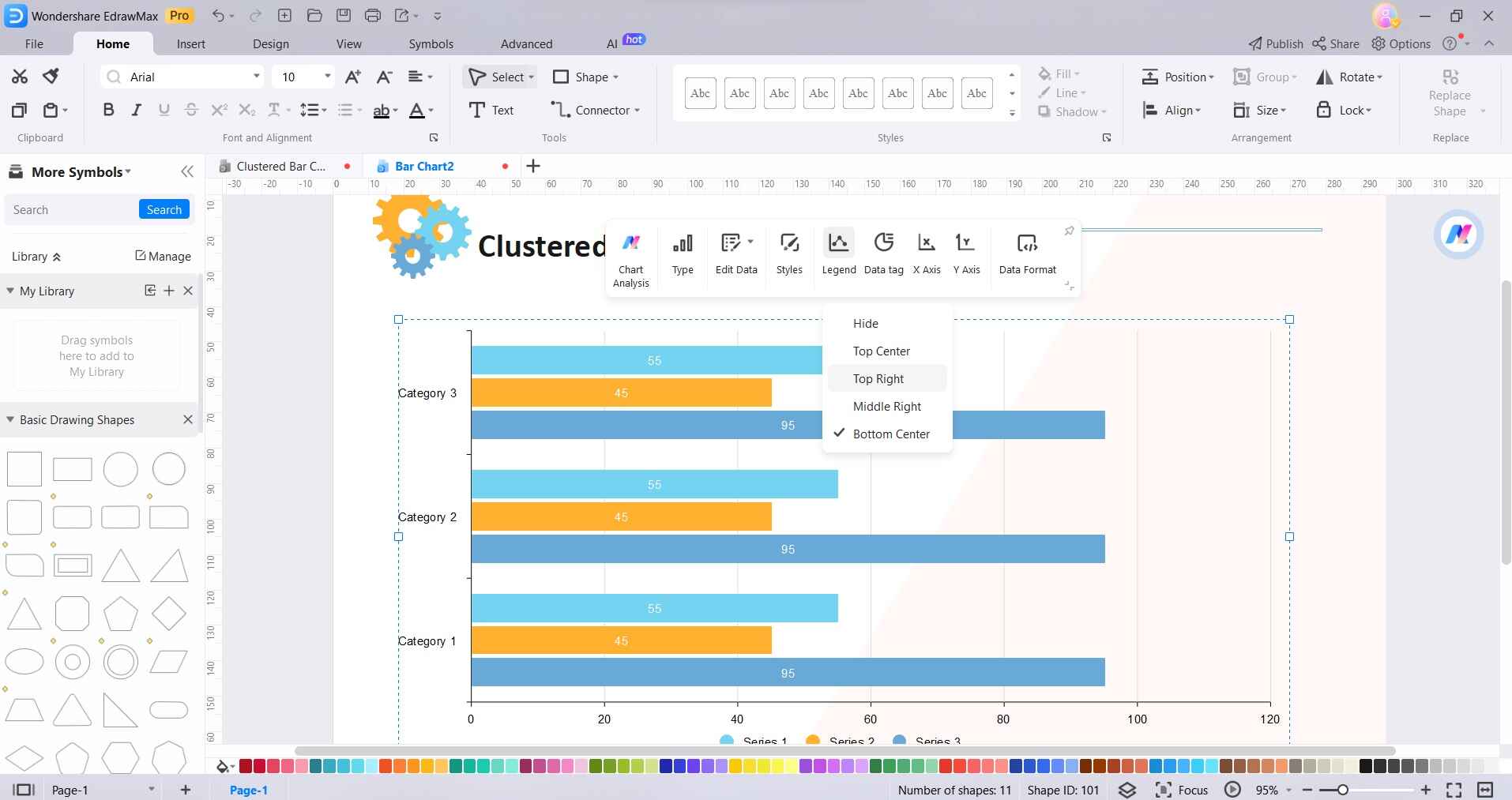
Step 5: Select the bar chart, and click on the "Legend" icon in the right sidebar to add a legend. You can customize it by double-clicking. To add labels to the bars, click on them and input the text directly.
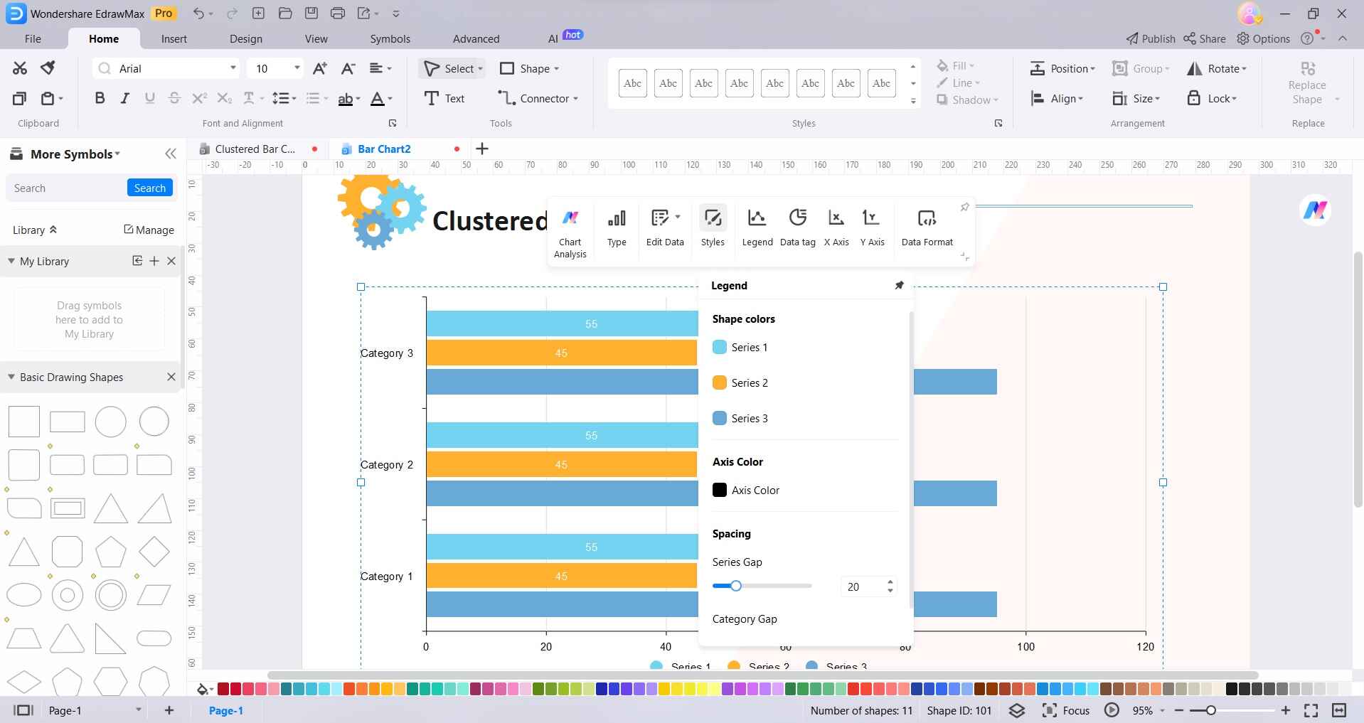
Step 6: Select the axis or gridlines and use the options in the right sidebar to customize their appearance, including labels, scales, and styles.
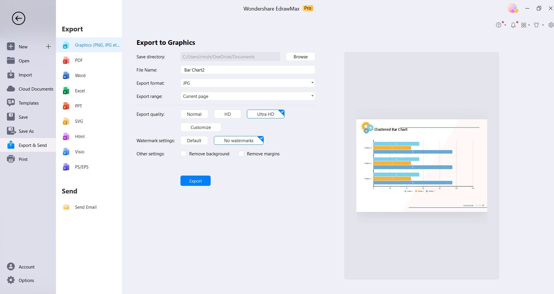
Step 7: Once you're satisfied with your Clustered Bar Chart, click on "File" in the top menu, then select "Save As" to save your file locally. To export, choose from various formats like PNG, JPG, PDF, etc., by clicking on "Export & Send" under the "File" menu.
EdrawMax's intuitive interface and dedicated features make crafting an attractive Clustered Bar Chart a smooth and efficient experience.
Expert Tips for Making Clustered Bar Charts
Here are some expert tips for creating effective stacked and clustered Bar Charts like a pro!
- Clear Category Labels: Ensure that category labels are concise and descriptive. Clarity in labeling helps viewers quickly understand the data being presented.
- Consistent Color Coding: Use a consistent color scheme for each category across the bars. This helps maintain visual coherence and aids in easy comparison.
- Appropriate Scaling: Pay attention to the scaling of both the x and y-axes. Ensure that they accurately represent the range of data without distorting the visual interpretation.
- Mindful Bar Width: Adjust the width of the bars to strike a balance between clarity and space efficiency. Overly thin bars may lead to clutter, while overly wide bars can make the chart appear distorted.
- Utilize Gridlines Sparingly: Gridlines can assist in reading data points, but excessive gridlines can clutter the chart. Use them judiciously to guide the viewer's eye.
- Provide Context with Titles and Legends: A clear and informative title helps set the context, while a well-organized legend explains the meaning of each color. These elements enhance the chart's interpretability.
By incorporating these expert tips, you'll create Clustered Bar Charts that effectively convey your data with precision and visual appeal.
Conclusion
With EdrawMax's user-friendly platform and expert tips in mind, you're equipped to transform complex data into compelling visual insights. Clear category labels, consistent color schemes, and thoughtful scaling are key elements. Remember to strike a balance with gridlines and provide context with titles and legends.
By following these steps, you can craft Clustered Bar Charts that not only convey information effectively but also captivate your audience, elevating your data storytelling capabilities to new heights.
AI Diagram Generator
Enter your prompt. Upload files if needed. Generate diagrams, charts, or slides instantly.


