


A scatter chart, also known as a scatter plot, is a type of data visualization that is widely used in data analysis and business intelligence. A Power BI scatter chart is a powerful tool for visualizing the relationship between two numerical variables. It is particularly useful for identifying patterns, trends, and correlations in the data. Here, we will discuss about the purpose of scatter charts in Power BI and more.
In this article
Part 1: Purpose of Scatter Charts in Power BI
Power BI is widely utilized to create scatter charts. Scatter charts in Power BI serve a lot of different purposes.
- Displaying the Relationship between Two Numerical Variables: The primary purpose of a scatter chart in Power BI is to display the relationship between two numerical variables in a dataset. This visualization helps users understand the correlation, if any, between the variables and identify any patterns or trends in the data.
- Identifying Clusters or Outliers in the Dataset: Scatter charts are effective for identifying clusters or outliers within the dataset, which can be crucial for making informed business decisions.
Part 2: Creating Scatter Charts in Power BI
Creating a scatter chart in Power BI involves a few key steps. Following these steps carefully will ensure that one can create an effective scatter chart using Power BI.
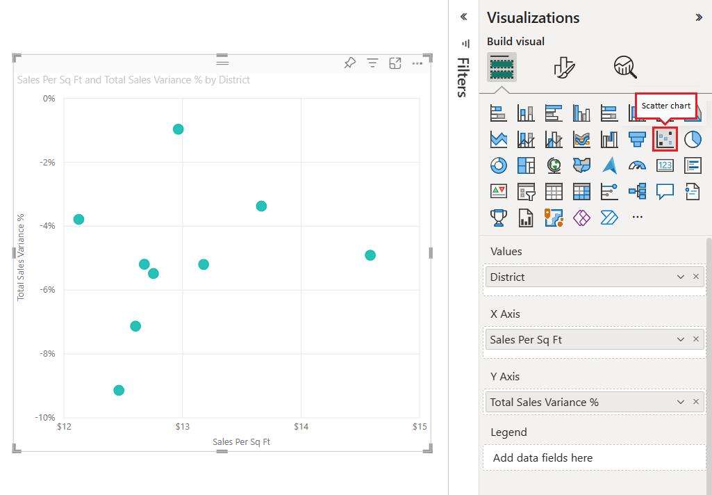
- Open Power BI Desktop: Open Power BI Desktop and load the dataset that contains the numerical variables you want to analyze.
- Select Scatter Chart: Select the "Scatter Chart" visualization from the visualization pane.
- Drag and Drop Fields: Drag and drop the numerical fields for the X-axis and Y-axis onto the respective fields in the scatter chart visualization.
- Customize appearance: Customize the appearance of the scatter chart by adjusting the axis scales, adding data labels, and modifying the colors and shapes of the data points.
Part 3: Tips for Creating Scatter Charts in Power BI
Creating an efficient Power BI scatter chart is crucial. By following a few valuable tips, one can create an effective scatter chart by utilizing Power BI.
- Choose the Right Variables: Selecting the appropriate numerical variables for the X and Y axes is crucial for creating meaningful scatter charts. Consider the nature of the data and the analytical goals when choosing the variables.
- Use Proper Scaling: Ensure that the axis scales of the scatter chart are appropriately scaled to accurately represent the range of values in the dataset.
- Consider Adding Trend Lines: Adding trend lines to scatter charts can provide valuable insights into the relationship between the variables and help in identifying patterns and trends in the data.
- Utilize Data Labels: Adding data labels to the data points on the scatter chart can improve the readability and interpretability of the visualization, especially when dealing with a large number of data points.
Part 4: Data Interpretation with Scatter Charts in Power BI
Scatter charts in Power BI can be used to interpret data efficiently. There are many ways in which data can be interpreted by using scatter charts in Power BI.
- Identifying Correlations: Scatter charts are useful for identifying correlations between two numerical variables. A positive correlation is indicated by data points sloping upwards from left to right, while a negative correlation is indicated by data points sloping downwards.
- Outlier Detection: Scatter charts can help in identifying outliers within the dataset, which are data points that deviate significantly from the general pattern or trend. These outliers may require further investigation to understand their impact on the analysis.
- Cluster Analysis: By visualizing the data points on a Power BI scatter chart, it is possible to identify clusters or groups of data points that share similar characteristics. This can be valuable for segmentation and targeting in business strategies.
Part 5: How You Can Create a Scatter Chart Using EdrawMax
Wondershare EdrawMax is undoubtedly the best tool for creating a scatter chart.
With its user-friendly interface and powerful features, it makes creating scatter charts a breeze. Its drag-and-drop functionality, customizable templates, and real-time data analysis make it stand out from other tools. The tool is a reliable choice for creating visually appealing and accurate scatter charts. These are the steps to create a scatter chart using the tool:
Step 1:
Begin by turning on your device and opening EdrawMax. If you don't already have an account, you can create one quickly.

Step 2:
Once logged in, you can either click the "+" icon next to "New" or use the shortcut key "Ctrl+N" to create a new document.

Step 3:
In the template library, search for "Scatter Chart" or navigate to the relevant section. Choose a suitable template from the options provided and click to open it.

Step 4:
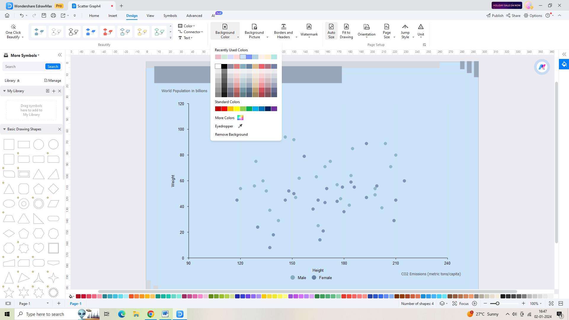
Customize the template to meet your requirements. You can adjust the layout, colors, and other elements of the chart as needed.
Step 5:
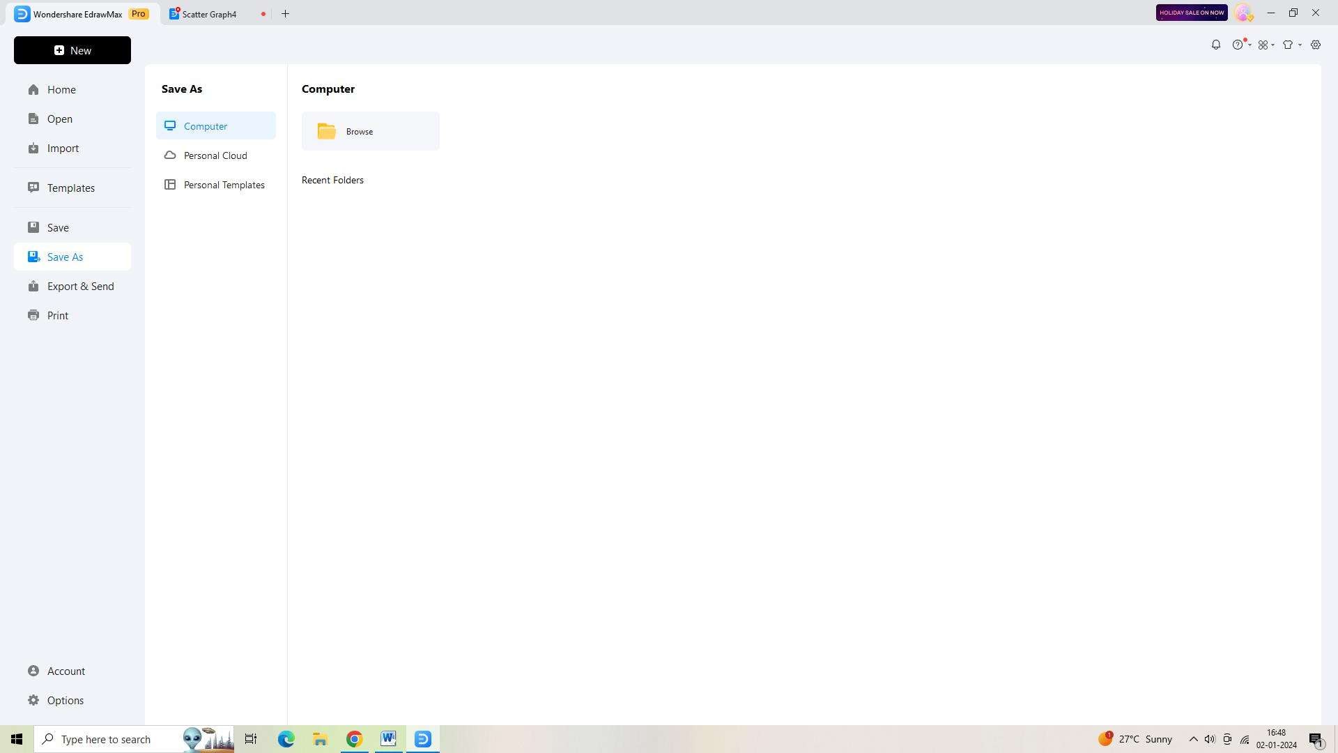
To save your scatter chart, use the keyboard shortcut "Ctrl+S" or select "Save As" from the left-side navigation pane. Decide whether you want to save the file in the cloud or on your computer.
Step 6:
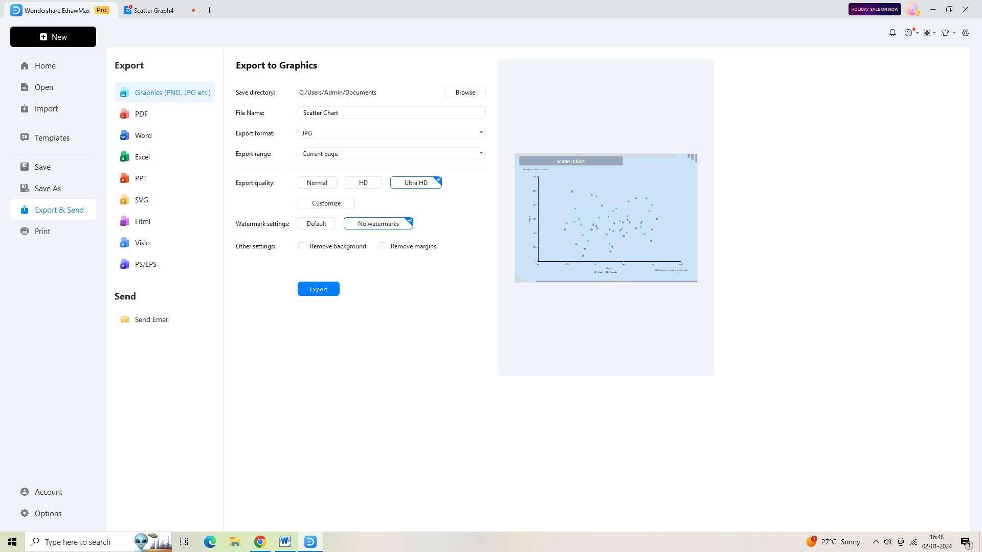
If you wish to export the diagram in a specific format, select "Export and Send." From there, choose your desired file type to export your scatter chart.
Conclusion
Scatter charts in Power BI are a valuable tool for visualizing and interpreting the relationship between two numerical variables in a dataset. By understanding the purpose and best practices for creating scatter charts, users can effectively analyze their data and derive meaningful insights for decision-making.
AI Diagram Generator
Enter your prompt. Upload files if needed. Generate diagrams, charts, or slides instantly.


