


In the world of business management, knowing how a company operates is important to productive teamwork and achieving objectives. This is where organizational charts, sometimes called organizational charts, become important. These graphic representations function as a road map, showing an organization's roles, reporting lines, and hierarchical structure.
Imagine how confusing and time-consuming it would be to navigate a maze without a map. Similarly, navigating the organizational landscape without a thorough grasp of its structure can be just as unpleasant. Organizational charts offer an important visual aid by showing the lines of authority distribution, channels of communication, and connections between different teams and departments.
This organizational chart tutorial enables you to understand what is an organizational chart, regardless of whether you're a seasoned professional looking to expand your grasp of organizational structures or a novice entering the corporate world.
In this article
Part 1. What is an Org Chart?
An organizational chart, often known as an org chart, is a visual tool that shows a company's internal personnel hierarchy. Its purpose is to draw attention to the people and roles that make up each company's division. These individuals are immediately identifiable by boxes that contain their contact details. Elbowed lines connect various pieces, much like in a UML diagram.
An organizational chart's main objective is to visualize the hierarchy, organizational structure, and the different departments and responsibilities that make up a company. That said, an organizational chart is more than just a lovely template. Its objectives are to show significant details about employees' employment positions and the general work culture and graphically represent the hierarchical relationships among individuals inside a company.
Despite their broad use, org charts can be used to structure a single department or team. Organizational charts are useful for understanding the role that must be filled and how that job will be connected to the department, particularly during the hiring process.
Part 2. History of the Org Chart
The concept of representing organizational structures visually can be traced back to ancient civilizations, with examples found in Egyptian hieroglyphics and Roman military formations. However, the modern organizational chart, as we know it today, emerged in the mid-19th century.
In 1855, Scottish-American engineer Daniel McCallum, the New York and Erie Railroad general superintendent, designed what is considered the first modern organizational chart.
McCallum's chart detailed the railroad's complex organizational structure, showing the reporting relationships between different departments and positions.
Organizational charts began to gain popularity in the early 20th century as businesses grew in size and complexity. Industrial engineers tasked with improving efficiency and productivity saw organizational charts as a valuable tool for understanding and optimizing organizational structures.
In 1914, consulting engineer Willard C. Brinton published his book "Graphic Methods for Presenting Facts," which included a chapter on organizational charts. Brinton advocated for the wider use of organizational charts, arguing that they could help businesses "visualize and understand their organizations more clearly."
Part 3. Some Common Types of Org Charts
Here are the types of organizational charts:
1. Hierarchical Organizational Charts
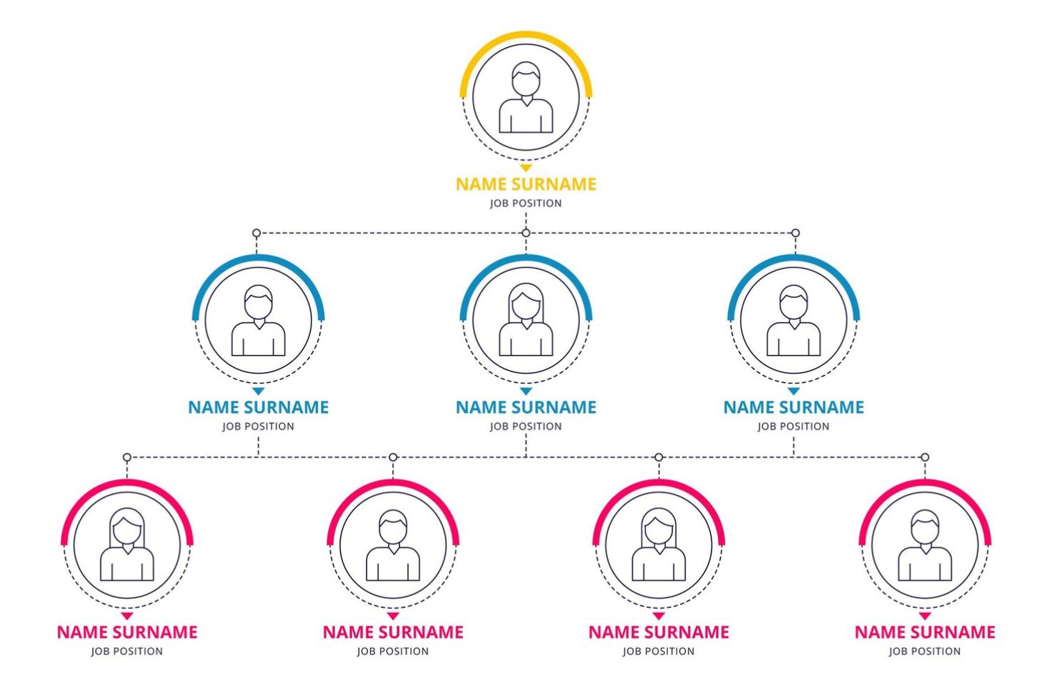
Hierarchical organizational charts are the most common type of organizational chart. They show a pyramid-like structure, with the CEO or president at the top and lower-level employees at the bottom. This chart type illustrates the reporting relationships between positions in a traditional top-down structure.

 below.
  below.
 2. Matrix Organizational Charts
Matrix organizational charts show how employees report to multiple managers in a matrix organizational structure. This chart type is often used in project-based organizations that need cross-functional collaboration.

3. Flat Organizational Charts
Flat organizational charts show a more decentralized organizational structure, with fewer levels of management and more cross-functional collaboration. This chart type is often used in organizations trying to be more agile and responsive to change.

4. Network Organizational Charts
Network organizational charts show the relationships between different departments and teams. This chart type often identifies potential collaboration areas and communication bottlenecks.

Part 4. Why Use an Organizational Chart?
Organizational charts have historically been utilized mostly by HR, executives in the business, and recent hires. HR is frequently in charge of keeping the organizational chart up to date with new hiring, staff changes, and employee departures.
Other business divisions know who to contact when they require the organizational chart. Business executives use organizational charts for various purposes, including presentations, headcount calculations, and identifying potential job role transfer opportunities.
The organization chart can be a new hire's lifeline, assisting them in learning names and titles and better understanding their place within the larger business hierarchy.
The organizational chart can be an invaluable tool for new hires seeking to understand the true identities of the people they see daily. Access to their coworkers' names, images, and professional and personal profiles benefits every employee.
Part 5. Pros and Cons of Organizational Charts
Let's explore the Pros and Cons of adopting organizational charts:
Pros of Organizational Charts
- Clarifies communication
- Aid decision-making
- Inform employees of changes
- Help new hires understand the structure
- Reveal conflicts and inefficiencies
Cons of Organizational Charts
- They can oversimplify organizational structures.
- They can promote hierarchical structures.
- They can be misread.
Part 6. 5 Examples of Organizational Charts
Take a look at the following examples of organizational charts:
Example 1

This organizational chart provides a visual representation of the structure groups, projects, and the reporting links between them. The chart is organized to create links between internal project owner and external agencies to maintain a visual connection and better understanding of the process.
Project managers can use this org chart to visually organize the details of their project management processes.
Example 2
This organizational chart provides a visual representation of the structure of a corporation by displaying the major divisions and the reporting links between them. The chart is organised top-down, with the Chief Executive Officer (CEO) at the top and lower-level staff at the bottom.
To give it a more creative look, you can also add images of the persons along with their names at each level.

Example 3
This organizational chart illustrates the structure of a marketing department hierarchy, including the functions each person plays within it. Many departments across the company can use this org chart to create a visual representation of their department hierarchy.
Example 4
If you want to visually represent the structure of the whole company, this org chart can be helpful. It provides you space to add details for all the company departments including IT, Design, Sales among others.
Small business startups can use this org chart template and develop their company hierarchy.

Example 5
The structure of this org chart is minimal representing several employees reporting to similar manager in an organization and then these in turn report to the CEO. When you want to keep things minimal, this org chart template can help you a great deal.

Part 7. How to Create an Org Chart?
Creating an organizational chart (org chart) can be a valuable exercise for understanding and communicating the structure of an organization. While various software programs and online tools can help you create org charts, you can also create them manually using simple drawing tools or by hand. Here's a step-by-step process on how to create an org chart:
Step 1: Gather Information and Define Structure
Before creating the org chart, gather information about the organization's structure, including the positions, departments, and reporting relationships. This information can be obtained from organizational documents, interviews with managers, or direct observation.
Once you have the information, define the organizational structure you want to represent. Determine the hierarchy levels, the major departments or divisions, and the reporting relationships between positions.
Step 2: Prepare the Drawing Tools
Select one that suits your comfort level and preferences. You can use simple drawing tools like Microsoft Paint or Google Drawings or more advanced vector graphics software like Adobe Illustrator or Inkscape.
Then, create a new document or file in your chosen drawing tool. Set the page size and orientation to accommodate the size and layout of your org chart.
Step 3: Create the Basic Structure
Draw boxes or shapes to represent each position or department on the org chart using the drawing tool's shape or rectangle tool. Adjust the size and spacing of the boxes to maintain a consistent and visually appealing layout.
Use the drawing tool's line tool to connect the boxes representing positions or departments with reporting relationships. Use different line styles or colors to differentiate between different levels of hierarchy.
Step 4: Add Labels and Details
Add a label inside each box or shape that identifies the position or department it represents. Use consistent font styles and sizes for readability.
Depending on your needs, you can add additional details to the org chart, such as employee names, contact information, or specific responsibilities for each position.
Step 5: Format and Enhance
Adjust the font styles, sizes, and alignment of the text labels to ensure they are clear, consistent, and visually appealing.
Use different colors, line styles, and shapes to differentiate between departments, levels of hierarchy, or other important distinctions. Consider adding borders, shadows, or other graphical elements to enhance the visual appeal.
Step 6: Review and Refine
Take a step back and review the org chart for accuracy and clarity. Ensure the structure and relationships are correctly represented, and the labels are easily read and understood.
Make any necessary adjustments to the layout, formatting, or visual elements to improve the overall appearance and readability of the org chart.
Step 7: Save and Share
Depending on your needs and sharing preferences, save the org chart in an appropriate format, such as PNG, JPG, or SVG.
Share the org chart with relevant stakeholders, such as employees, managers, or external parties, to communicate the organizational structure effectively.
Remember, an org chart is a dynamic representation of an organization's structure, and it should be updated regularly to reflect any changes in positions, departments, or reporting relationships.
Part 8. Tips for Making Effective and Easy-to-understand Org Charts
Organizational charts (org charts) help in visualizing and communicating the structure of an organization. When designed effectively, org charts can enhance communication, improve decision-making, and foster a better understanding of organizational roles and responsibilities.
Defining the Purpose and Scope
Before creating an org chart, defining its purpose and scope is crucial. Consider the audience using the chart and what information they need. Tailor the chart to their specific needs and level of understanding.
Clearly define the purpose of the org chart, whether it is to illustrate the overall structure, communicate specific changes, or provide detailed information about individual positions.
Gathering Accurate and Current Information
Accurate and current information is essential for creating a reliable and meaningful org chart. Verify reporting relationships with managers or HR personnel to ensure the chart reflects the organizational structure. Keep employee names, titles, and contact information up-to-date to maintain the chart's relevance and accuracy.
Choosing an Appropriate Layout and Format
The layout and format of the organizational chart should effectively convey the organizational hierarchy and be visually appealing. Select a layout that aligns with the organizational structure. For a traditional top-down structure, a vertical layout is suitable.
For a matrix structure, a grid-based layout may be more appropriate. Maintaining consistent spacing between boxes or shapes creates a balanced and organized chart.
Using Clear and Consistent Labels
Clear and consistent labels enhance the readability and comprehension of the org chart. Label each box or shape with the corresponding position or department title. Use clear and consistent font styles and sizes for easy reading.
Consider adding additional details to the chart, such as employee names, contact information, or brief descriptions of responsibilities, if appropriate.
Enhancing Visual Appeal with Design Elements
Incorporate design elements to enhance the visual appeal of the org chart without compromising clarity. Use different colors, shapes, or line styles to distinguish between different levels of hierarchy visually.
Use color coding to group related departments or highlight specific focus areas within the org chart. Choose a legible font that complements the overall design.
Reviewing and Refining for Clarity
Review and refine the org chart to ensure it remains accurate, clear, and visually appealing. Step back and assess the chart from a distance to identify areas that could be improved.
Seek feedback from colleagues or stakeholders to gain different perspectives. Based on feedback and your assessment, adjust the layout, formatting, and visual elements.
AI Diagram Generator
Enter your prompt. Upload files if needed. Generate diagrams, charts, or slides instantly.


