


Using templates can be a great way to get started when you are creating a bar chart in PowerPoint or Google Slides. But it is possible that you might struggle to find suitable templates in the software or on the Internet. That’s why we have selected 7 bar chart templates from the templates community of EdrawMax of various types and subjects that you might find useful.

Read on to pick the one that best suits your needs. And if you are interested in finding more of such templates, download our software or try it online for free and explore a world of possibilities.
In this article
Part I. 7 Bar Chart Templates for PowerPoint and Google Slides
1. Vertical Bar Chart

 below.
  below.
A vertical bar chart is the classic choice for time series data. It uses vertical bars to represent data, with the height of each bar corresponding to the value.
2. Horizontal Bar Chart

Instead of going up, the bars go sideways in a horizontal bar chart. They work well when you have more extended category labels or want to prioritize the horizontal space.
3. Stacked Bar Chart (or Segmented Bar Chart)

A stacked bar chart is similar to a standard bar chart, but each bar has divisions or sub-bars stacked up on each other. The height or length of each sub-bar represents the contribution of each group to the total.
4. Grouped Bar Chart

A grouped bar chart is like a combination of vertical and horizontal bar charts. They display multiple bars side by side, each representing a different category. These are handy when you want to compare values across two fields.
5. Bar Chart for Tracking Sales of Fiction Books
This editable template is created in Wondershare EdrawMax to track the sales of fiction books. It displays the stats of 7 years of sales of five fiction books, from 2008 to 2014. They include Marine Sprite, Striking Calf, Tank Picture, Bucket Slope, and Reborn Kid. If you want to keep a track record of your bookstore’s sales, try this template.
6. Bar Chart for Monitoring Banking Operations

This bar chart displays the stats of banking operations for six years, from 2020 to 2025. The operations this chart presents include A PM, payments, support, digital, marketing, fraud management, ATM, compliance, branch, contact center, and security. The different color segments in a single bar show different operations. If you are a banking officer, this editable bar chart could be your great helping hand.
7. Bar Chart for Managing Vegetables Shipment

This bar chart example lists vegetables on the X-axis and the quantity on the Y-axis to display the shipment details. If you are looking forward to managing vegetable sales per pound, this chart will lend you a helping hand. A table is also included in the diagram to put the quantity in digits in front of every vegetable, as shown below.
Part II. How to Customize and Export the Charts to PowerPoint
Now if you are interested in the templates above, you might need guidance on how to customize them to best meet your needs and use them on PowerPoint and Google Sheets.
It’s not complicated. Follow the simple steps below to use the charts.
Step1
Download and install EdrawMax or try it online. Log in with an account of Wondershare, Google, Facebook, or Twitter.
Step2
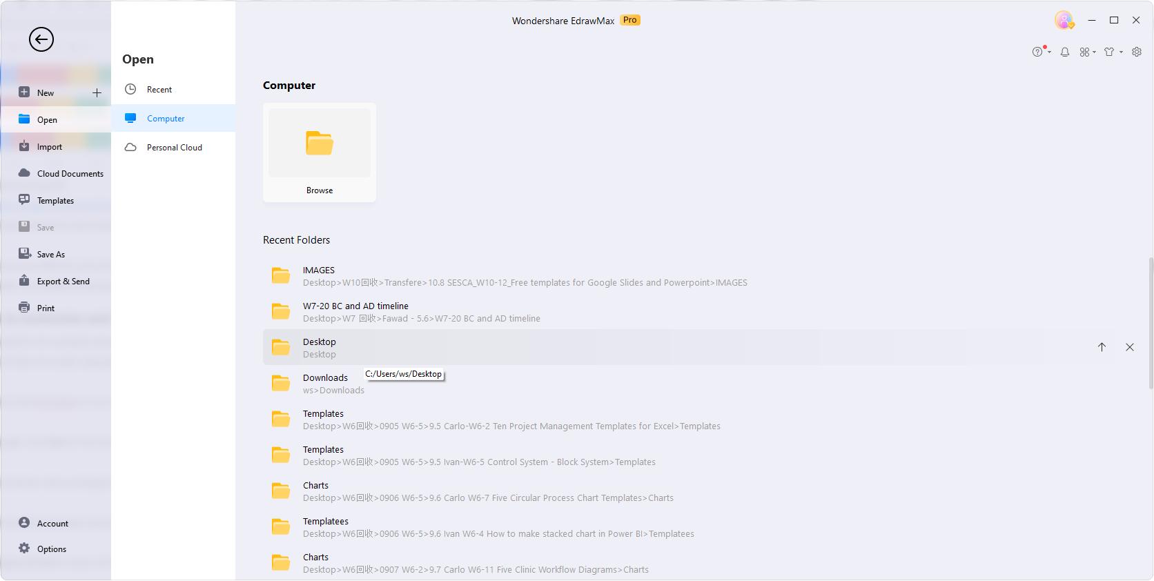
On the homepage, Click Open to find the template you downloaded and open it.
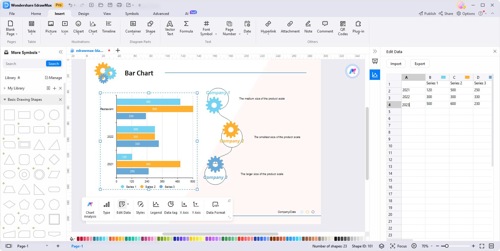
Step3
Edit the text of the bar chart according to the data you are dealing with.
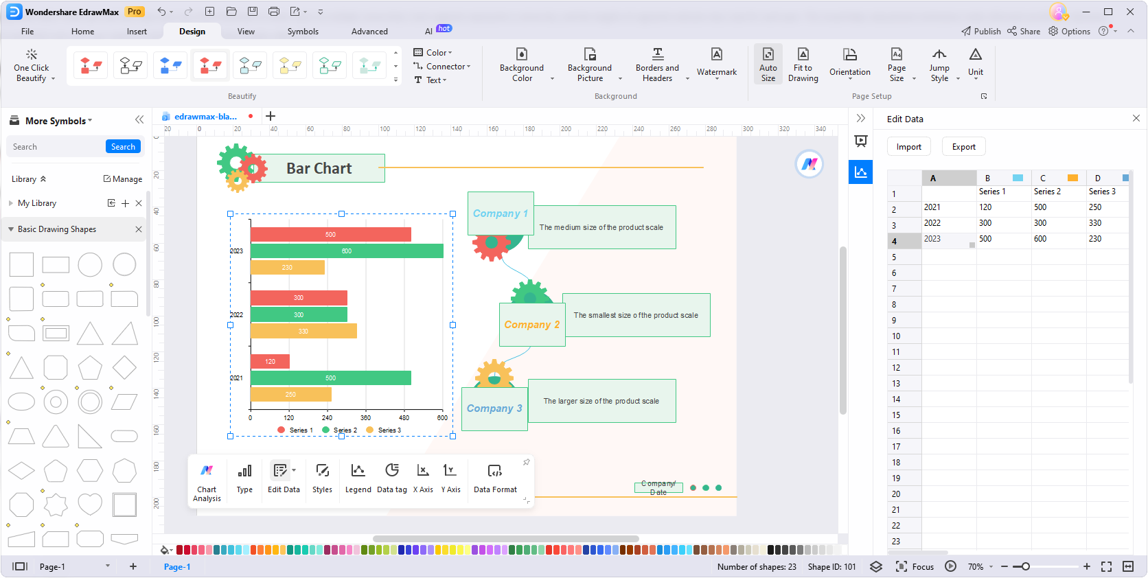
Step4
Customize the styles of the shapes and text using the tools on the Design menu or the floating tool bar. Try the One Click Beautify function to save time.
Step5
Go to File > Export & Send to export the file to the format of PPT. You can also open PPT files with Google Slides. Or, you may export the chart in the format of JPG or PNG.

Part III. How to Open PowerPoint Presentations in Google Slides?
Google Drive provides you with an unmatchable platform to save your documents or any type of data. Most importantly, you can access them at any time from anywhere in the world. All you need to access them is internet connectivity and a computer or mobile phone.
Do you have to present an important topic? Want to keep a backup of your PowerPoint presentation? There is nothing better than uploading it to Google Drive and opening it in Google Slides when presenting. Here is how you can open your PowerPoint presentation in Google Slides.
Step1
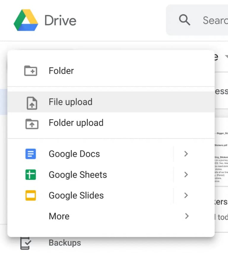
Go to your Google Drive. Click the “+New” button and upload your PowerPoint presentation.

Step2
Now, tap on the “File Upload” button and select the presentation you want to upload to Google Drive.
Step3
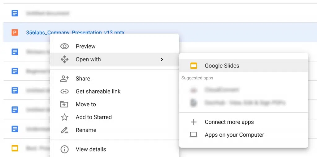
Once the presentation is uploaded to Google Drive, right-click on it and move your cursor to the “Open with” menu.
Step4
Tap on the “Google Slides” option, as shown below.
This is how you can easily open your PowerPoint presentation into Google Slides.
Conclusion
Bar charts, including stacked, segmented, and horizontal types, offer a simple yet effective way to visualize data trends. Using bar chart templates can help you save time and improve efficiency. Get started with templates from EdrawMax to make your presentations and communicate your data effectively.
[没有发现file]AI Diagram Generator
Enter your prompt. Upload files if needed. Generate diagrams, charts, or slides instantly.


