All set to begin your journey of data visualization? You're in the right place. In this guide, we'll walk you through the steps to create impactful Stacked Charts and Clustered Charts effortlessly. Starting with the fundamental process of inserting a chart, we'll dive deeper into selecting the right type and subtype to suit your data.
Whether you're a novice or a seasoned analyst, this comprehensive resource is tailored to enhance your chart-making skills and help you present data with clarity and precision.
Contents of this article
What is a Bar chart?
A Bar chart is a way to show information with rectangular bars. The length of each bar represents a value, making it easy to compare things. The bottom shows categories, like types of fruit, and the side shows numbers. It's great for seeing differences or trends in information, like which fruit is most popular.
People use Bar charts in many areas, like in business or school, because they make it easy to understand data quickly.
Types of Bar Charts:
There are primarily three types of Bar Charts:
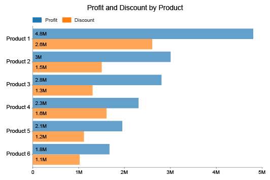
1. Clustered Bar Chart: This type displays multiple bars for each category side by side. It's great for comparing values across different groups.
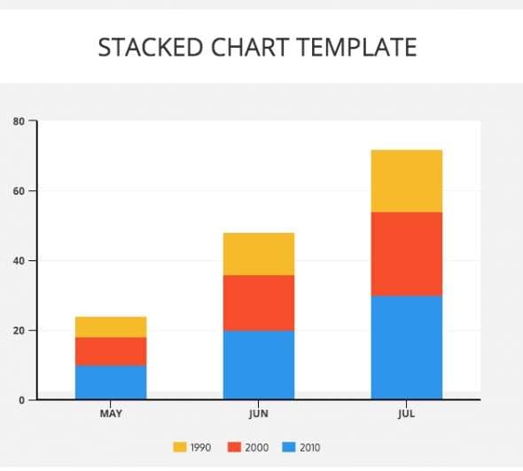
2. Stacked Bar Chart: In this chart, bars are stacked on top of each other, representing the total value while also showing the contribution of individual components.
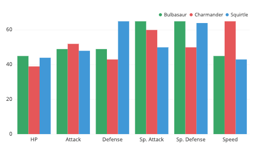
3. Grouped Bar Chart: This combines elements of both clustered and stacked charts. It displays groups of bars, where each group represents a category, and within each group, bars represent subcategories.
Choosing the right type depends on the data and requirements.
When to Use Bar Charts?
Bar charts are versatile and effective for various scenarios. Here are some common situations where using a bar chart is beneficial:
- Compare Categories: Easily compare values of different categories, like sales of various products.
- Track Changes: Bar charts can show changes in a specific category over different periods. However, for continuous data over time, a line chart might be more suitable.
- Highlight Part-to-Whole: Stacked bars demonstrate how components contribute to a whole, like expenses in a budget.
- Visualizing Ranking or Order: Bar charts are effective in displaying rankings or ordinal data, like the popularity of movies or customer satisfaction ratings.
With their simplicity and clarity, bar charts are an essential tool for making data-driven decisions in a wide range of scenarios.
How to Create a Bar Chart Easily with EdrawMax
Wondershare EdrawMax is an invaluable tool for crafting bar charts with precision and efficiency. It's intuitive interface and robust features streamline the process, ensuring that even complex data is presented with clarity. With a diverse range of customizable templates and a vast library of symbols,
EdrawMax empowers users to create visually engaging bar charts tailored to their specific needs. Whether for business reports, presentations, or educational purposes, EdrawMax elevates the chart-making experience.
So, whether you want to create a stacked chart, clustered chart, or a column and line chart, you can make the most of EdrawMax’s capabilities. Follow these steps to get started:
Step 1: Open the EdrawMax software on your computer. Click on New> Graph and Charts. Select 'Bar Chart' from the list of available options.

Step 2: Double-click on the chart to open the data table. Input your data in the provided cells. You can also copy and paste data from Excel or other sources.
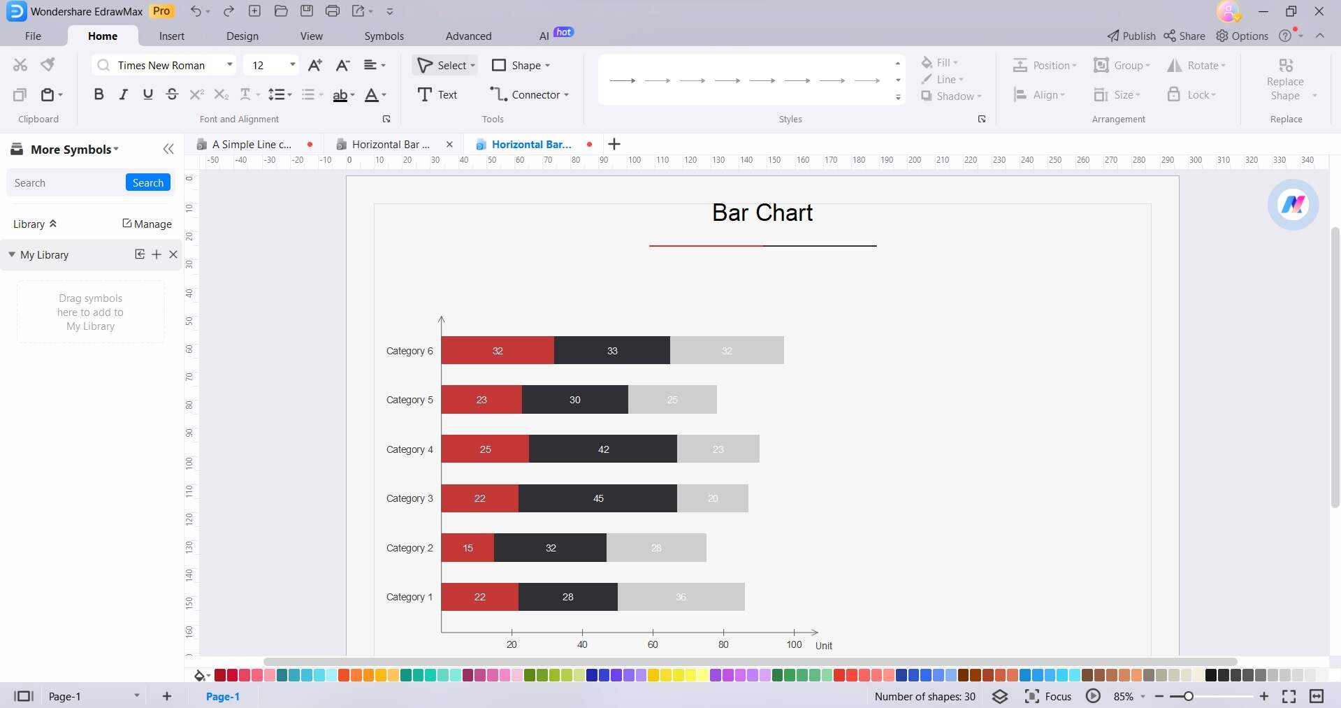
Step 3: Fine-tune the X and Y axis labels, scales, and intervals to best represent your data.
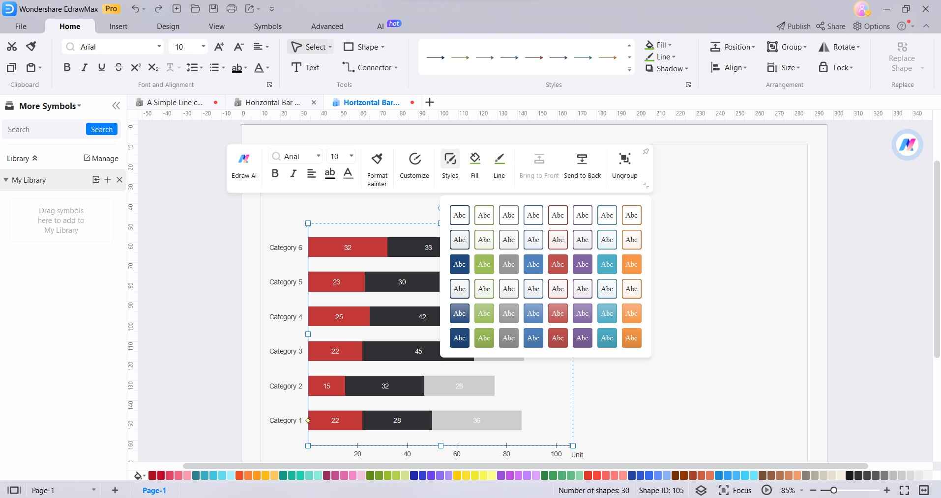
Step 4: Customize the chart appearance, including titles, colors, and fonts, to match your preferences or your presentation's theme.
Step 5: Review your chart to ensure it accurately reflects your data. Once satisfied, save the file to your preferred location.
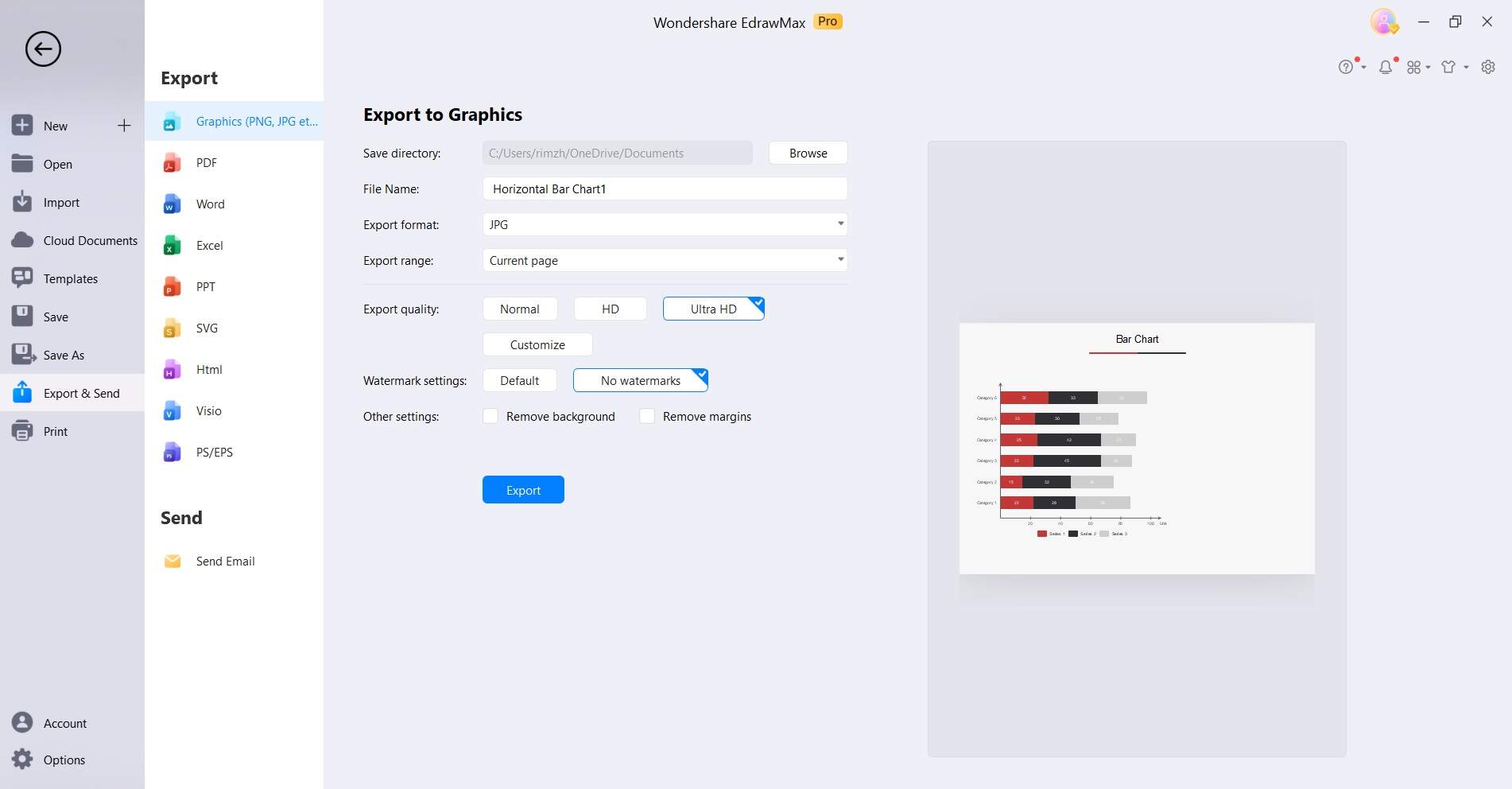
Step 6: Navigate to File> Export and Send. Export the chart in your desired format (e.g., PNG, JPEG, PDF) or directly insert it into your presentations, reports, or documents.
EdrawMax's ease of use and wide range of customization features render it a superb selection for crafting bar charts that are both visually appealing and rich in information.
Limitations of Bar Charts
While bar charts are a powerful tool for visualizing categorical data, they do have some limitations to be aware of:
- Limited for Continuous Data: Bar charts are most effective when dealing with categorical or discrete data. For continuous data, other types of charts like line graphs may be more suitable.
- Complexity with Many Categories: When dealing with a large number of categories, the bars can become crowded and it may be challenging to interpret the chart effectively.
- Not Ideal for Showing Trend: Bar charts are static and may not convey trends or patterns as effectively as other types of charts, like line charts.
- Comparing Multiple Data Sets: While bar charts are excellent for comparing within a single category, comparing multiple data sets across different categories might be better suited for a different type of chart, like a grouped bar chart.
- Limited for Showing Relationships: Bar charts primarily display individual values and may not be the best choice for showing relationships or correlations between variables.
Being aware of these limitations can help you make informed decisions when choosing the right type of chart for your specific data and objectives.
Conclusion
In conclusion, stacked charts and clustered charts stand as versatile and indispensable tools for data visualization, offering a clear and intuitive means to present categorical information. Whether comparing categories, tracking changes over time, or highlighting part-to-whole relationships, they simplify complex data for informed decision-making. Recognizing their limitations is equally crucial in choosing the appropriate visualization method.
In a world increasingly driven by data, mastering the art of bar chart creation empowers individuals across industries to communicate insights effectively.