Creating a Google organizational chart in Google Docs or Google Sheets can be a valuable tool for visualizing the structure and relationships within your organization. By gathering and organizing the necessary data, inserting the chart, and customizing its appearance, you can create a clear and informative representation of your company's hierarchy. Whether you choose to use the Drawings feature in Google Docs or export from Google Sheets, these platforms offer flexibility and collaboration to help you create a visually appealing and functional organizational chart.
Contents of this article
Part 1. Organizational Chart in Google Docs: Overview
A Google Docs org chart serves as a visual representation of the hierarchical structure, roles, and relationships within an organization. It offers a clear and concise overview, allowing individuals to understand the reporting lines, departmental divisions, and communication pathways within the company.
Part 2. Tips to Create an Organizational Chart in Google Sheets
Creating an organizational chart in Google Sheets can be a valuable tool for visualizing the structure and relationships within your organization. By gathering and organizing the necessary data, inserting the chart, and customizing its appearance, you can create a clear and informative representation of your company's hierarchy.
- Set Up Data
The first step to creating a Google organizational chart in Google Sheets is to gather the necessary data. Start by collecting information about the job titles, names, and other relevant details of the individuals within your organization. Ensure that the data is well-organized and up-to-date.
- Insert Chart
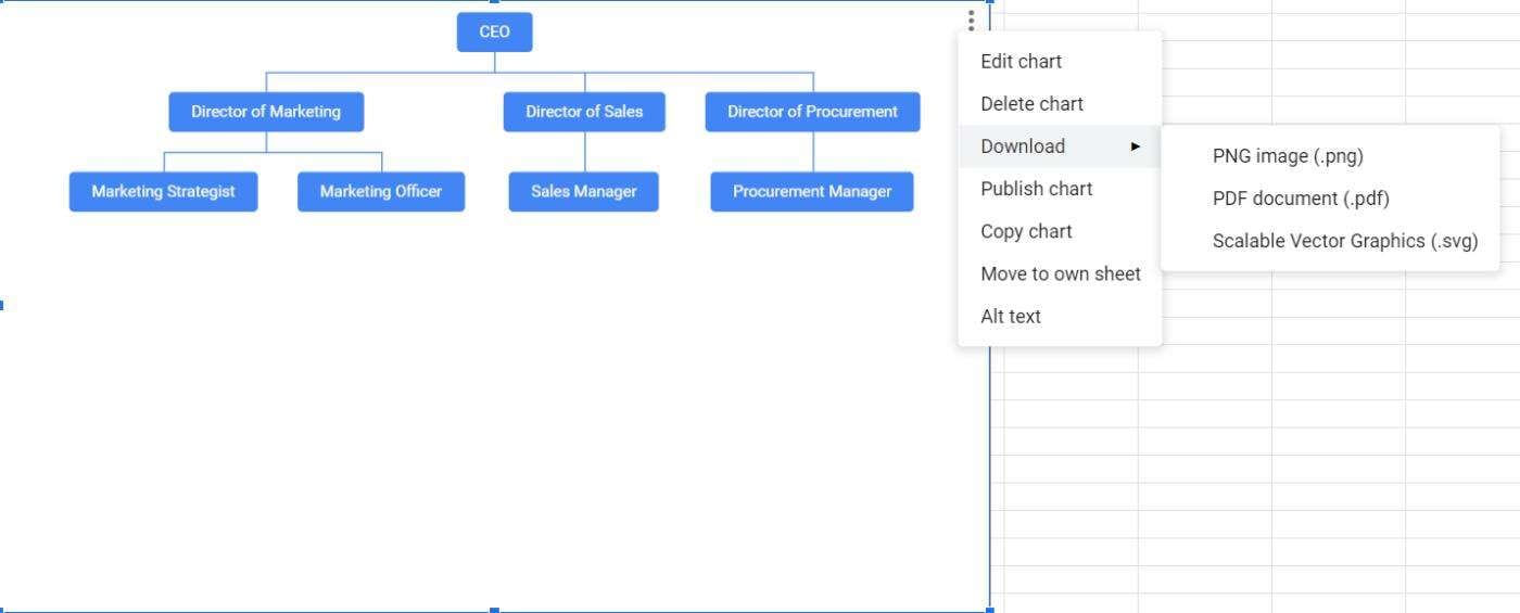
Once you have prepared the data, proceed to insert the organizational chart. In Google Sheets, navigate to the "Insert" tab and select "Chart" from the drop-down menu. Choose the chart type that best represents your organizational structure, such as a hierarchical chart. Import the data into the chart, making sure to select the appropriate columns for names, job titles, and other relevant information.
- Customize Chart
Customizing the Google hierarchy chart in Google Sheets allows you to tailor its appearance and functionality to suit your specific needs. You can modify the chart's layout, font style, color scheme, and other visual elements. Additionally, you may want to include tooltips highlighting additional information when hovering over specific elements within the chart.
Part 3. Examples of Organizational Charts in Google Sheets
There are various examples of organizational charts in Google Sheets. Users can utilize one of them depending on their specific purpose.
Example 1. Add Name Column to Show as Tooltip
One effective way to enhance the functionality of your Google hierarchy chart is by adding a name column. This column can be used to display tooltips, providing additional information such as department, contact details, or any other relevant data when hovering over a particular employee's name.
Example 2. Add Names Under Job Titles
To make the organizational chart more comprehensible, consider adding the names of employees directly beneath their respective job titles. This approach ensures clarity and eases navigation within the chart, especially in cases of complex hierarchies or larger organizations with multiple departments.
Example 3. How to Make an Organizational Chart with Name & Email in Tooltips
If you desire a more comprehensive organizational chart, you can include both the employee's name and email address within the tooltips. This added functionality enhances communication by providing quick access to contact information when needed.
Part 4. Edrawmax: A Better Alternative to Making an Org Chart in Google Sheets
Creating a Google Docs org chart can be done in various ways. One can create an organizational chart in Google Docs with the Drawings feature or by exporting from Google Sheets.
- Google Docs Organizational Chart with Drawings
Google Docs offers an alternative platform for developing organizational charts through its versatile Drawings feature. By utilizing this tool, users can design visually appealing charts directly within a Google Docs document. This flexibility allows for enhanced customization while maintaining the collaborative nature of Google Docs.
- Exporting From Google Sheets
Alternatively, Google Sheets offers the capability to export organizational charts to Google Docs. This process streamlines the charting process, as Google Sheets provides a robust environment for data management and manipulation.
Part 5. Tools to Create Organizational Chart in Google Docs
For creating organizational charts, there are several cutting-edge tools available out there. These tools are user-friendly and offer plenty of advanced features. Some of the most popular tools for creating organizational tools are discussed below:
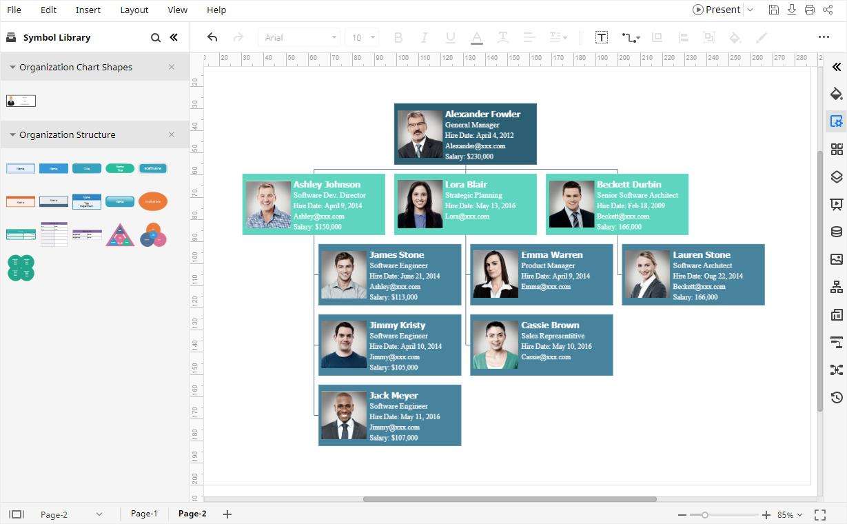
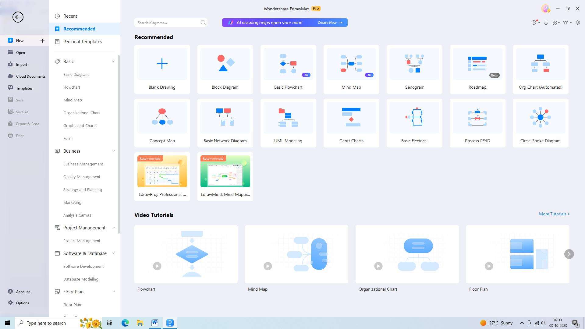
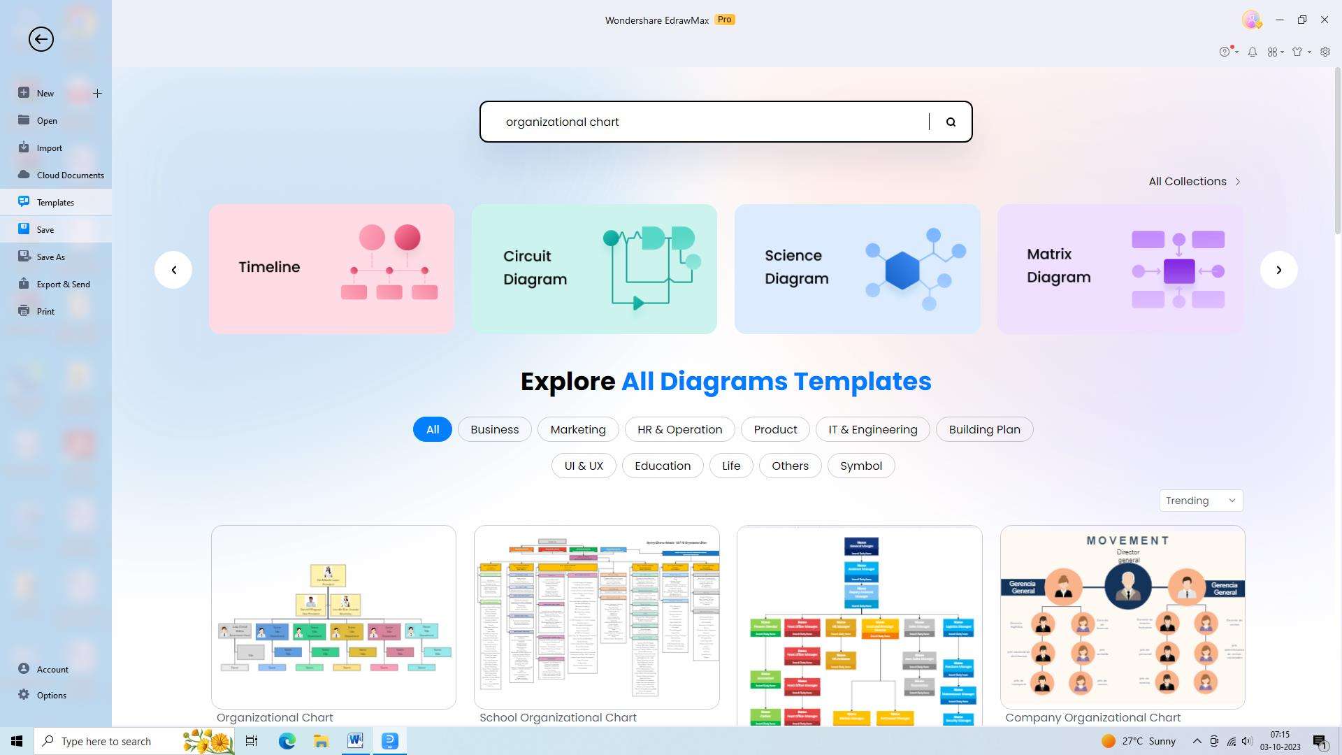
1. Wondershare EdrawMax
WondershareEdrawMax is an intuitive organizational chart Google Docs creator tool. It enables users to quickly and easily create professional-looking organizational charts in minutes. It features a range of templates, shapes, and symbols to help users create visually appealing organizational charts. It also offers a variety of customization options, allowing users to personalize their charts to their exact specifications. Here are the steps to create an organizational chart using the tool:
Step 1: Open WondershareEdrawMax
Begin by launching the WondershareEdrawMax software on your computer to access its features and functionalities.
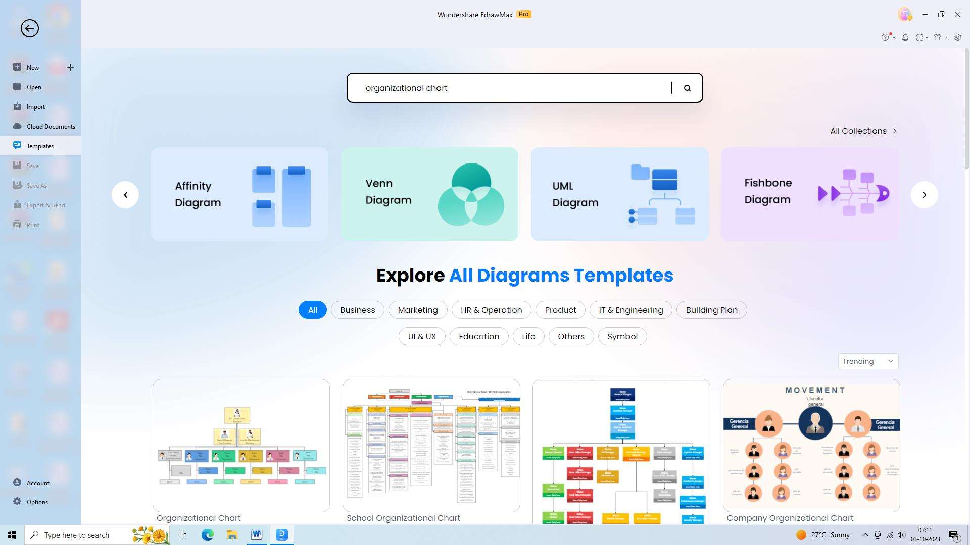
Step 2: Select the Organizational Chart template
Save valuable time by selecting a pre-designed template from the available options, allowing you to quickly start creating your organizational chart.
Step 3: Add shapes and connectors
Utilize the convenient drag-and-drop feature in EdrawMax to effortlessly add shapes and connectors, simplifying the process of building your chart.
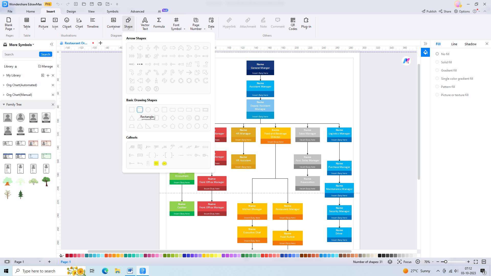
Step 4: Customize shapes and text
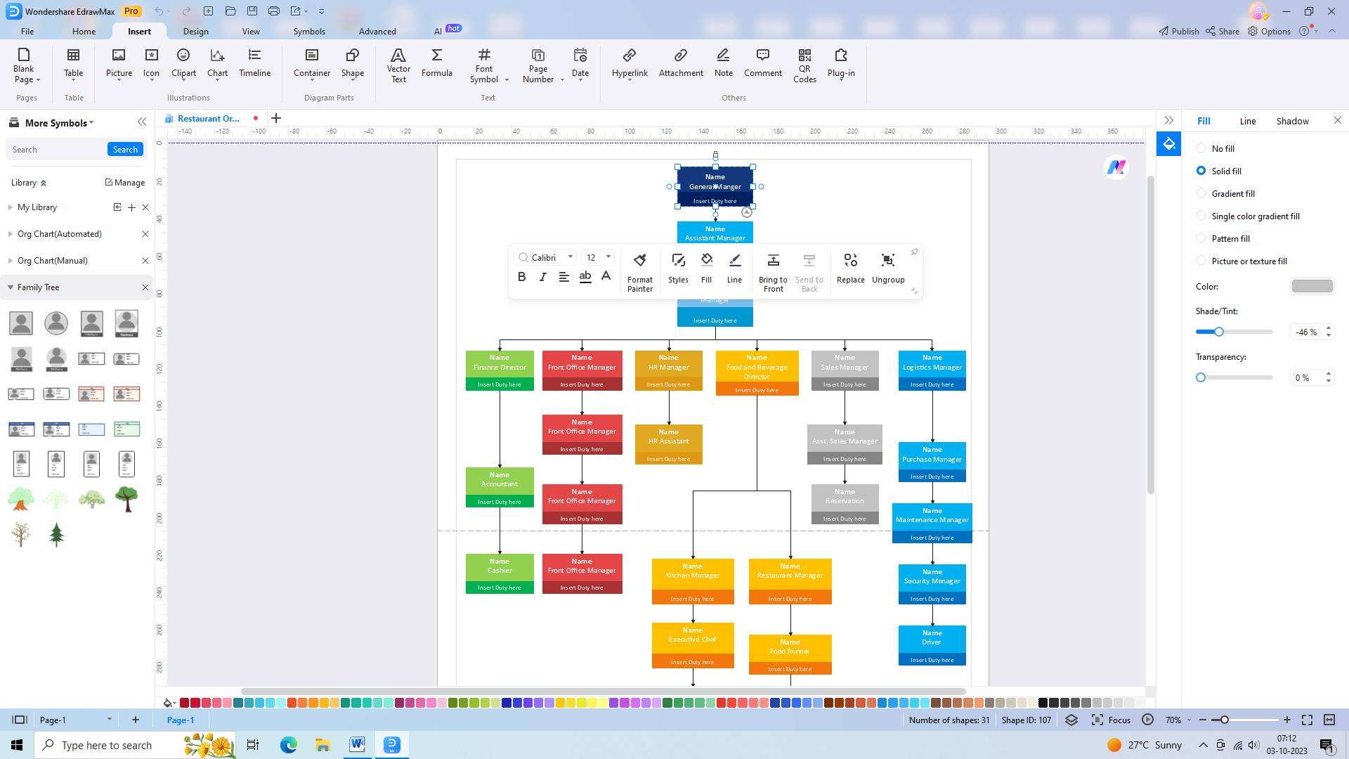
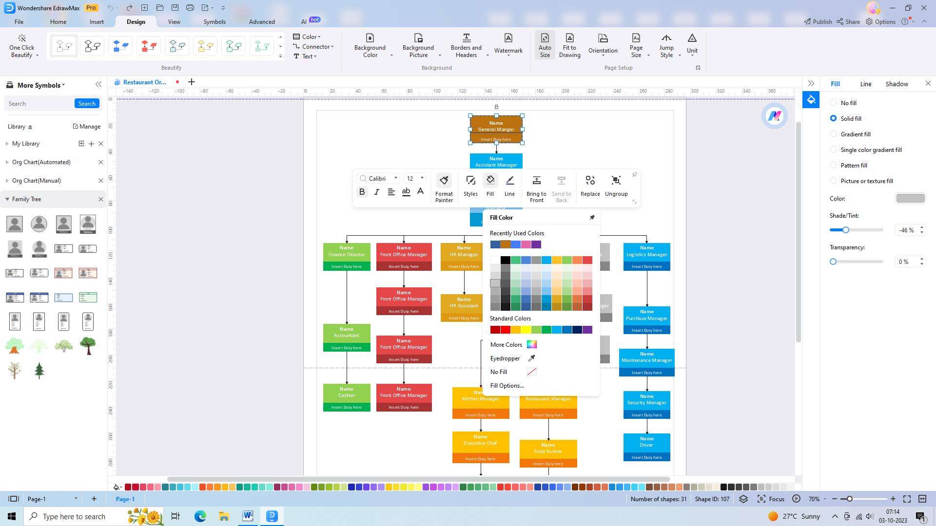
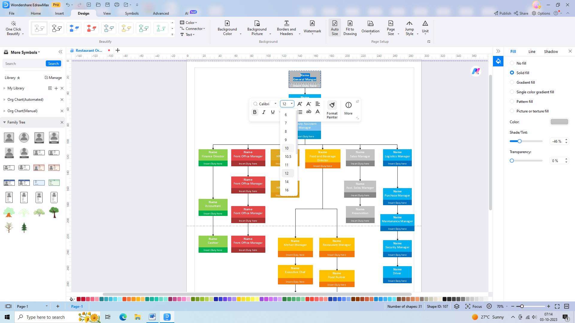
Take advantage of the customization options available in EdrawMax to modify the appearance of each shape, ensuring they align with your organization's branding, and add relevant text to provide clarity.
Step 5: Add additional elements
Enhance the visual appeal and relevance of your organizational chart by incorporating additional elements such as titles, images, or logos, which can help convey information effectively.
Step 6: Arrange and align shapes
Ensure optimal clarity and readability by arranging and aligning the shapes in a logical order, making it easier for viewers to understand the hierarchy and relationships within your organization.
Step 7: Add names and titles
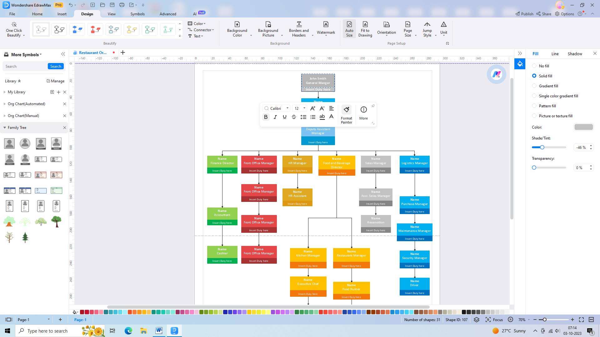
Input the names and job titles of individuals in each position to complete your organizational chart, providing a comprehensive overview of your organization's structure.
Step 8: Save and share the chart
Once your chart is finalized, save it in a suitable file format and easily share it with your team or stakeholders, allowing for collaboration, feedback, or reference purposes.
2. Organimi
Organimi is a user-friendly organizational chart creation tool that allows businesses to easily create and manage their organizational structure. It provides a visual representation of the company hierarchy and helps streamline communication and collaboration within teams.
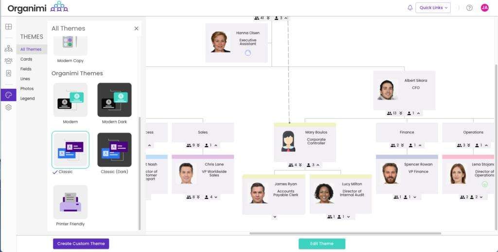
Features:
- Organimi offers a simple drag-and-drop interface, making it easy to add, remove, and rearrange employees within the organizational chart.
- Users can choose from a variety of pre-designed templates or create their own personalized charts to match their company's unique structure.
- Organimi enables real-time collaboration, allowing multiple users to work on the same chart simultaneously and make updates in real time.
Pros:
- Organimi allows users to create detailed profiles for each employee within the organizational chart, including contact information, job titles, and department information.
- The tool offers secure cloud storage, ensuring that organizational charts are accessible from anywhere, anytime.
- Organimi can integrate with other software applications, such as HR systems, making it easier to import and update employee data.
Cons:
- While Organimi provides templates, users find the customization options somewhat restricted.
- Organimi's reporting features are relatively basic, which is a drawback for businesses that require more advanced analytics or data visualization options.
- The tool has limited options for exporting charts, which restricts sharing and collaboration outside of the platform.
3. Miro
Miro is a versatile online collaboration platform that includes a comprehensive organizational chart creation tool. It offers an array of features that go beyond traditional charting, providing businesses with a powerful tool for visualizing and managing their team structures.
Features:
- Miro enables team members to collaborate in real time, making it easy to brainstorm, plan, and update organizational charts together.
- With Miro, users can create complex diagrams and flowcharts, allowing for more detailed and dynamic organizational charts.
- Miro seamlessly integrates with popular project management and communication tools, ensuring smooth workflows and data synchronization.
Pros:
- Miro offers a wide range of features beyond organizational chart creation, making it a valuable all-in-one collaboration tool for businesses.
- Users have extensive control over the design and layout of their organizational charts, allowing for a highly tailored visual representation.
- Miro seamlessly integrates with popular project management and communication tools, such as Slack and Trello, enabling smooth workflows and centralized data management.
Cons:
- Miro’s level of complexity can sometimes lead to information overload, making it challenging for users to focus on the most critical information and navigate the chart effectively.
2: While Miro is designed for collaboration, some users have experienced difficulties when collaborating on large-scale organizational charts.
- While Miro does offer integrations with popular tools like Slack and Google Drive, some users have reported limitations in the available integrations.
Conclusion
Organizational charts are powerful tools that simplify the complex structure of businesses and companies. They help individuals comprehend their roles and responsibilities within an organization and promote effective communication and collaboration. By utilizing a Google organigram, businesses can improve decision-making processes, identify areas of improvement, and ensure efficient workflow.