Bar graphs are a fundamental tool for visualizing data, and Excel offers a versatile platform to craft them effectively. Whether you're a data analyst, business professional, or student, mastering the art of creating and customizing bar graphs will empower you to convey your information with impact and clarity. In this step-by-step tutorial, we'll walk you through the process of creating a bar graph in Excel, from data input to fine-tuning aesthetics, ensuring you're equipped to excel in Excel's data visualization capabilities.
Contents of this article
What is a Bar Graph?
A bar graph is a visual way to display information using rectangular bars. Each bar represents a category or group, and the length of the bar corresponds to the quantity or value it represents. This makes it easy to compare different groups or track changes over time. For instance, in a bar graph showing sales data, each bar would represent sales for a specific period or product. Bar graphs are widely used in reports, presentations, and studies to make data easy to understand at a glance.
Difference Between Bar Graph and Bar Chart:
A bar graph and a bar chart are often used interchangeably, but there is a subtle distinction. A bar graph is a graphical representation of data in which bars of equal width are drawn in a graph to show the frequency or count of data points within specific ranges or categories.
On the other hand, a bar chart is a broader term that encompasses various types of charts, including bar graphs. It can refer to any chart that uses bars to represent data, not limited to just frequency or count. In essence, while all bar graphs are bar charts, not all bar charts are necessarily bar graphs.
Steps to Creating a Bar Graph in Excel
With Excel's user-friendly interface and powerful features, you'll be crafting professional-grade bar graph in Excel in no time. Let's get started and learn the steps for making a bar graph in Excel:
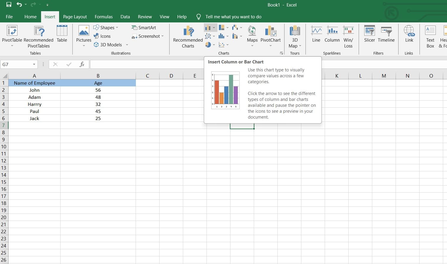
Step 1: Launch Microsoft Excel and input the data you want to represent in the bar graph.
Step 2: Enter the data range you want to include in the bar graph. This selection will be the basis for creating the chart.
Step 3: Navigate to the "Insert" tab in Excel's ribbon menu. Click on the "Bar Chart" option. Choose the specific type of bar chart you want like clustered, stacked bar graph, grouped, and so on.
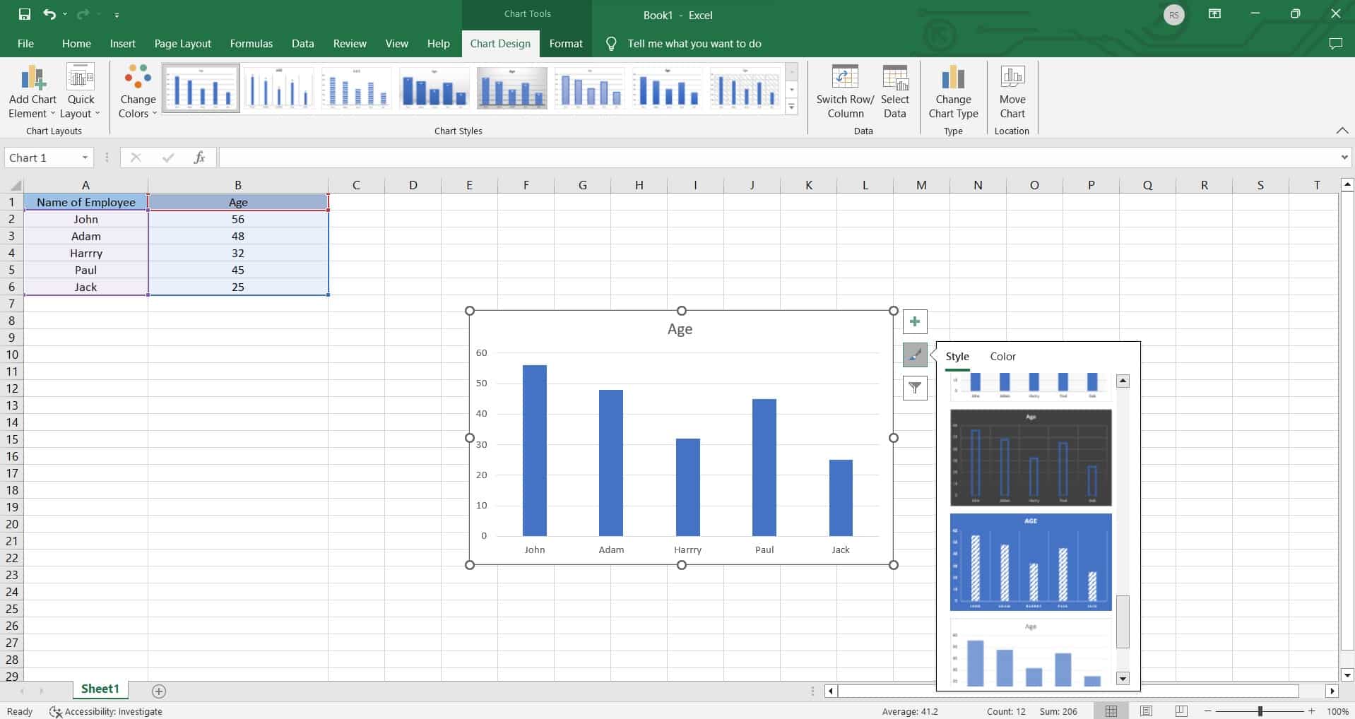
Step 4: Excel will generate a default chart. You can further refine its appearance by customizing elements like titles, axes, and color schemes.
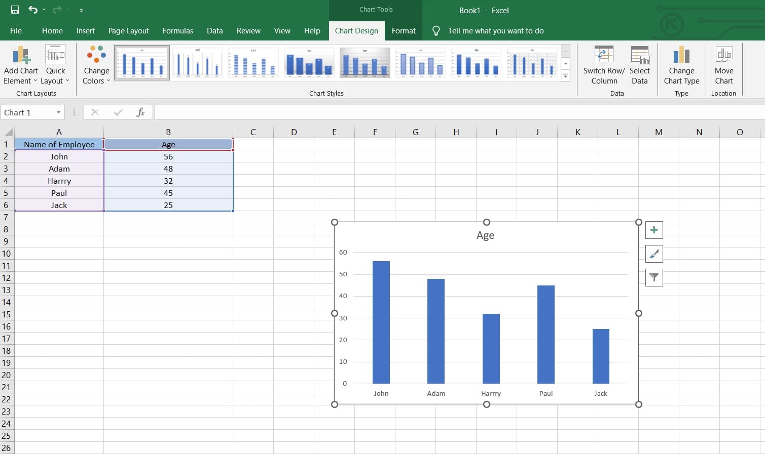
Step 5: Customize the appearance of the bars by changing their colors, styles, and widths. Adjust the scaling of the axes to ensure accurate representation of data.
Step 6: Once you're satisfied with the bar graph, save your Excel file.
Excel offers a wide range of customization options, so feel free to explore and experiment to create the perfect bar graph for your specific needs.
Limitations of Using Excel To Create Bar Graph
While Excel is a popular choice for creating basic visualizations, it's important to be aware of its limitations when working with more complex or extensive datasets. Here are some drawbacks you might face while creating a bar graph in Excel:
- Dependency on Software Version and Compatibility: Different versions of Excel may have varying features and capabilities, which could affect the ease of creating and customizing bar graphs.
- Limited 3D and Specialized Visualizations: Excel is primarily designed for 2D charting, and creating complex 3D visualizations or specialized charts like heatmaps or network diagrams can be cumbersome or may require additional add-ins or manual adjustments.
Create Bar Graph Easily Using EdrawMax
Wondershare EdrawMax is specifically designed for creating a wide range of professional-grade visualizations, including bar graphs. It provides a more extensive set of customization options, allowing for greater control over the appearance and layout of the graph.
Unlike Excel, EdrawMax supports a plethora of chart types beyond the standard offerings. This includes specialized visualizations that may not be easily achievable in Excel, such as bubble charts, Gantt charts, and fishbone diagrams, providing users with a broader range of options for data representation.
Here are the steps to create a bar graph using EdrawMax:
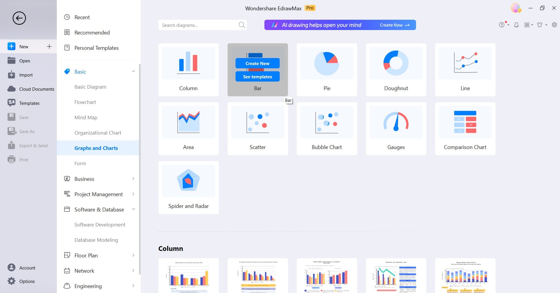
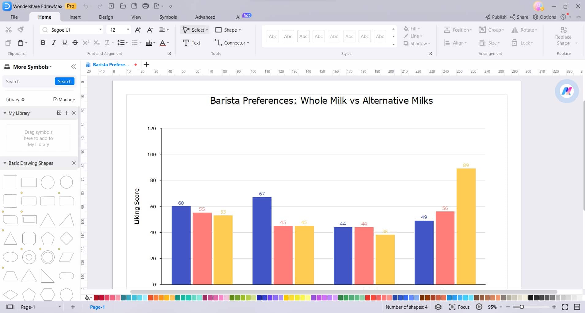
Step 1: Open the EdrawMax software on your computer. In the EdrawMax interface, navigate to the New> Graphs and Charts" category. Select “Bar Chart”.
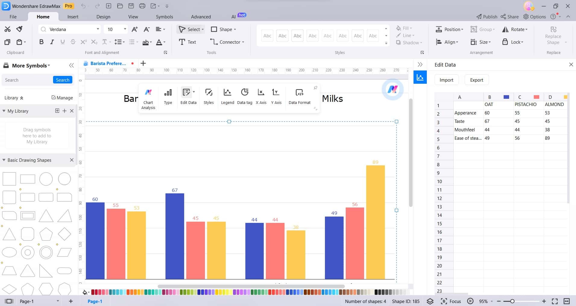
Step 2: Click on the graph and select “Edit Data”. A spreadsheet-like interface will appear. Input or paste your data into the provided table.
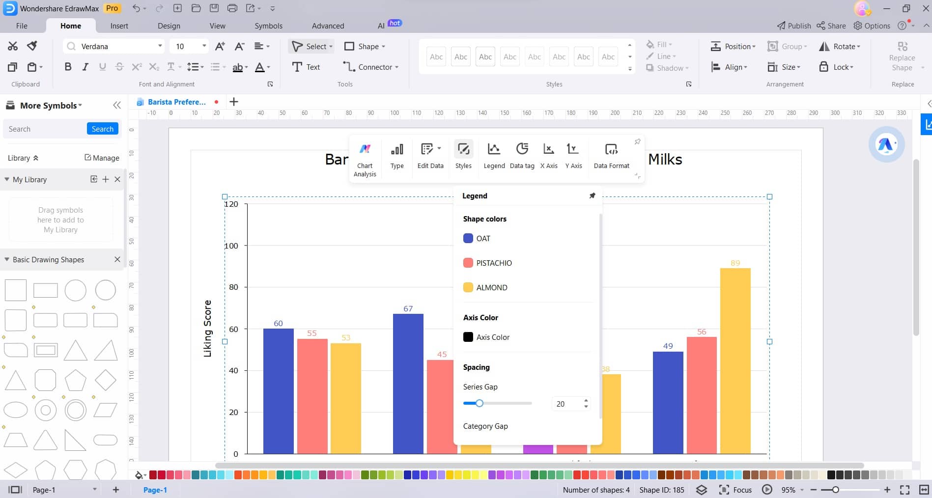
Step 3: After inputting the data, you can customize various elements of the bar graph. This includes changing colors, adjusting bar width, modifying axis labels, and more. Use the formatting options available in the EdrawMax interface.
Step 4: Further refine the appearance of the bar graph by adjusting fonts, backgrounds, and other visual elements to ensure a polished and professional look.
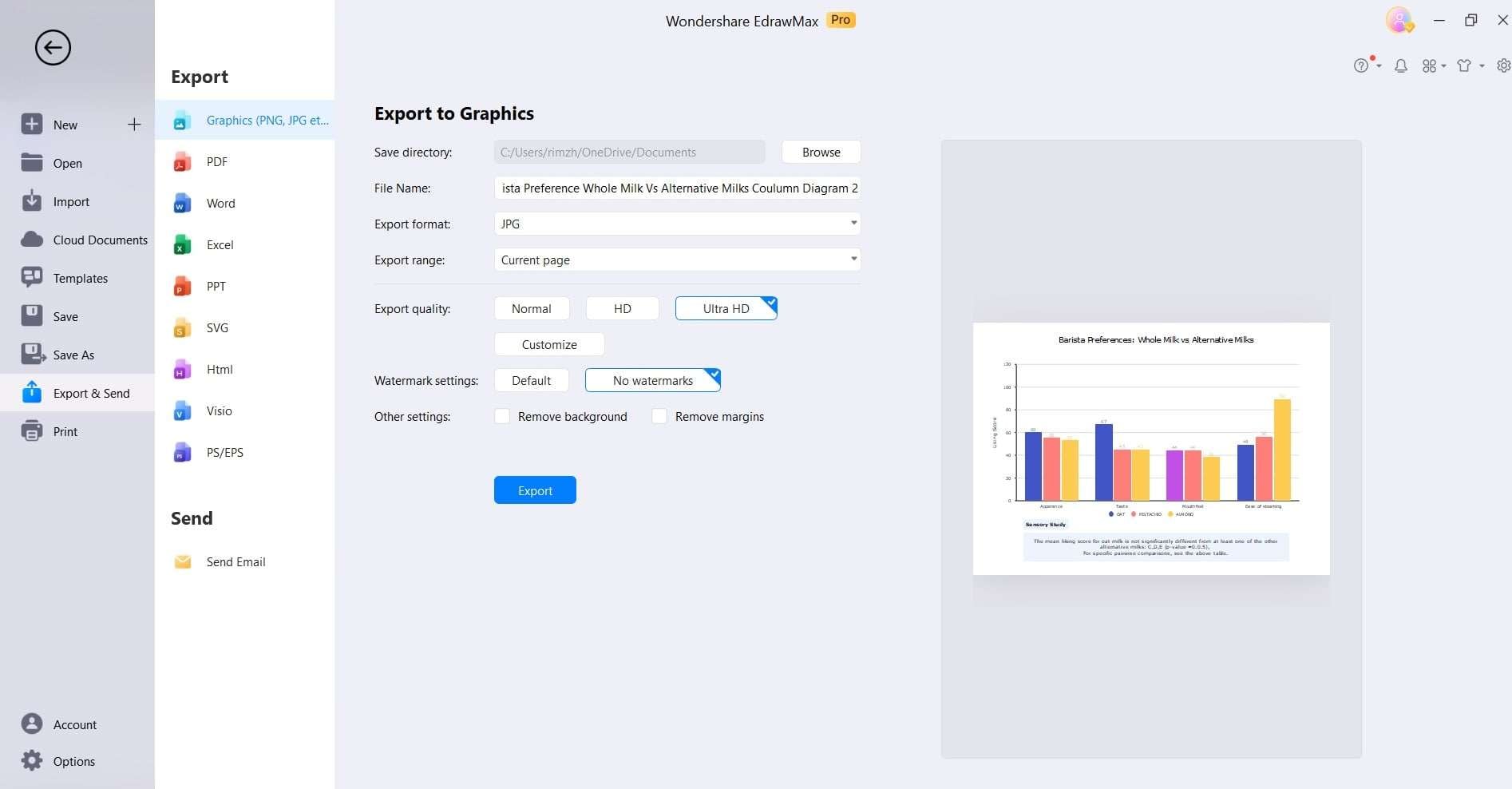
Step 5: Once you are satisfied with the bar graph, save your project to retain your progress. EdrawMax allows you to save your work in various formats for easy sharing and editing.
With EdrawMax, you have the power to create visually stunning and highly customizable bar graphs that effectively convey your data. Start visualizing your information with precision and style today!
Conclusion
Mastering the art of creating bar graph in Excel is a crucial skill for anyone working with data. While Excel offers basic charting capabilities, EdrawMax elevates the experience with its intuitive interface and extensive customization options.
With EdrawMax, you can effortlessly design visually compelling bar graphs that leave a lasting impression. Its versatility and rich feature set make it an invaluable tool for professionals across various fields.