In the field of data analytics, the ability to convey insights effectively is paramount. Stacked and traditional bar charts are important tools in this endeavor. In this comprehensive guide, we will learn the art of creating these visualizations using Tableau, a powerhouse in the field of data visualization.
Whether you're a seasoned analyst or just starting your data journey, mastering these techniques will empower you to present complex information with clarity and impact.
Contents of this article
What are Stacked Bar Charts?
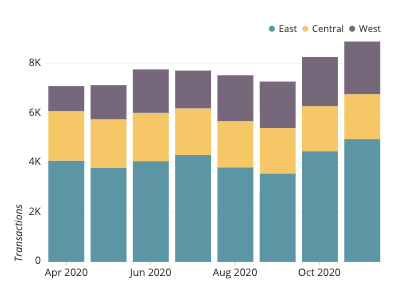
Stacked bar charts are a type of data visualization that extends the concept of traditional bar charts. They represent multiple variables in a single bar, stacking segments to illustrate the total value while also showing the contribution of individual components. Each segment's height corresponds to its proportion of the total, allowing for easy comparison between different categories.
Stacked bar charts are invaluable for visualizing the composition and distribution of data across various dimensions, providing a clear overview of how different elements contribute to the whole. They are widely used in data analysis and reporting.
Different Types Of Bar Charts
Here are the various types of bar charts in Excel and their unique applications in data visualization
- Vertical Bar Chart: A vertical bar chart displays categorical data with vertical bars, where the height of each bar represents the value of the category. It's effective for comparing discrete data points and is widely used for straightforwardly presenting information.
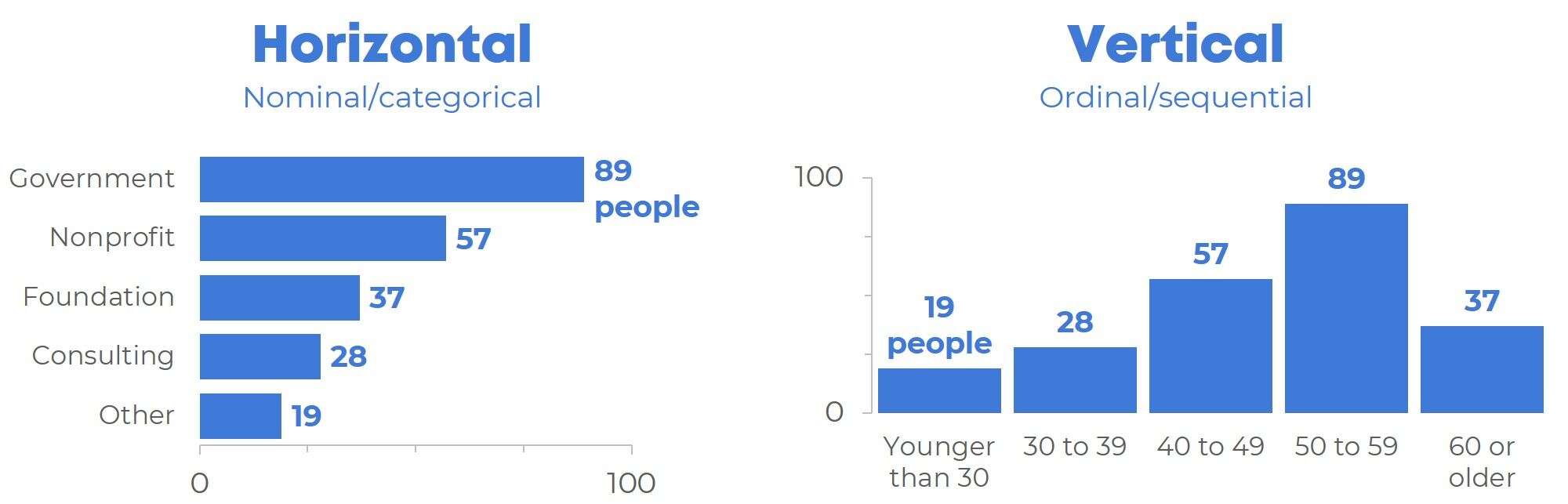
- Horizontal Bar Chart: In a horizontal bar chart, data is represented by horizontal bars, with the length of each bar indicating the value it represents. This type of chart is particularly useful when dealing with long category names or when you want to emphasize comparisons across categories.
- Grouped Bar Chart: A grouped bar chart displays multiple sets of data side by side within each category. It allows for easy comparison between the different groups, making it a valuable tool for illustrating variations and trends across multiple variables simultaneously.
- Stacked Bar Chart: A stacked bar chart combines multiple variables in a single bar, with segments representing the contribution of each variable to the total. This chart type is ideal for visualizing the composition and distribution of data, highlighting both individual components and their cumulative impact on the whole.
How to Create Stacked Bar Charts in Tableau?
To create Stacked Bar Charts in Tableau, follow these steps:
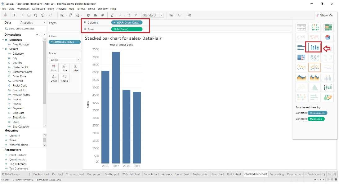
Step 1: Open Tableau, connect to your dataset, and select the appropriate dimensions and measures.
Step 2: Drag the dimension you want to use for categories to the Rows shelf, and the measure you want to represent on the bar chart to the Columns shelf.
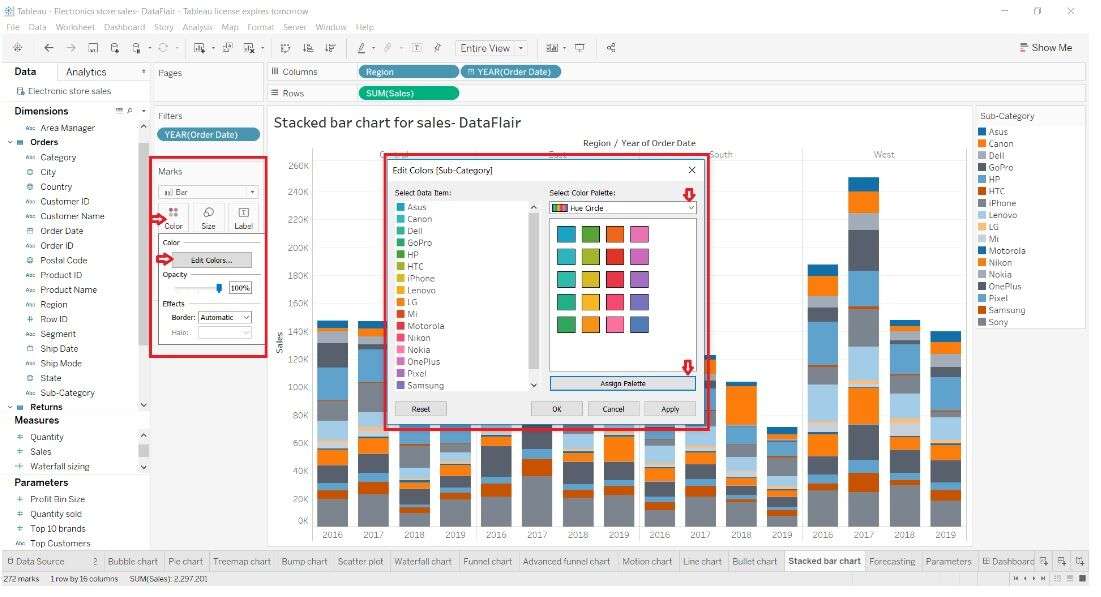
Step 3: Drag another dimension to the Color shelf. This will stack the bars based on the values of this dimension.

Step 4: Adjust colors, labels, and other formatting options as per your preference. Customize labels and tooltip information to enhance clarity and context.
Step 5: Once satisfied, save your work and publish it to share with your audience.
Limitations of Creating Bar Charts in Tableau:
Although Tableau is a powerful tool for visualizing data, it does come with some limitations when it comes to creating bar charts.
- Limited Customization: While Tableau offers substantial customization options, some advanced formatting or design choices may be challenging to achieve without extensive manual adjustments.
- Performance with Large Datasets: Creating bar charts with extremely large datasets can sometimes lead to performance issues, causing delays in rendering and interactions.
- Learning Curve: Tableau has a learning curve, and mastering advanced bar chart techniques may require time and practice, especially for beginners.
Create Stacked Bar Charts Easily Using EdrawMax
Compared to Tableau, Wondershare EdrawMax offers a user-friendly interface and a diverse range of templates, making it an accessible and efficient choice for creating precise and visually appealing bar charts. Another significant advantage of using EdrawMax is its seamless integration with various data formats, allowing for easy import and visualization of data without the complexities sometimes associated with Tableau.
Here are the steps for creating bar charts in EdrawMax:
Step 1: Open the EdrawMax software on your computer. Click on the "New" button, then choose "Graphs and Charts" from the template categories.
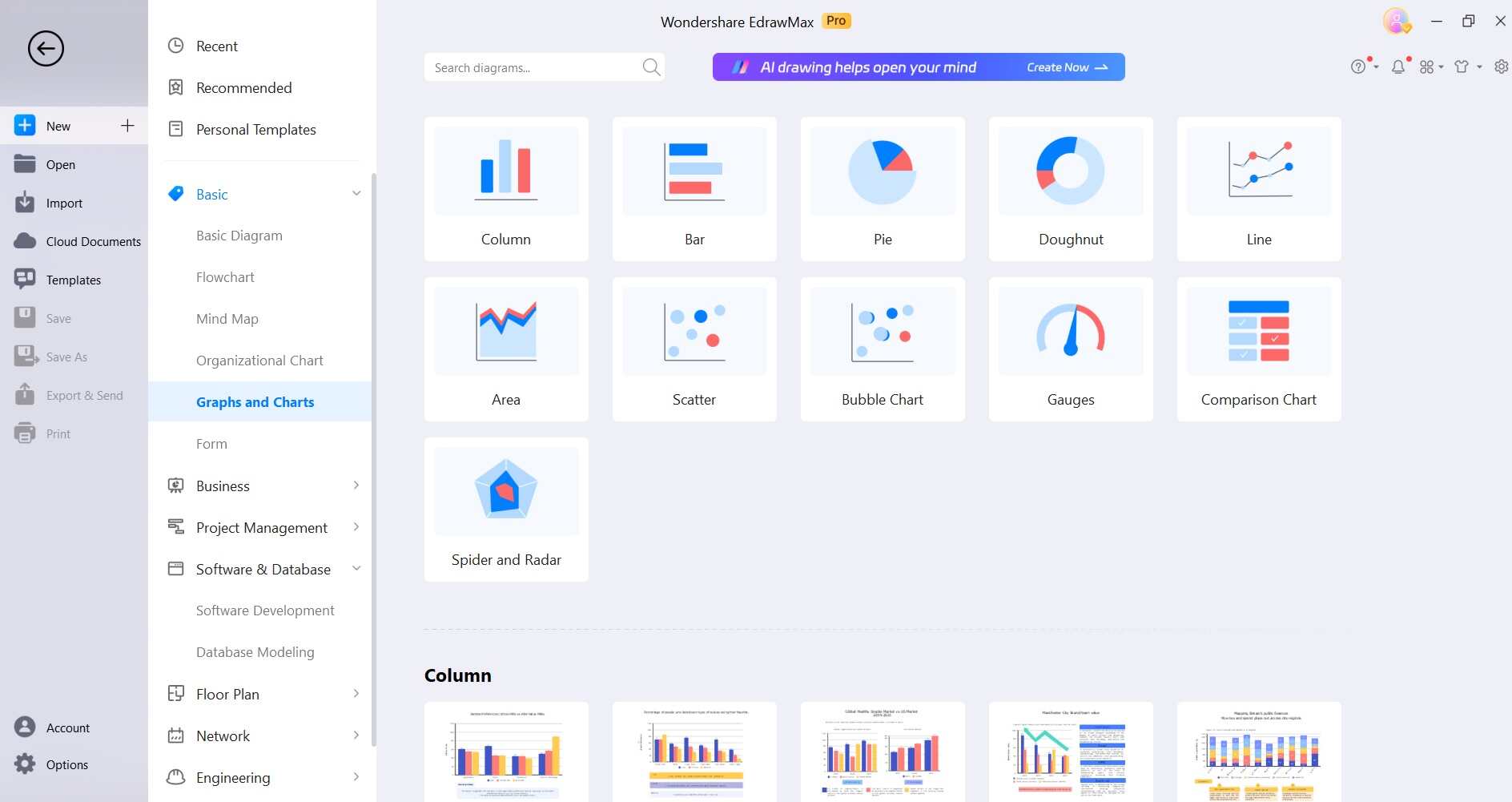
Step 2: Browse through the options and select "Stacked Bar Chart" from the list of chart types.
Step 3: A spreadsheet will appear. Input your data into the provided cells, specifying categories and values for each segment.
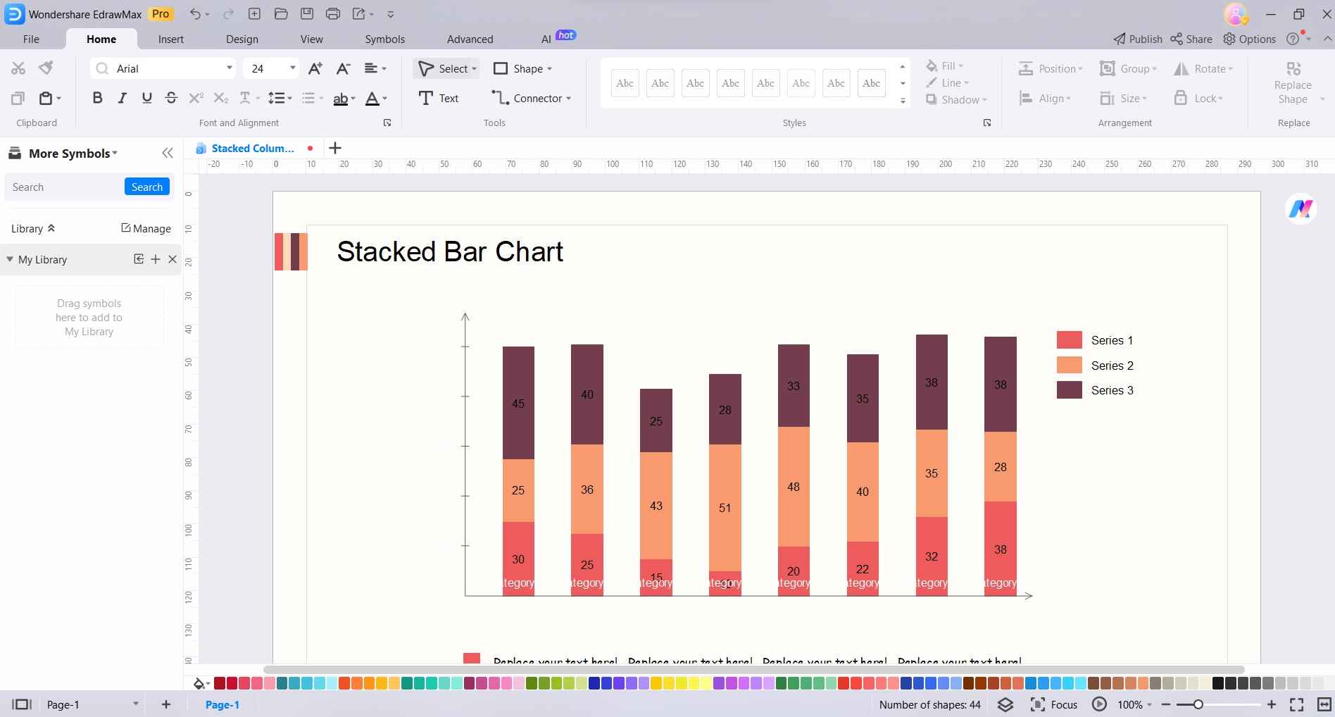
Step 4: Customize the appearance of your chart by adjusting colors, labels, titles, and other formatting options.
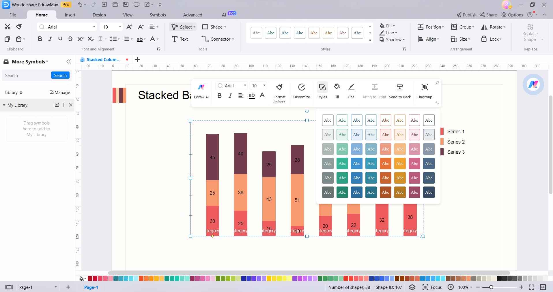
Step 5: Add relevant labels, titles, and any necessary annotations to enhance clarity and understanding.
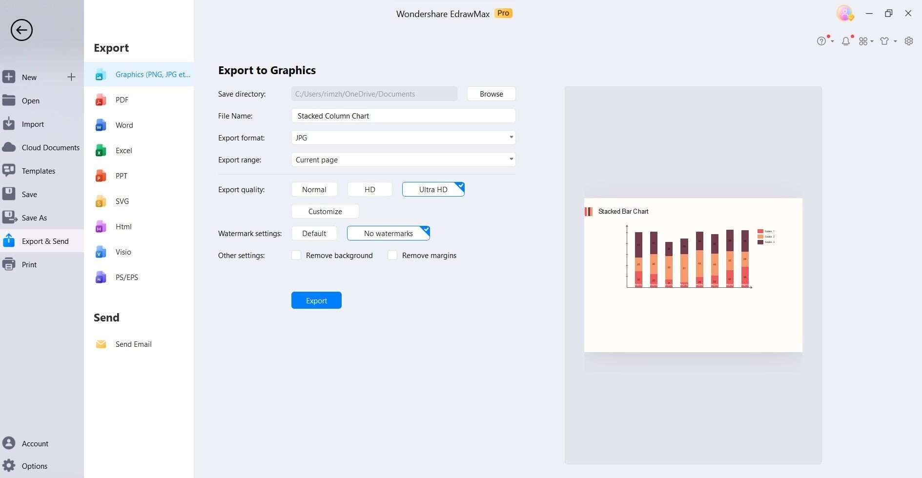
Step 6: Once satisfied, tap on File> Export and Send to save your work in the desired format and export it for presentations or reports.
Pros and Cons of Using EdrawMax:
Before deciding which tool suits your needs best, let's explore the key advantages and drawbacks of EdrawMax for creating stacked bar charts.
Pros:
- User-Friendly Interface: EdrawMax is intuitive and accessible to users of all levels.
- Extensive Customization: Offers a wide range of customization options for precise chart design.
- Versatility: Provides a variety of templates and chart types suitable for different industries.
- Cost-Effective: A more budget-friendly option compared to specialized data visualization tools.
- Offline Access: Works without an internet connection, ensuring availability in any environment.
Cons:
- Not Specialized for Data Visualization: While versatile, it's not as specialized as dedicated data visualization software for in-depth data analysis.
- Steep Learning Curve for Complex Charts: Creating highly complex visualizations may require more effort and expertise compared to specialized tools.
Conclusion
Both Tableau and EdrawMax offer distinct advantages, with Tableau excelling in complex data analysis, while EdrawMax shines in user-friendly customization. Choosing the right tool depends on specific needs and preferences. Regardless of the platform, the ability to translate data into compelling visual narratives empowers analysts and decision-makers alike.
With practice and proficiency, one can harness the potential of stacked bar charts to unlock deeper insights and effectively communicate complex information.