


A Five Forces model is your X-ray vision—if it can't see through 'competitive advantage' fairy tales, you're flying blind.
But building one from scratch? Slides and spreadsheets eat up hours you don't have.
With the right template, you can deploy a polished Five Forces analysis in minutes—not ours. Below, I'll break down actionable templates (tested by EdrawMax users) and how to adapt them to your industry.
In this article
What is a Five Forces Diagram?
A Five Forces diagram, part of Porter's model for industry analysis, shows how different factors shape a business's competitiveness. It helps you see what affects your position in the market, whether you're launching a product or entering a new industry.
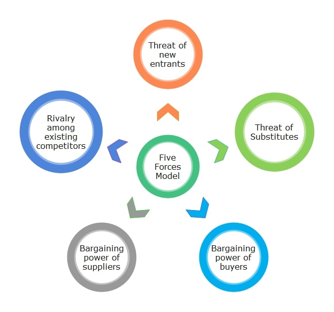
The model includes five forces:
- Buyer Power: Can customers easily switch or negotiate prices?
- Threat of New Entrants: How easy is it for others to enter your market?
- Threat of Substitutes: Are there cheaper or better alternatives?
- Competitive Rivalry: How tough is your industry competition?
By laying these out visually, you can spot risks and plan better. If you're doing any sort of competitive analysis, the Five Forces chart should be your starting point.
Why Use Five Forces Diagram Templates?
Strategic thinking is only part of the work. Presenting it well matters just as much. A clear Five Forces model can help, but only if it's easy to read and consistent.
Most professionals know the idea, but not everyone applies it equally. Tools and styles vary, and the result is often cluttered.
Aligning shapes, drawing arrows, and labeling forces take time, often more than thinking through the actual analysis.
Templates remove that friction. You start with a clean layout that is ready for your input. Whether you're checking the competition once or tracking trends every quarter, templates keep your approach steady.
The layout is already sorted. Each section is labeled and easy to update. You don't need to figure out where to start. You just focus on the insights.
8 Best Five Forces Diagram Examples
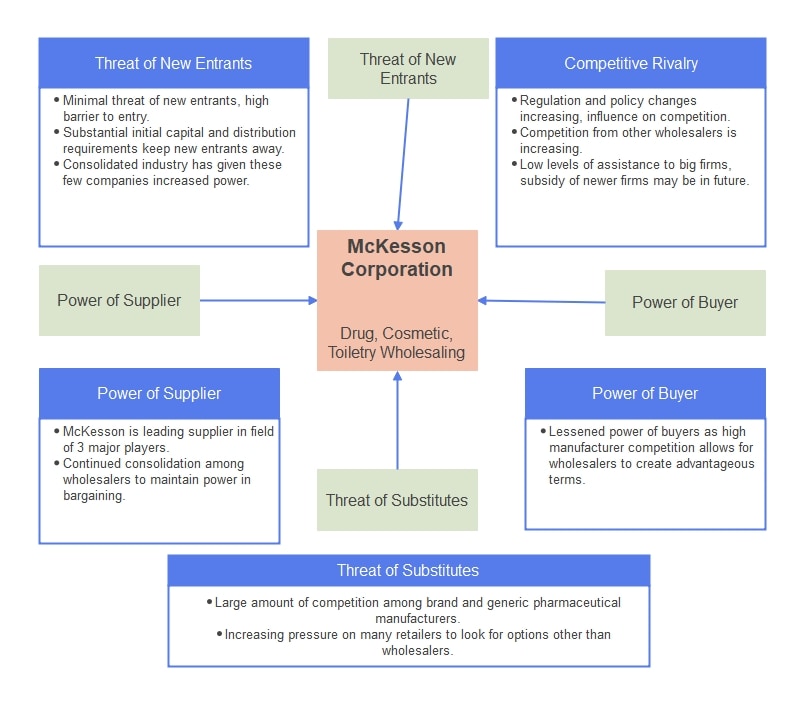
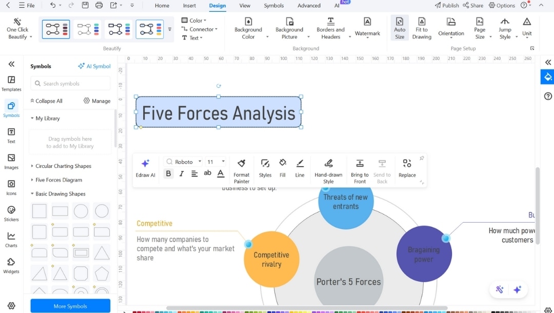
Template 1
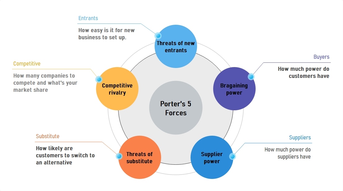
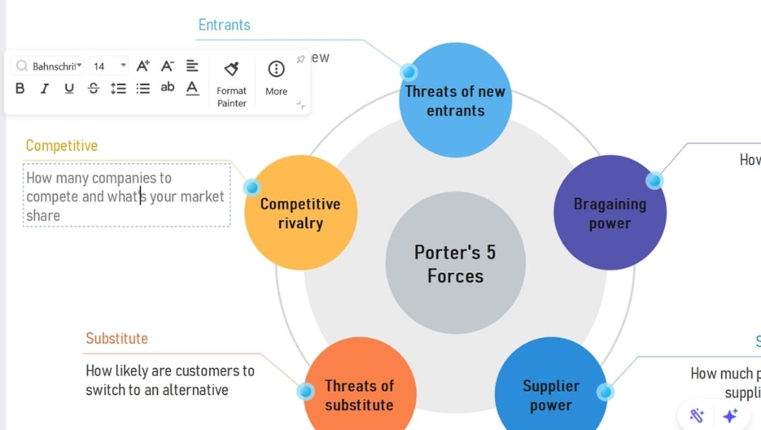
This template puts a large pentagon made of small circles in the center. Five wedges extend from its circles, each representing a key force. Each wedge has space for quick notes or key numbers.
The layout makes it easy to compare all five forces side by side. You can use color or size to show which ones are stronger; darker shades or bigger wedges will stand out.
It works well in board meetings or any setting where you need to show strategy in a clean, organized way. It's also a strong teaching tool or a great fit for competitive updates.
The even layout shows that no single force works in isolation. There's some space to add scores or sources next to each section if needed.
Template 2
If you're building a site for an industrial or enterprise company, this sitemap offers a clean framework.
It's divided into key sections, like Corporate Style, Passenger Elevator, and Product Series. Each section includes clearly labeled subpages, such as Installation Guide or Hydraulic Elevator.
The grid-style layout keeps everything clean and easy to follow, even when the content gets technical. It works well to showcase detailed services, product info, or support documents.
You can use it to plan a site for manufacturing, construction, or large product lines. It's especially useful for B2B platforms that combine product details with helpful resources.
Template 3
This sitemap template works well for small business websites.
It follows a top-down layout that starts with the homepage and branches into key sections like Products, About Us, News & Events, and Contact Us.
Each section has one or two subpages, for example, Features under Products or Calendar under News & Events.
It's a clean way to show main pages and a few details without making the structure too complex. Good for projects that need a quick, editable layout.
Template 4
This template breaks things down into neat parts. At the top, the main menu includes common pages: Home, Products, About Us, and Pricing.
Next is the service tier section. It lists different offers like Service Starter and Service Combo. This kind of setup is great for showing upgrade options. It works especially well for businesses that use tiered pricing.
This setup will most benefit SaaS platforms and service-based companies. It's built for those who offer both products and support tools.
With a clear split between info, services, and tools, the layout stays easy to navigate. It's a solid choice for businesses with layered offerings.
Template 5
Here, you get a left-aligned tree that splits daily site work by function. "Dashboard" breaks into real-time stats, "Content" into creating, editing, and archiving, and "SEO Tools" into keyword and metadata tasks.
Each branch is just one click down, so no section is hidden three levels deep. The design favors teams that juggle many contributors; you sketch exactly which screens an author, editor, or admin will see. Collapsible nodes keep the canvas compact, making presentations cleaner.
Choose this layout if you run a multi-author blog or community site and need a quick reference for who handles articles, images, and audits without stepping on each other's toes.
Template 6
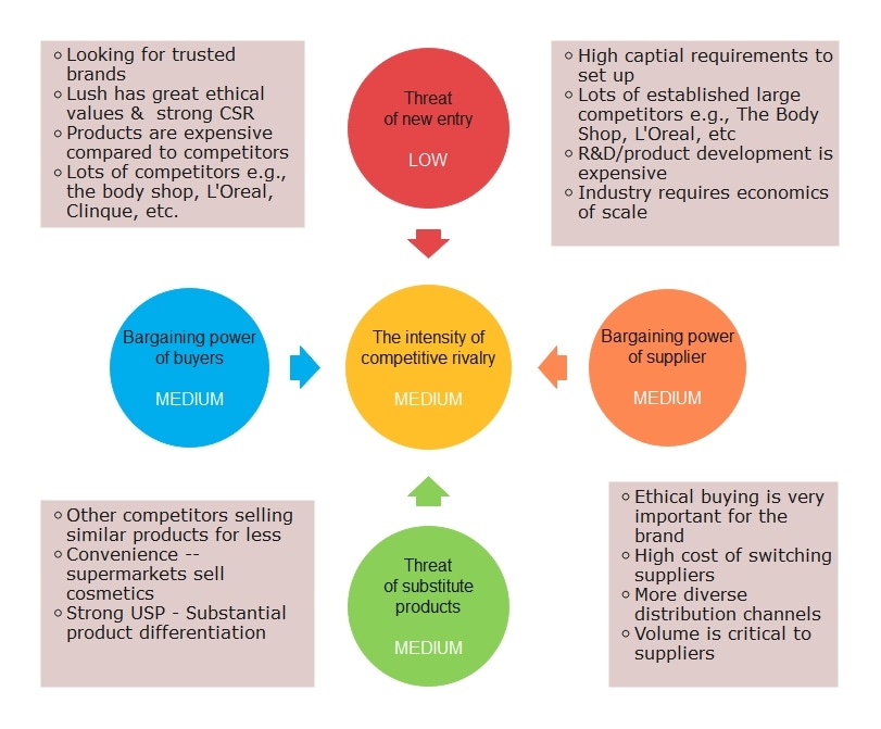
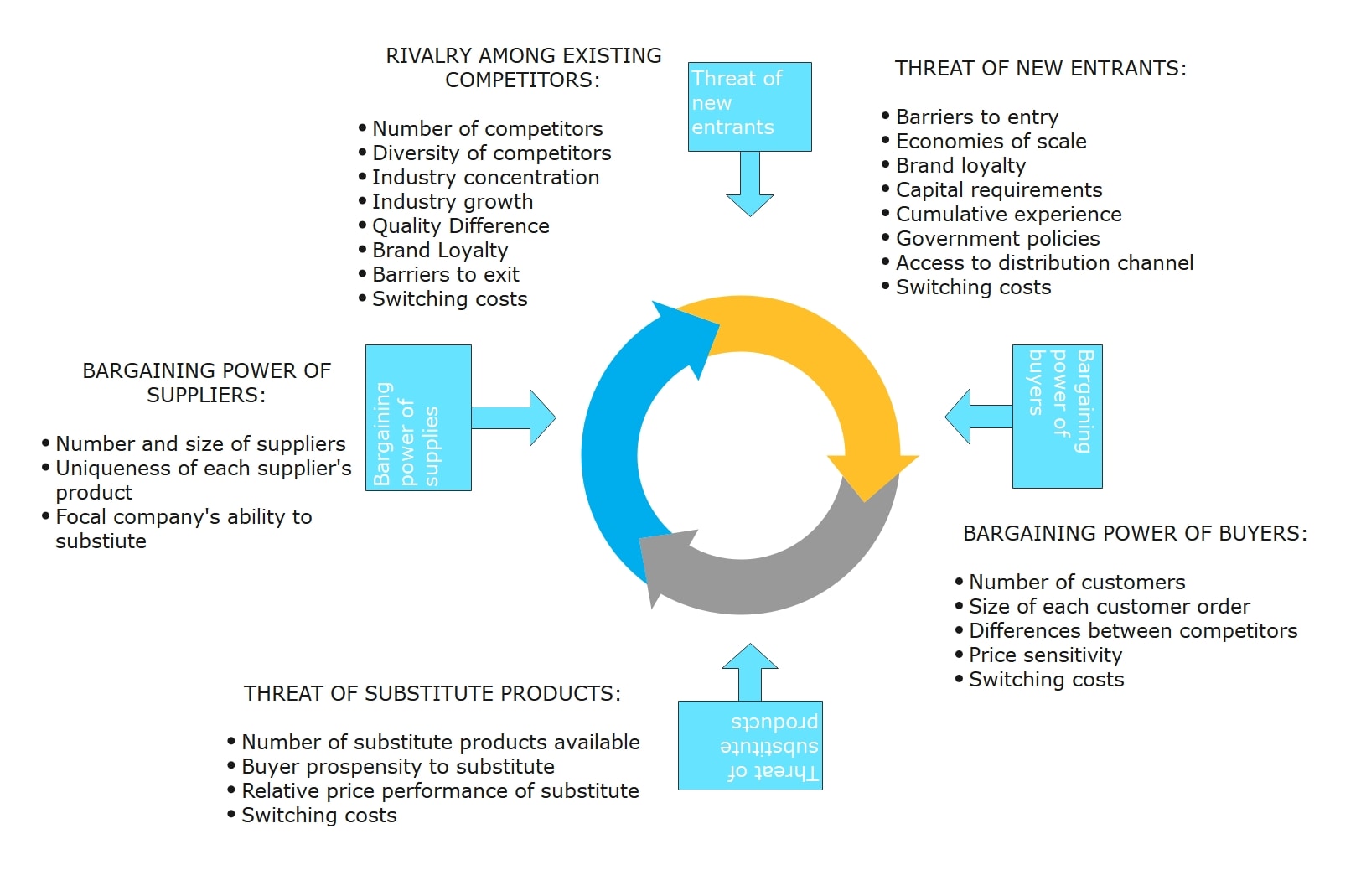
This template is made for ethical brands and companies that rely on trust to stand out. At the center is competitive rivalry, which is linked by arrows to four other areas.
The layout shows the push and pull between each force. You get a quick view of how strong each one is (LOW, MEDIUM), plus useful notes. For example, switching from supplier to supplier can be expensive.
The format makes it easy to assess how attractive a market is, and where your brand might have the edge, especially in industries where values influence buying decisions.
Template 7
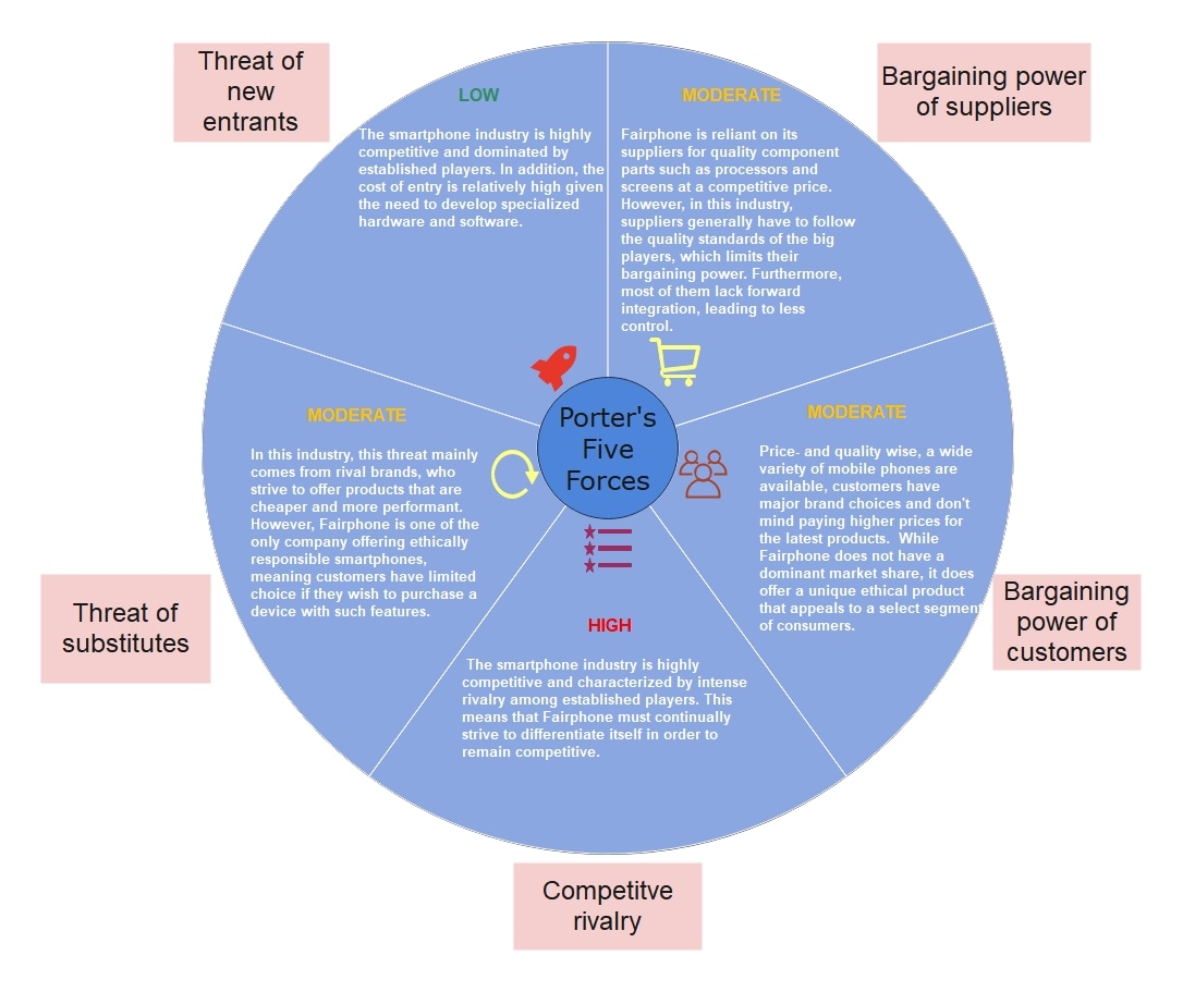
You can use this template to run a simple but complete Porter's Five Forces analysis. The sample shown focuses on smartphones.
At the center is a circle with all five forces mapped out around it. Each segment explains one force in detail.
It shows low risk from new competitors due to the high costs of entering the market. At the same time, rivalry is high since many strong brands are already in the game.
This layout is also great for planning strategy, building products, or learning business fundamentals. It helps you understand where competition comes from and how tough the market is.
Template 8
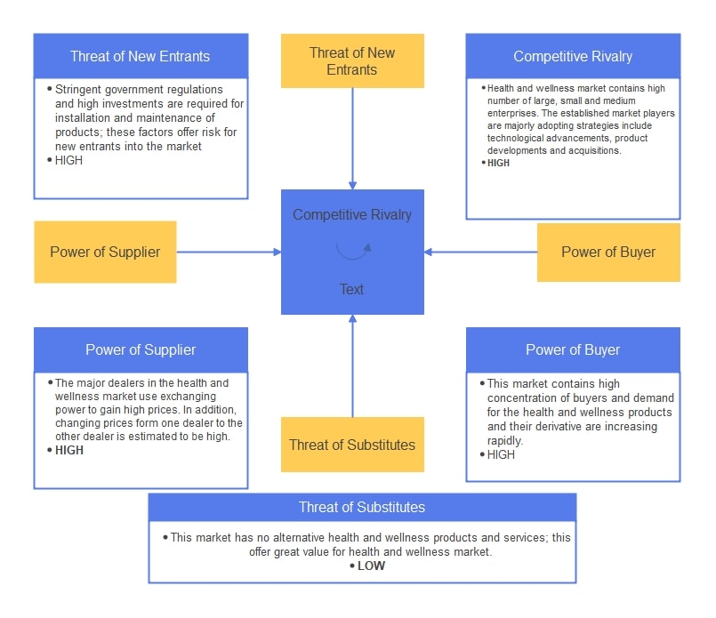
This template maps out the health and wellness market competition with a clear structure. It places competitive rivalry at the center and lays out four key areas: new entrants, buyer power, supplier power, and substitutes.
Each section is well-labeled and easy to read. Using colors, mainly blue and yellow, keeps the layout clean. Arrows link the sections, showing how these forces connect.
It's helpful for professionals who need to study the market carefully, from business analysts to strategic planners.
It shows what makes the market tough or appealing and helps guide smart choices for growth or positioning.
How to Customize a Five Forces Template in EdrawMax?
If you've ever tried building a Five Forces diagram manually, you know the layout isn't just five boxes; the flow, spacing, and readability take time to get right.
EdrawMax removes that overhead. Here's how:
- Built-in Strategy Templates: No need to build from scratch. Search "Five Forces," pick a layout, and start editing. It saves 20–30 minutes upfront.
- Full Control Without Complexity: You can edit shapes, text, and connectors by clicking and dragging; no advanced design knowledge needed.
- Flexible Formatting for Presentations: Whether you're preparing slides or documents, export to PPTX, PDF, or PNG without losing clarity or layout.
- Cross-Device Access: Work anywhere, on a desktop or browser. Changes stay synced.
- Consistent Visual Standards: Teams use the same format, so diagrams remain comparable across products, business units, or quarters.
Step1Open the Template
- Launch EdrawMax on your system or open the web version.
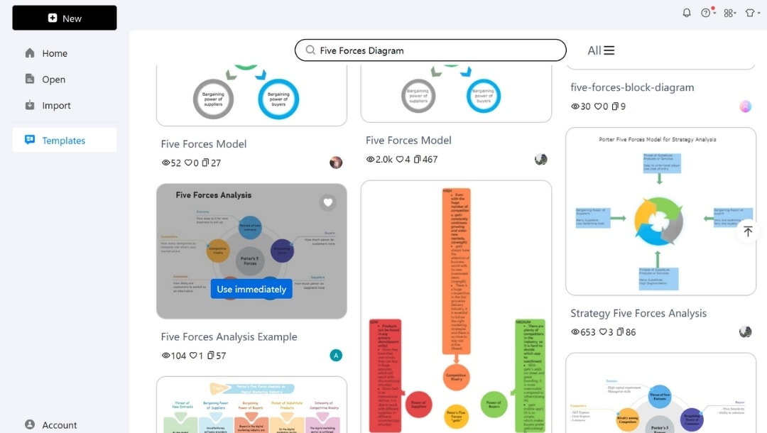
- In the left-side panel, click Templates, Type "Five Forces Diagram" in the search bar and hit Enter.
- Preview a few options. Look for one with editable text boxes and a layout that matches your purpose: circular for general use, grid for internal strategy decks, and quadrant for visual emphasis.
- Click Use immediately to load the template onto your canvas for editing.
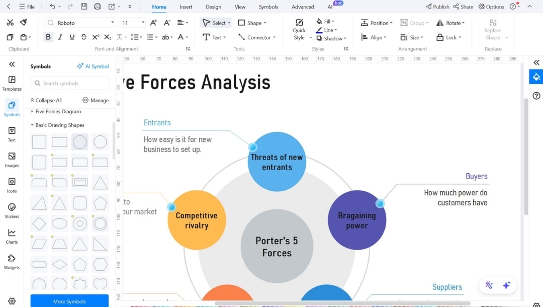
Step2Edit Text
- Double-click any textbox in the diagram to edit the content.
- Replace the placeholder text with information relevant to your analysis, such as specific details about supplier power or competitive rivalry in your industry.
- You can break down forces into bullet points or short sentences.
- Use the mini pop-up menu to customize the font size, style, line spacing, text alignment, and more.
Step3Enhance Customization
- To delete an unused element, select it and hit Delete.
- Explore the Symbols library on the left. Drag a matching shape (e.g., rectangle) onto the canvas to add an extra element if required.
- You can search for specific shapes in the search bar.
- Go to the Design tab, change the theme color from the Theme section, or try One Click Beautify.
- Click on individual elements to change font, border style, or shape fill from the pop-up menu.
- You can add icons from EdrawMax's built-in library for visual clarity, which is especially useful for presentations.
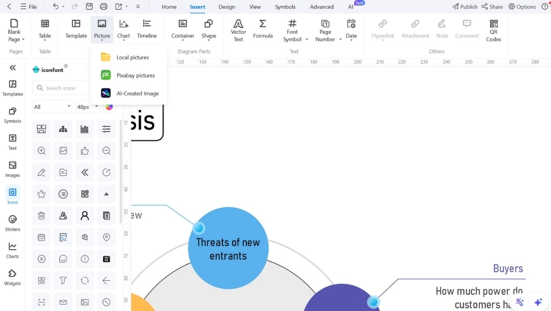
- To brand the diagram, upload and insert your company logo in a corner using Insert > Pictures.
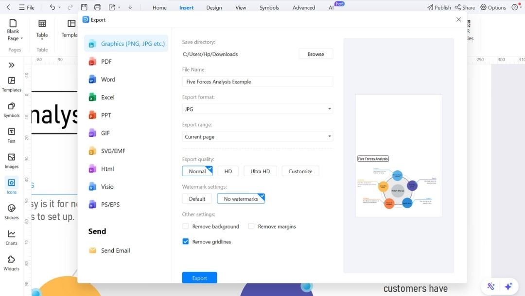
Step4Save and Export
- Once you've finalized the diagram, hit CTRL+S to save your file.
- To download it, click the export icon in the upper bar.
- Choose from formats like PDF, PPTX, PNG, SVG, or editable Word files, then tap the Export button.
Best Practices for Creating Five Forces Diagrams Professionally
I treat every Five Forces diagram as a working tool, not a one-time task. It's meant to guide action. Here's the process I follow.
1. Start with Verified Info
Don't fill out anything until you have real-world data. Contracts, trends, customer concentration, everything counts. Don't just say "high buyer power." Say exactly what makes it high.
2. Stay Specific
Every force needs clear examples. Say if a supplier owns key tech. Point to which tools could replace yours. Mention real price battles or market shifts under rivalry.
3. Use Color to Prioritize
Color makes scanning easier: Red = high risk, Yellow = watchlist, Green = stable. The right colors help teams focus without reading every word.
Final Words
Five Forces diagrams work best when they're clear, consistent, and easy to update. That's exactly what EdrawMax templates offer.
You're not stuck reinventing the format or second-guessing layout decisions. You spend your time where it counts: analyzing markets, evaluating risks, and shaping smarter strategies.
For business teams that need structure and speed, these templates deliver both. Try one today; no cost to get started.
AI Diagram Generator
Enter your prompt. Upload files if needed. Generate diagrams, charts, or slides instantly.


