
In today's world, it's really important to share information in a clear way, especially because we use a lot of data. Stacked column charts in Excel are a great tool for making complicated data easy to understand. They help us see things clearly!
This guide will walk you through the process step-by-step, demystifying the creation of these compelling charts.
Whether you're a seasoned Excel user or just starting, this tutorial will equip you with the skills to transform raw data into insightful visual narratives. Say goodbye to dull reports and unlock a new level of impactful data representation.
Contents of this article
What is a Stacked Column Chart?
A stacked column chart is a visual representation tool that helps organize and simplify complex data. It consists of vertical bars divided into segments, each representing different categories or groups. These segments are stacked on top of one another, illustrating the total and the contribution of each category. This chart is valuable for comparing data across various groups and tracking changes over time, making it an essential tool for effective data communication.
Creating a Stacked Column Excel Chart
Here are the steps to create a stacked column Excel chart:
Step 1: Open Excel on your Computer. Ensure your data is arranged properly in columns or rows. The first column or row should contain the categories, and the subsequent columns or rows should represent the different data series.
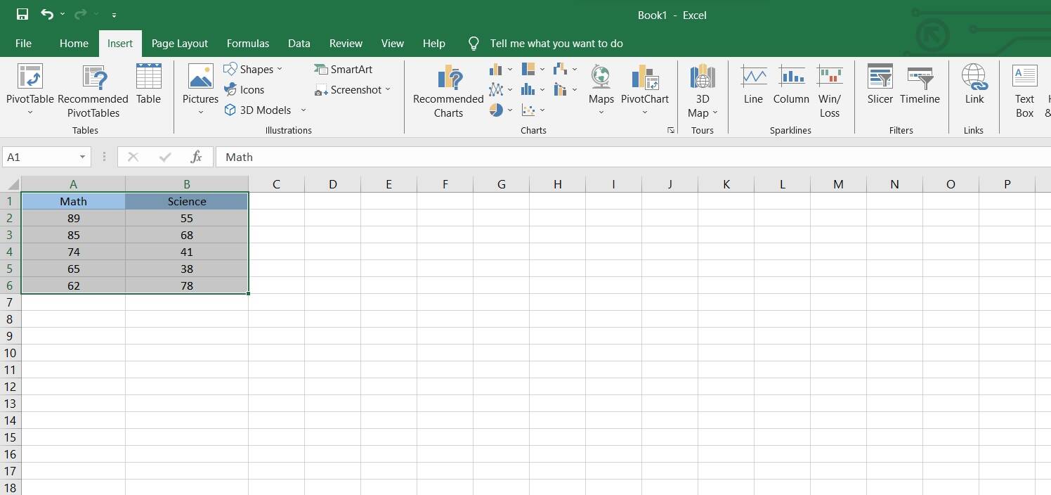
Step 2: Highlight the data range you want to include in your chart. This will be the categories and their corresponding values.
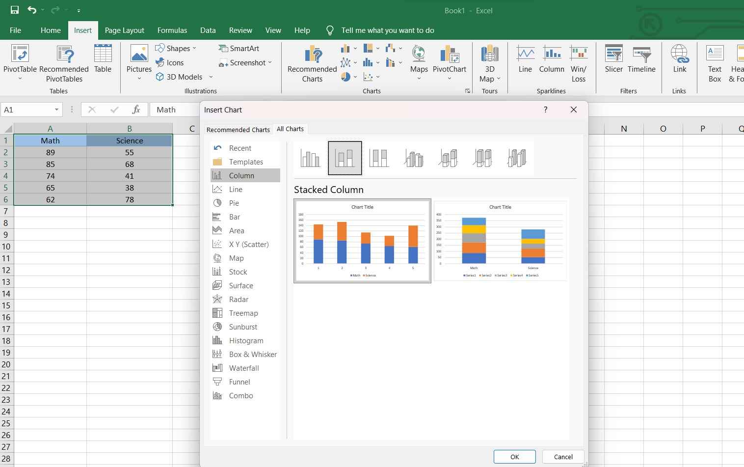
Step 3: Go to the "Insert" tab on the ribbon and select "Column Chart." Choose the "Stacked Column" option.
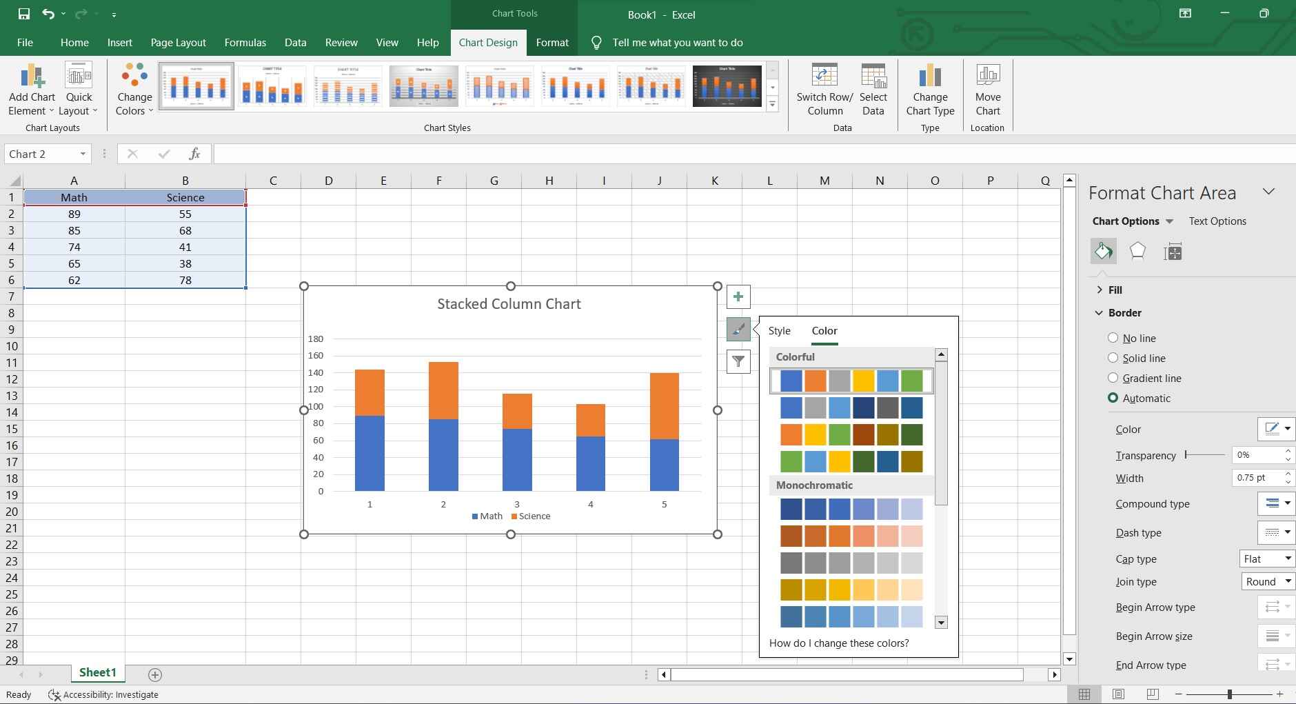
Step 4: You can customize the chart by right-clicking on various elements like axes, legend, or data series. This allows you to format the chart to your preference.

Step 5: Make any final adjustments like changing colors, fonts, or other formatting options to enhance the visual appeal.
Step 6: Save your Excel file to ensure your chart is stored along with your data.
No matter whether you are creating a stacked column chart, column diagram, or graph column, remember to always double-check your chart to ensure it accurately represents your data. With these steps, you'll be able to create a stacked column chart in Excel with ease!
Limitations of Excel:
While Excel is a versatile tool for creating charts, it's important to be aware of its limitations:
- Limited Customization Options: Excel has a finite set of customization features for charts. While it offers a good range of options, more complex or specialized chart requirements may be challenging to achieve within Excel's interface.
- Limited Interactivity: Excel charts lack the dynamic interactivity found in specialized data visualization tools or software. Users cannot implement advanced interactive elements like hover-over tooltips or clickable elements without extensive workarounds.
- Difficulty with Large Datasets: Excel may struggle with handling very large datasets efficiently. When working with extensive data, it can lead to slower performance, making it less suitable for projects that require handling massive amounts of information. Specialized data visualization tools often handle large datasets more effectively.
Creating a Stacked Column Chart Easily with EdrawMax
Agree or not, Wondershare EdrawMax surpasses Excel in the realm of data visualization and chart creation with its dedicated focus on professional-grade diagrams and visuals. Unlike Excel, which primarily serves as a spreadsheet program with charting capabilities, EdrawMax is purpose-built for creating intricate and visually appealing diagrams, flowcharts, and infographics. Its intuitive interface, extensive template library, and advanced design tools empower users to effortlessly craft stunning visuals that Excel simply cannot match.
Additionally, EdrawMax's robust export options and compatibility with various file formats ensure seamless integration into presentations, reports, and other professional documents, making it the superior choice for anyone prioritizing visual impact and precision in their data representations.
Here are the steps to create a stacked column chart in EdrawMax:
Step 1: Launch the EdrawMax software on your computer. Navigate to New> Graph and Charts> Column Chart.

Step 2: Alternatively, In the EdrawMax dashboard, go to the "Template Categories" and select "Charts" from the list. Search for"Stacked Column Chart". Select a template that suits your data and presentation style. EdrawMax offers a variety of pre-designed templates to choose from.

Step 3: Either input your data directly into the chart template or import it from an existing spreadsheet or file. EdrawMax provides an easy-to-use data editor for this purpose.
Step 4: Provide a title for your chart and label the axes appropriately to convey the information effectively.

Step 5: Make any necessary adjustments to ensure the chart accurately represents your data. This may include refining the spacing, gridlines, colors, or data labels.
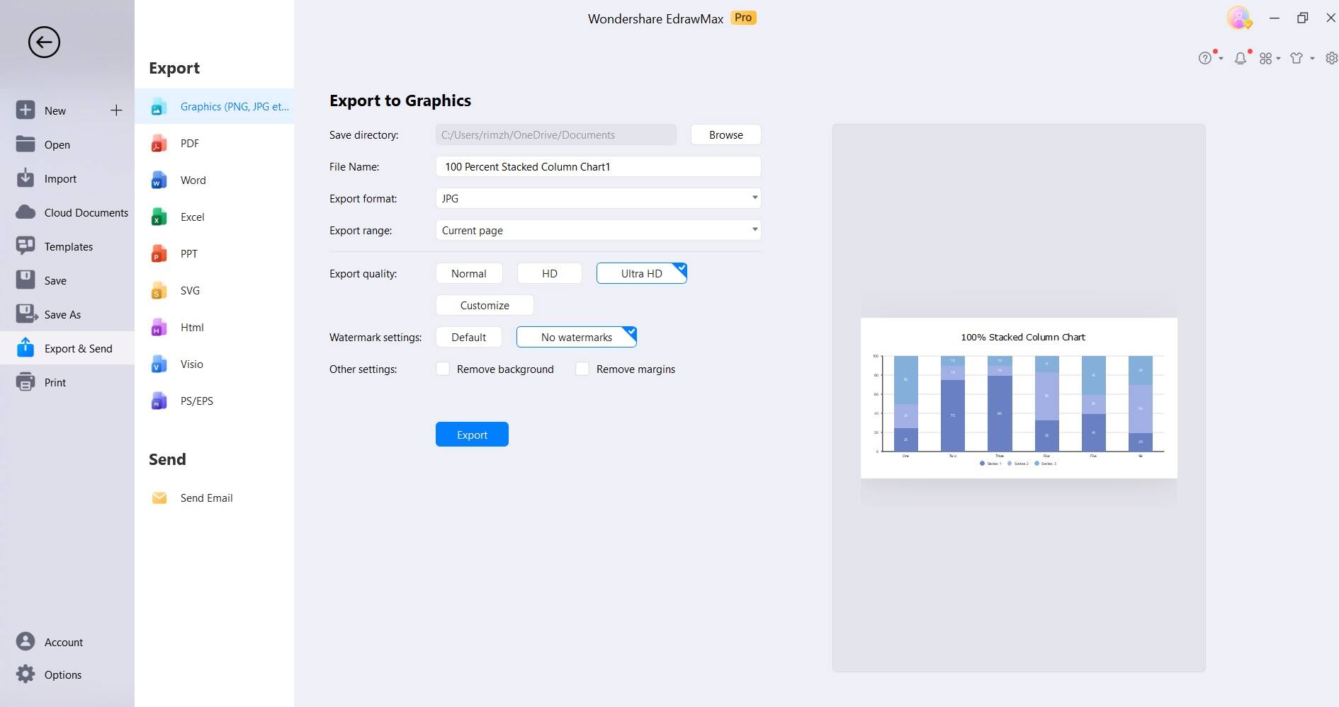
Step 6: Once you're satisfied with the chart, head to File> Export and Send to save your project in the desired file format. EdrawMax supports various formats, making it easy to integrate the chart into presentations, reports, or other documents.
By following these steps, you can easily create a polished and professional stacked column chart using EdrawMax.
Tips to Create a Stacked Column Chart
To enhance your stacked column chart, consider these tips:
- Use Descriptive Labels: Clearly label each section for easy interpretation.
- Color Coding: Apply distinct colors to segments for visual clarity and impact.
- Consistent Scale: Ensure uniform axis scaling for accurate comparisons.
- Limit Categories: Avoid overcrowding by limiting the number of categories.
- Utilize Data Labels: Display precise values to reinforce the data.
These strategies elevate the effectiveness of your stacked column chart.
Conclusion
In conclusion, learning the skill of creating stacked column charts is valuable in visualizing data effectively. Whether for business reports, presentations, or analysis, Excel or specialized tools like EdrawMax offer versatile options. Understanding the nuances of customization, data handling, and chart interpretation empowers users to convey insights with precision.
By following these instructions and using the tips, you can turn basic data into impressive visuals, making a bigger impact on your data projects.