
Empower your data presentation skills with this comprehensive guide on creating a Line and Stacked Column Chart in Power BI. This tutorial provides step-by-step instructions, ensuring you can craft compelling visualizations with ease. Dive into the world of dynamic data representation and learn to effectively communicate insights. Elevate your Power BI proficiency and transform your reports into visually stunning narratives
Contents of this article
Part 1. What is a Stacked Column Chart?
A Stacked Column Chart is a visual tool that helps display data in vertical columns. Each column is divided into segments, representing different categories. It's useful for comparing totals across categories and showing the makeup of each category. Knowing how to use this chart effectively is key in Power BI.
Part 2. Difference Between Line and Stacked Column Chart
While both Line and Stacked Column Charts are vital for data representation, they have distinct features. A Line Chart displays data trends over a continuous scale, making it ideal for showing changes over time. On the other hand, a Stacked Column Chart emphasizes the composition of different categories within a total, making it great for comparing multiple groups at once. Understanding their unique strengths allows for more effective data communication in Power BI.
Part 3. Create a Line and Stacked Column Chart Power BI
To create a Line and Stacked Column Chart in Power BI, follow these steps:
Step 1: Launch Power BI and open the report or dataset you want to work on.
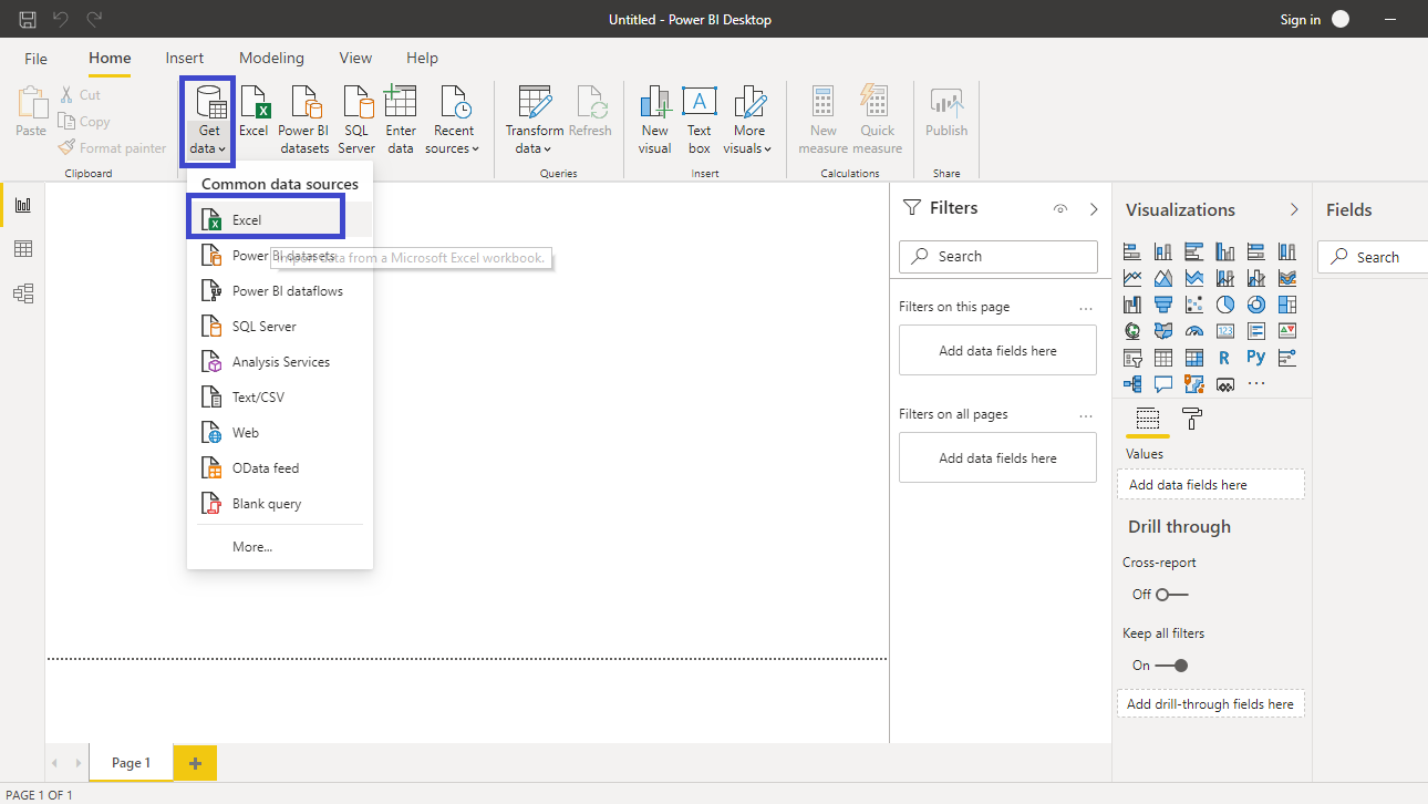
Step 2: In the report view, select the "Insert" tab from the toolbar. From the visualization options, select "Line and Stacked Column Chart."
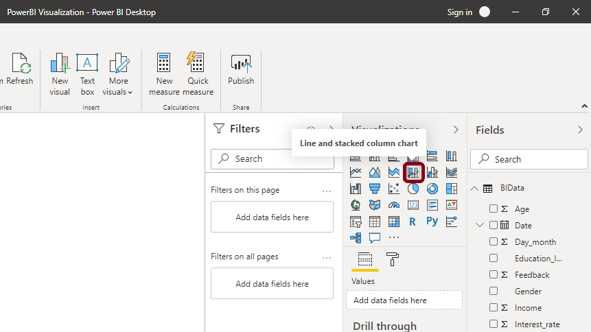
Step 3: In the Fields pane on the right, choose the data fields you want to use for the chart. Assign the data for the category, axis, and values appropriately.
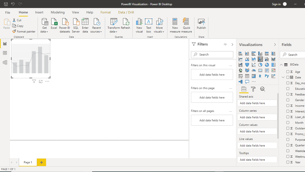
Step 4: Drag and drop the chosen fields into the respective areas (Axis, Legend, and Values) in the chart visualization.
Step 5: Use the formatting options in the visualization pane to adjust colors, labels, and other visual properties to suit your preferences.
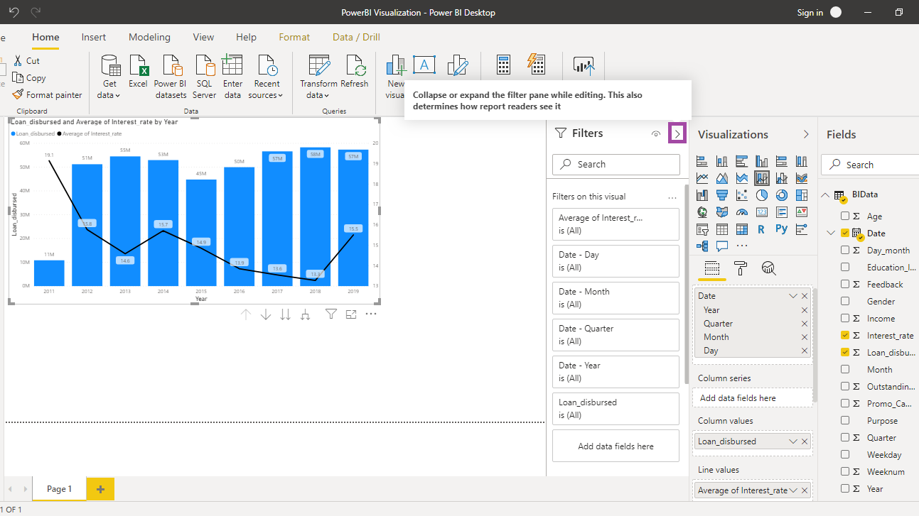
Step 6: Once you're satisfied with the chart, save your report and, if applicable, publish it to your Power BI workspace or share it with your team.
Limitations of Using Power BI:
One major limitation of using Power BI is its pricing structure. While Power BI offers a free version with limited features, the more advanced capabilities and features are part of premium plans, which can be costly for smaller businesses or individual users. This pricing model may pose a challenge for organizations with budget constraints or for individual users looking for more robust functionalities without a significant financial commitment.
Part 4. Create a Stacked Column Chart Easily With EdrawMax
Wondershare EdrawMax is an invaluable tool for creating Line and Stacked Column Charts, offering a user-friendly interface and a comprehensive set of features that streamline the process. Its intuitive drag-and-drop functionality and extensive template library make data visualization effortless. Additionally, EdrawMax's robust customization options and real-time collaboration capabilities ensure that charts can be tailored to specific needs and created collaboratively with team members. With EdrawMax, users can efficiently produce professional-grade Line and Stacked Column Charts, enhancing data communication and decision-making processes.
Here are the steps to create a stacked column chart using EdrawMax:
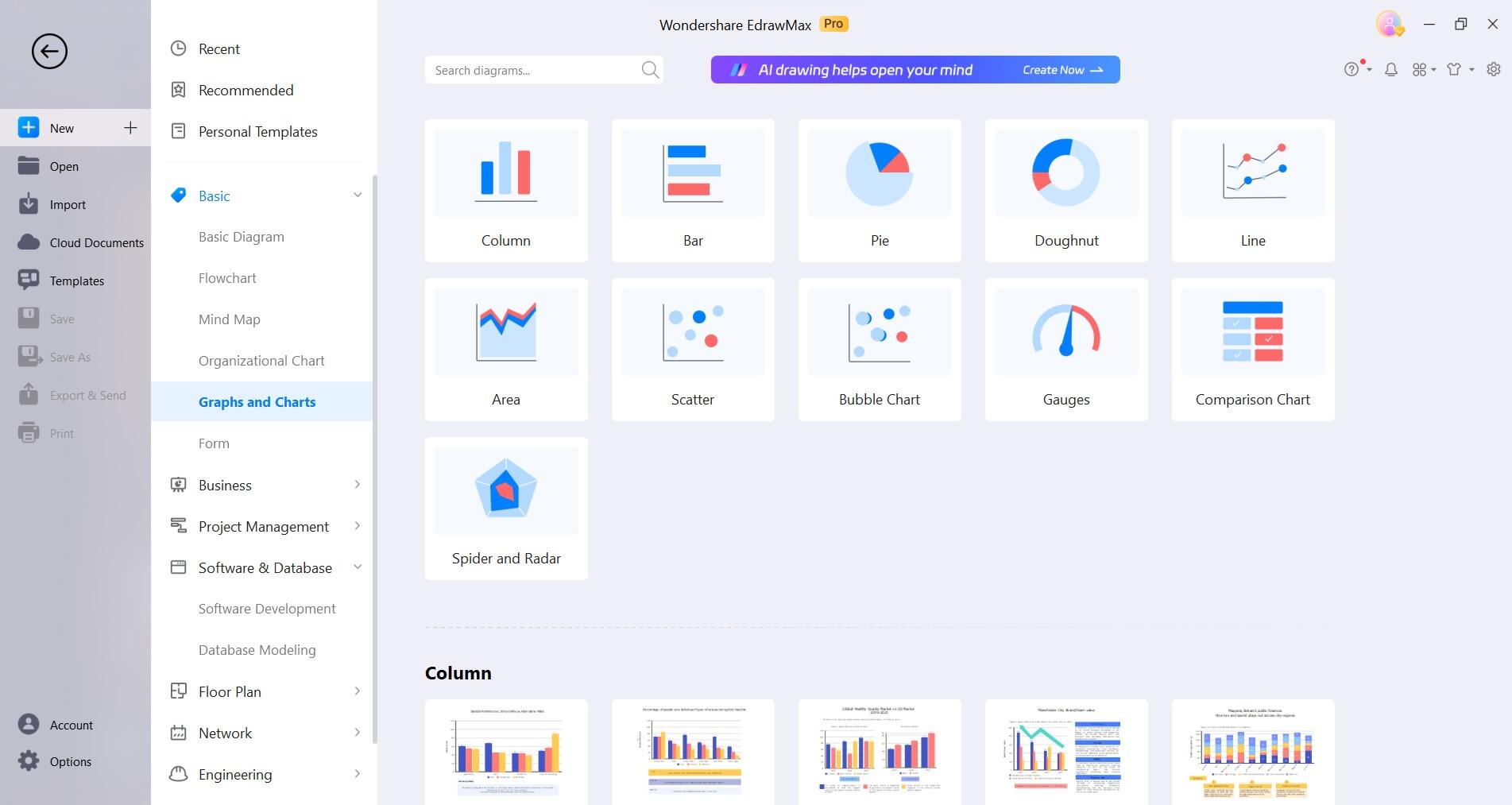
Step 1: Open the EdrawMax software on your computer. Navigate to Graph and Charts> Column Chart.
Step 2: Drag and drop a stacked column chart from the left menu pane to the EdrawMax canvas to get started.
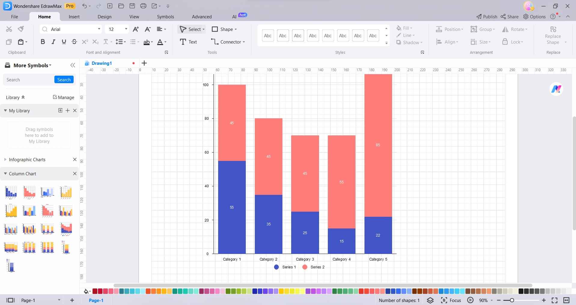
Step 3: Double-click on the chart to enter the data. Input your values and categories in the provided spreadsheet-like interface.
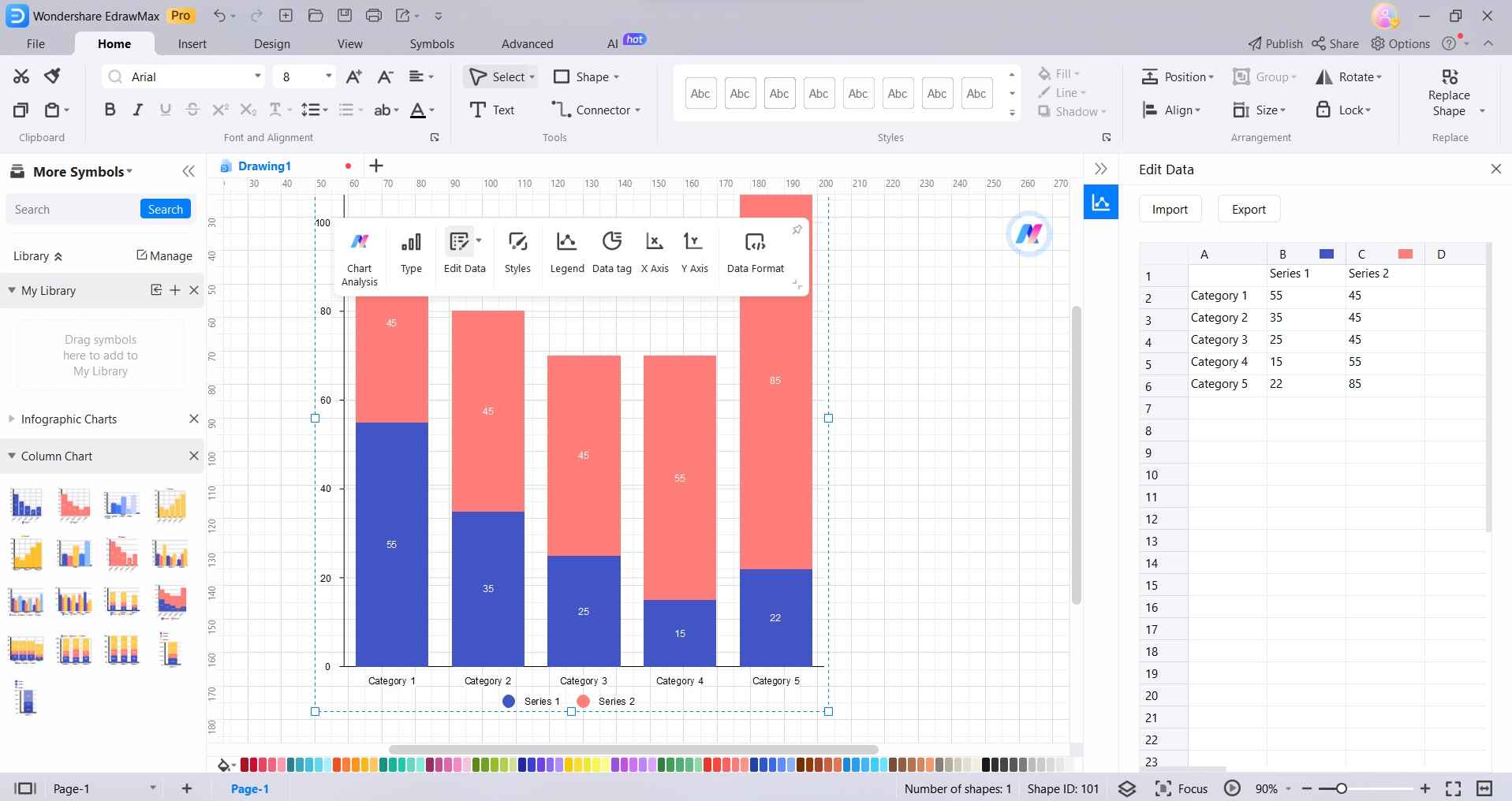
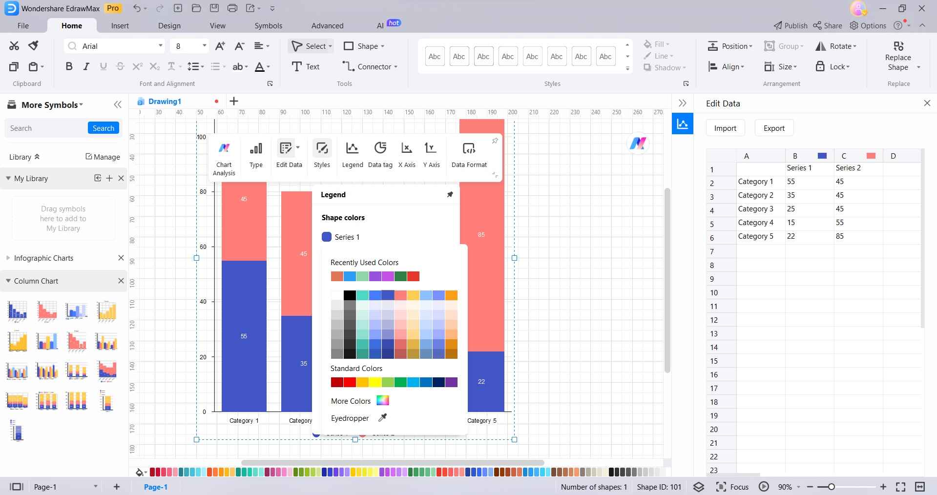
Step 4: Customize the appearance of the chart by changing colors, labels, and other visual elements to suit your preferences.
Step 5: Once satisfied with the chart, save your project and export it in your desired format (e.g., PNG, JPEG, PDF) for sharing or inclusion in presentations and reports.
Part 5. Best Online Tools to Create Stacked Column Charts
#1 Wondershare EdrawMax
Wondershare EdrawMax stands out as the top choice for creating Stacked Column Charts. Its intuitive interface and extensive library of templates simplify the chart-making process. EdrawMax's robust customization options allow for precise adjustments, and its collaborative features facilitate team projects. Moreover, its ability to export charts in various formats ensures compatibility with different platforms and presentations.
#2 Canva
Canva is a popular online graphic design tool that provides a user-friendly platform for creating a wide range of visuals, including charts and graphs. While not as specialized as some other tools, Canva offers an array of customizable templates, making it accessible for users looking to create visually appealing Stacked Column Charts without a steep learning curve. Its drag-and-drop interface and extensive library of elements make it a versatile choice for various design needs.
#3 Piktochart
Piktochart is a web-based design tool known for its ease of use and suitability for creating various visual elements, including charts. It offers a range of templates and customization options, making it accessible to users with different design preferences. Piktochart's intuitive interface and drag-and-drop functionality streamline the process of creating Stacked Column Charts, making it a valuable tool for individuals and businesses seeking to enhance their data presentation.
Conclusion
In conclusion, becoming proficient in creating stacked column charts in Google Sheets is vital for impactful data communication. While Google Sheets offers a foundation, EdrawMax stands out as a versatile alternative with advanced customization and offline capabilities. Its intuitive interface and rich features make it an excellent choice for chart creation.
By utilizing EdrawMax, individuals can enhance their data visualization, leading to more effective presentations and well-informed decisions.