How do our eyes decode the story numbers tell at a glance? This article unveils a variety of bar chart examples to illuminate their storytelling power. Here, you'll explore the essential components that make bar charts an effective tool in data presentation.
We'll also discuss the advantages of using bar chart samples, like their ability to highlight differences in data clearly and compellingly. Additionally, to help you avoid common pitfalls, this guide will point out frequent mistakes made when designing bar charts. Whether you’re a student, a professional, or simply curious, understanding these elements can significantly enhance your data visualization skills.
In this article
What is a Bar Chart?
A bar chart is a visual tool used to compare quantities across different categories. It highlights comparative metrics and trends at a glance. Utilizing examples of bar charts guide users in structuring their data. This helps to reveal underlying patterns and insights. This method simplifies complex information and aids in making informed decisions.
10 different types of bar chart examples
A multiple bar chart with pie charts
This multiple bar chart shows average agreement scores for three groups. Each color in a bar shows a level of agreement from 'Strongly Disagree' to 'Strongly Agree'.
This chart is great for comparing group responses easily. It is often used in market research and surveys to clearly show differences in opinions across demographics.
A grouped bar chart includes value annotations
This bar chart shows summer high temperatures for West Texas and Eastern Montana from 2018 to 2022.
Red and yellow bars represent each region. It clearly displays changes in temperatures each year. This chart is great for comparing weather patterns between areas.
A stacked bar chart includes value annotations
The chart uses blue, red, and yellow bars to show time spent on different triathlon activities across three categories. It's perfect for coaches and athletes to see how they perform. They can use it to plan better training and prepare for events.
(4 bars) Grouped/multiple bar chart
This chart has colorful bars to show sales of four products with five strategies. Blue, orange, yellow, and light orange bars stand for Products A to D. It helps quickly see which sales strategies work best for each product.
A simple vertical bar chart
The chart displays the sales of various vegetables by weight. Each color represents a different vegetable, such as radishes, sweet potatoes, and onions. This visual tool is perfect for quickly comparing product performance in markets or stores.
A stacked bar chart includes value annotations
This bar chart shows sales from 2008 to 2014 for five fiction books. Each book has its own color, like "Marine Sprite" in blue and "Striking Calf" in orange. It’s great for publishers to see which books sold best each year and spot sales trends.
A vertical bar chart includes value annotations
This bar chart shows how many people like different movie types. Each red bar shows votes for genres like comedy, action, and sci-fi. These are the most popular. This chart is good for marketers and film people to see what movies viewers prefer.
A stacked bar chart includes value annotations
This bar chart shows how many people used Facebook, Twitter, and Instagram each month for six months. It uses green for Facebook, orange for Twitter, and blue for Instagram. The chart makes it easy for marketers to see which platform had the most activity and growth.
A sub-divided bar graph
This bar chart compares real-time coverage for Group X across different conditions, marked by various colors indicating ORF lengths. Each bar grows taller with increased time, illustrating how coverage extends over periods from 0.1 to 50. It's ideal for visual analysis in scientific studies.
A horizontal multiple bar chart
This bar chart visualizes the preferences of Columbia Business School students at a speed dating event. It uses blue and pink bars to compare male and female values on attributes like attractiveness and intelligence. Insights include men prioritizing attractiveness more and women valuing shared interests highly.
What are the Key Components of a Bar Chart?
Several key components make a line chart, each contributing to its overall effectiveness and clarity. These components work together to help viewers understand and interpret the data being presented.
Let's explore these essential parts in more detail.
Title
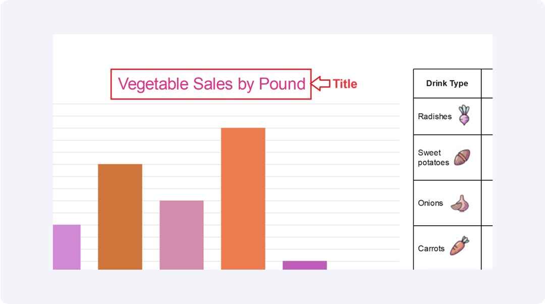
The title of a bar chart, like "Vegetable Sales by Pound," clearly identifies the chart's subject. It guides the viewer by stating what data is being represented, making it easier to understand the chart's purpose at a glance.
Bars
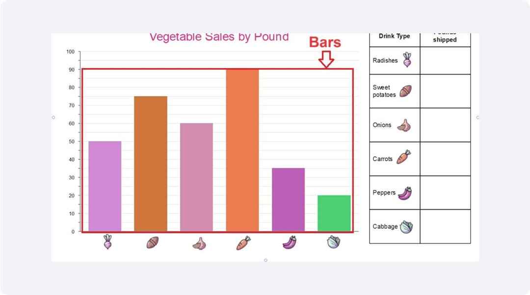
Bars are essential to a bar chart and serve as its primary visual tool. Each bar varies in height or length. This directly corresponds to the data values it represents. This design allows for quick and easy comparisons across different categories. Viewers can immediately gauge which categories are larger or smaller. It facilitates a straightforward understanding of complex data sets.
.
Categories
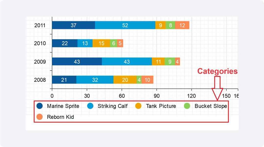
Categories in a bar chart organize data into groups. Each category is usually represented by different colors or labels at the base of the bars. This makes it easy to distinguish between different data sets and understand variations within the chart.
Y-Axis
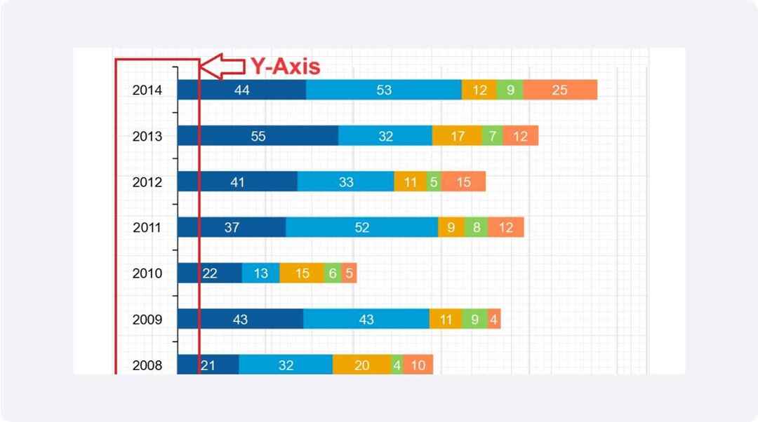
The Y-axis on a bar chart displays the range of values for the data being represented. It helps in measuring and comparing the magnitude of the bars, which can represent different quantitative values like sales, percentages, or any numerical data.
X-Axis
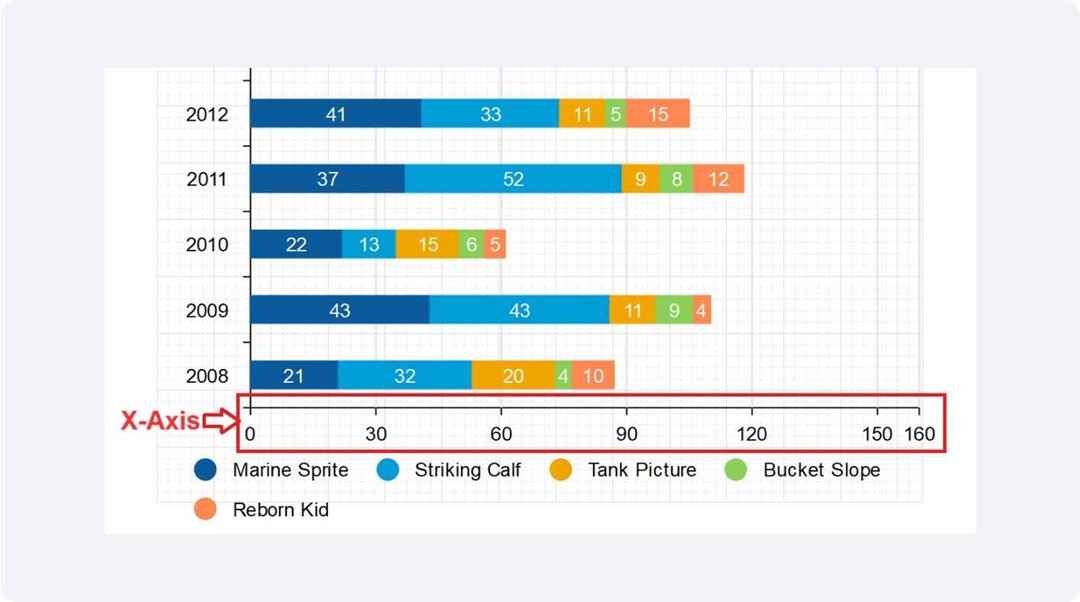
The X-axis of a bar chart labels the categories or periods being analyzed. It runs horizontally along the bottom. It helps to organize the data visually so viewers can easily track differences and trends across the bars.
What are the Advantages of Using a Bar Chart Over Other Types of Charts
Visual Simplicity
Bar charts are straightforward and effective. They display the differences between groups. This makes them excellent for presentations. Their simple design helps audiences grasp essential data without confusion. It facilitates faster and clearer communication.
Comparative Analysis
Bar charts excel at showing direct comparisons. They make it easy to spot which categories are bigger or smaller. This helps viewers make quick decisions and understand data faster.
Trend Identification
Bar charts are great for showing trends over time. They line up data in order along the X-axis. This setup shows whether things are going up or down clearly, helping audiences see patterns quickly.
Adaptability
Bar charts are highly adaptable to various data sets, from sales figures and survey responses to inventory counts. This versatility allows them to be used in diverse fields ranging from business and finance to healthcare and education. It ensures that they meet a broad range of analytical needs.
Tips for Interpreting Bar Charts Effectively
To make the most of bar charts, it's essential to approach them with a clear understanding of what to look for. Here are some effective strategies:
-
Examine the Axis Labels Carefully
Always start by reading the axis labels. These labels tell you what the bars represent and the units of measurement. This is crucial for understanding the context of the data.
-
Note the Scale
Check the scale on the Y-axis to understand the range of values presented. A scale that doesn't start at zero can exaggerate the visual impact of differences between bars, potentially misleading the viewer.
-
Look for Patterns
Identify any patterns in the data, such as trends over time or discrepancies among categories. This can provide insights into larger trends or issues that may not be immediately obvious.
-
Compare the Bars
Directly compare the height or length of bars to gauge relative sizes. This helps in making quick comparisons between different groups or changes over time.
Best Practices for Creating Bar Charts
Creating clear and accurate line charts is essential for proper data representation. Here are some best practices to follow when designing your line charts.
Label Axes Clearly
Make sure both the x-axis and y-axis are clearly labeled with the units of measurement and the periods they represent. This helps users understand the context of the data.
Choose the Right Data
Select data that is categorical or discrete for comparison. Bar charts excel at illustrating differences among a few categories.
Keep It Simple
Use a clean and uncluttered layout. Avoid adding too many categories, which can complicate the chart and make it hard to read. Stick to a limited color palette and consistent bar widths.
Label Clearly
Ensure all axis, bars, and categories are clearly labeled. Use straightforward language that your audience will understand. Titles and labels should be concise but descriptive.
Start the Y-Axis at Zero
To maintain the integrity of the data representation, start the Y-axis at zero. This prevents distortion of the data and keeps the visual comparison accurate.
Use Color Effectively
Use color to enhance understanding, not distract. Different colors can represent different categories or highlight specific data points, but the choice of color should be logical and add to the clarity of the chart.
Common Mistakes to Avoid When Creating Bar Charts?
To ensure your bar charts are both effective and accurate, it’s crucial to avoid these common pitfalls:
Overcrowding the Chart
Adding too many bars makes the chart difficult to read. Limit the number of categories so that each bar stands out clearly.
Misusing Colors
While colors can help differentiate between categories, using too many colors or overly bright colors can distract and confuse the viewer. Stick to a consistent and subtle color palette.
Incorrect Bar Widths
Using bars that are too wide or too narrow can distort the viewer's perception of the data. Ensure that all bars are uniformly spaced and sized appropriately to provide a clear and accurate visual comparison across categories.
Starting the Y-Axis Above Zero
Starting the Y-axis above zero can mislead viewers by exaggerating differences between bars. Always start the Y-axis at zero to represent the data accurately.
Choosing the Wrong Bar Orientation
Use horizontal bars when dealing with longer category names or a large number of categories, and vertical bars for simpler or fewer categories. Choosing the right orientation enhances readability.
AI Diagram Generator
Enter your prompt. Upload files if needed. Generate diagrams, charts, or slides instantly.


