


Graphs and charts for diagramming play a pivotal role in visualizing data. They enable swift comprehension of trends, patterns, and relationships within datasets. They cater to varying data scenarios and make data interpretation accessible to both experts and non-experts.
Their visual appeal and capacity to convey information make them indispensable tools. Different graphs and charts work best for presenting, analyzing, and communicating data-driven insights. This page explores the different types of graphs and charts you can use for diagramming. Explore the article below to learn more.
In this article
Part I. Overview of Popular Graphs and Charts
Data visualization is an indispensable tool for conveying information. Four popular types of graphs and charts are often used to illustrate data. These are bar graphs, line graphs, pie Charts, and scatter plots.
Bar Graph
A bar graph presents data using rectangular bars. The length of each bar corresponds to the value it represents. It's ideal for comparing discrete categories and their quantities. The x-axis lists categories, while the y-axis displays the values. Bar graphs are often used to show comparisons and trends over time. It can show the distribution of data within categories.
Line Graph
A line graph depicts data points connected by lines. It showcases trends or changes over continuous intervals. It's useful for illustrating trends, patterns, or correlations in data. Line graphs are well-suited for displaying changes in data over time. They are great at making predictions based on the patterns observed.
Pie Chart
A pie chart represents data as sectors of a circle. Each sector's angle is proportional to the corresponding data value. Pie charts display the composition of a whole. It's suitable for showing the distribution of parts within a whole or percentages of different categories.
Scatter Plot
A scatter plot displays individual data points as dots on a two-dimensional plane. It's employed to examine the relationship between two variables and identify correlations. Scatter plots are valuable for identifying clusters, outliers, and trends within the data points.
Part II. Four Brilliant Examples of Graphs and Charts
To further understand the four types of graphs, let’s explore some examples from the Wondershare EdrawMax Templates Community.
Cumulative Percentage of Respondents Bar Graph
This bar graph illustrates the cumulative percentage of respondents associated with prominent tech companies. Notable companies samples are Actuate, SAP, IBM, Microsoft, Tableau, and others. The graph's labels on the right detail actions like utilizing parameterized reports, conducting predictive analysis, and monitoring scorecards. This versatile graph can be employed for market research. It highlights industry preferences or gauges technology adoption trends across sectors.

 below.
  below.
The Change of Sales Line Graph
This line graph portrays the sales fluctuations of three products over eight months. Product 1 exhibits erratic growth. Meanwhile, Product 2 experienced a notable increase, particularly in March. Product 3 shows a persistent decline. Valuable for sales analysis, this graph helps identify which products need adjustments. It aids in assessing seasonal demand. This type of graph also guides strategic decisions to optimize sales performance.

Spring Field School Pie Graph
This pie chart displays student preferences for subjects at Springfield School. Each label is categorized as English, Economics, History, and Psychology. Each slice represents the proportion of students opting for a particular subject. This visual aid assists school administrators in understanding curriculum popularity. It informs resource allocation and identifies potential areas for improvement within the academic offerings.

C02 Emissions Scatter Graph
This scatter graph depicts the annual correlation between the world's total population and global CO2 emissions from 1960 to 2014. It also relates to the height and weight differences between males and females. This comprehensive visualization can be utilized to examine the relationships between population growth, CO2 emissions, and physical attributes. It sheds light on potential connections between environmental factors and human characteristics.

Part III: Wondershare EdrawMax — Your Partner in Crafting Professional Graphs and Charts
Now that we have explored some templates from EdrawMax. You might be interested in more templates. Or you might want to make one on your own. If so, give EdrawMax a shot. This popular app is your go-to platform for creating professional visualizations.
Key Features
Here are some key reasons why you should try EdrawMax:
- Comprehensive Diagram Software. EdrawMax has all the tools you need for professional graphs and charts. It caters to diverse visualization needs without needing advanced knowledge.
- Abundant Template Collection. Access a wide array of templates with EdrawMax's Templates Community. It facilitates the quick creation of various data-driven visualizations in one click.
- Beginner-friendly UI. EdrawMax is the diagram maker for you whether you are a pro or a newbie. Its powerful functions and intuitive UI makes creating complicated diagrams a walk in the park.
- Various Export Options. You can choose to export your diagrams in a variety of formats like PDF, JPG, and MS Office formats so you can share them with others effortlessly.
- Online and Offline Accessibility. EdrawMax provides the flexibility to work whether you're online or offline. Use the dedicated app or the online tool, depending on your connectivity needs.
- Free Version Availability. EdrawMax offers a free version for both online and offline usage. This enables you to explore and create graphs and charts without any cost.
Part IV. How To Create Impactful Graphs and Charts With EdrawMax
Creating a chart or graph with EdrawMax is simple. Here is how.
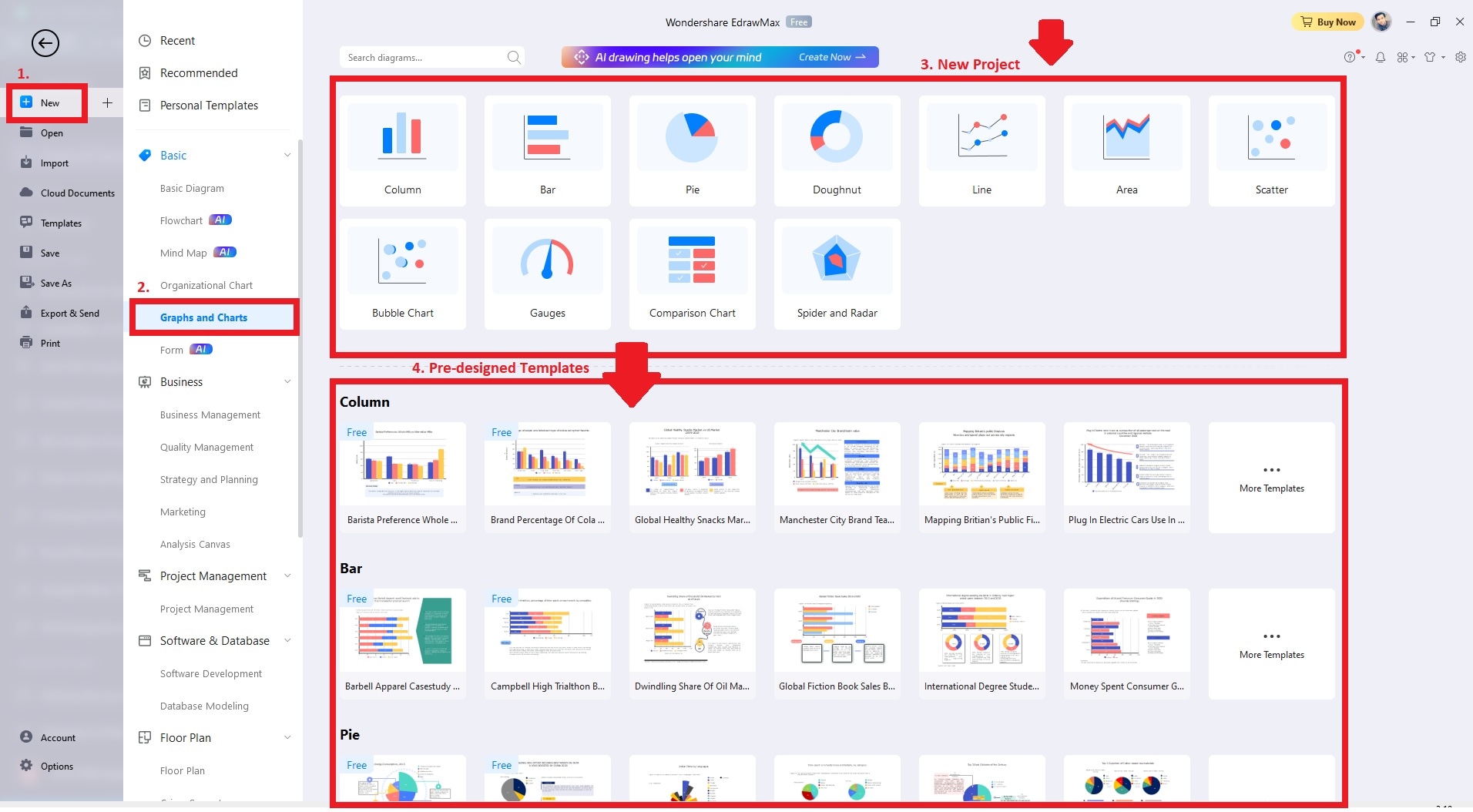
Step1
Download, install, and launch EdrawMax. Log in with your Wondershare ID or an account of Google, Facebook, or Twitter. Click the New button and go to Graphs and Charts. Choose your preferred diagram or a pre-designed graph or chart template to start.
Step2
Once your template is ready, customize it to your needs. Replace template data with your dataset. Edit axis labels, titles, and data point explanations. Adjust the style by selecting colors, fonts, and styles that enhance clarity.

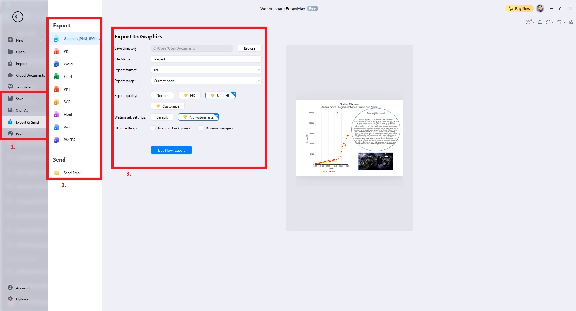
Step3
Preview your customized graph to ensure it conveys your message. Once done, Save or Export your visualization as an image, PDF, or other compatible formats. Share your creation with colleagues, clients, or stakeholders.
Part V. Best Practices for Effective Data Visualization
Mastering effective data visualization is essential for conveying insights. By adhering to the best practices outlined below, you can unlock the potential of your narratives.

Choosing the Right Graph for the Data
It's essential to select the appropriate graph or chart type based on the nature of your data. Choose the right graph for the message you aim to convey. Consider factors such as data relationships and variables. Ensure the chosen visualization format highlights your key points.
Design Principles for Clarity
In terms of design, simplicity is key. A clutter-free visualization with appropriate colors enhances clarity. Maintain consistent styles for fonts, sizes, and elements throughout the visualization.
Proper Labeling, Scaling, and Representation
Proper labeling is also important. Use clear titles, axis labels, and data point explanations to provide crucial context. Choose appropriate scales to prevent misinterpretation and ensure accuracy. Avoid truncating axes or using 3D effects that can distort proportions.
Avoiding Chart Junk and Misleading Visuals
It's also crucial to avoid unnecessary decorations that can confuse or distract viewers. Avoid misleading visuals, such as skewed scales or manipulated proportions. They compromise the integrity of your message and insights.
Conclusion
Choosing the right graph empowers your data to tell compelling stories. Taking advantage of EdrawMax's Templates Library can also save time when creating different graphs and charts.
If you don't have a dedicated tool for managing types of graphs and charts, consider EdrawMax. Its drag-and-drop interface and customization tools can elevate your creative efforts. Whether you are a seasoned analyst or a newcomer to data, the platform empowers you to craft narratives that resonate.
[没有发现file]AI Diagram Generator
Enter your prompt. Upload files if needed. Generate diagrams, charts, or slides instantly.


