


In this article
1. What is a Timing Diagram?
In Unified Modeling Language (UML), timing diagrams are a form of sequence diagram that uses graphs and waveforms to depict the behaviour and interactions of objects and timed events over a given period of time.
1.1 The Usage of Timing Diagrams
- You can tell what changes an object undergoes during its life cycle;
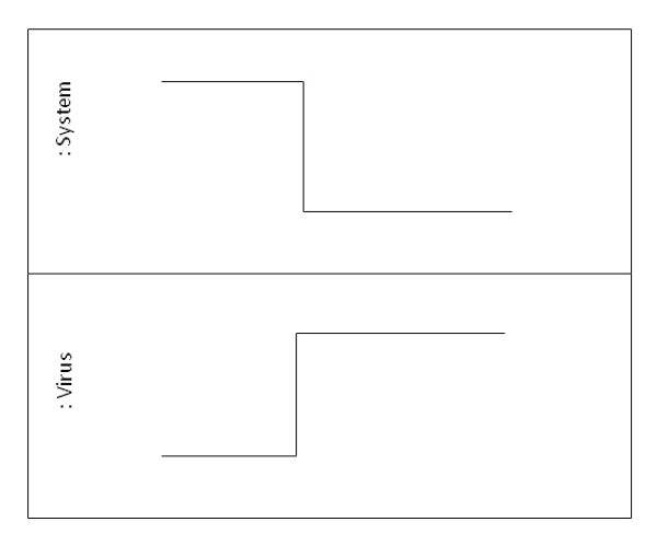
- You can tell how objects interact, and how the state of one object affects the other (see example below);
- Timing diagrams show how long certain processes take. From this data, users can identify which steps in a process take too much time and what needs to be streamlined to enable the system or software to operate more efficiently as a whole.
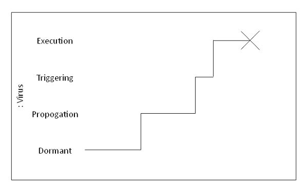
1.2 Timing Representation
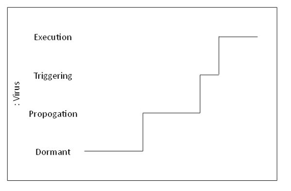
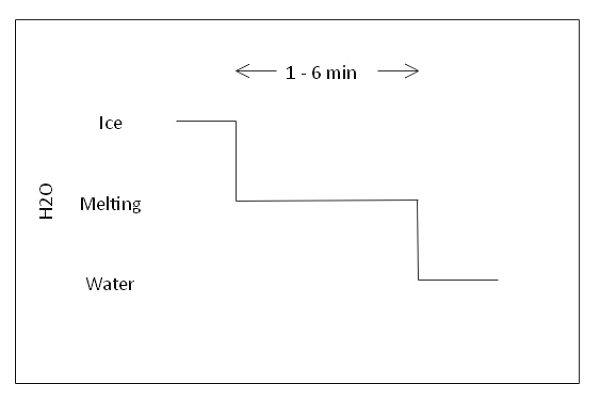
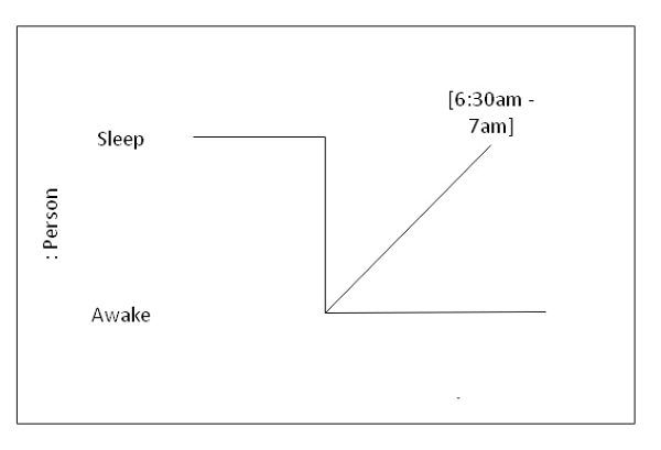
State timeline representation
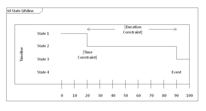
It is used to show changes in state over time, represented by changes in the lifeline's levels. Changes in levels can be caused by a variety of factors, including receiving messages, conditions within a system, or a passage of time.
- X-axis: time
- Y-axis: state
Value lifeline representation
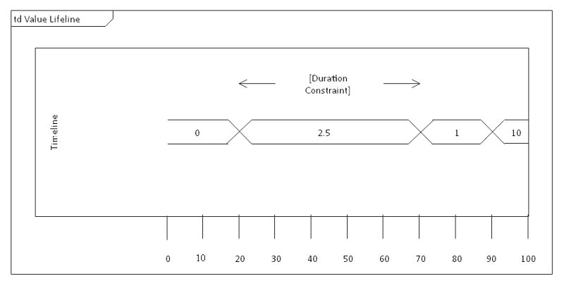
It is used to show the change in value of subject matter over a period of time. This is represented by the crossing over of the two horizontal lines.
X-axis: time
1.3 Basic Concepts
Lifeline
Represents an individual part of an interaction.
State or condition timeline
A continuous timeline that represents the state of participating classifiers or testable conditions.
Duration constraint
Represents a duration interval, or the period of time a state or value must be in effect for. A failed system is one where a state or value falls outside the scope of the constraint.
Time constraint
Indicates when an event should occur. If an event fails to appear at the said time, the system is considered to have failed.
Destruction occurrence
An “X” symbol marks the end of a lifeline.
Source:Javatpoint
1.4 Commonly Used Timing Diagram Graphics
Square Wave
A square wave jumps back and forth between two set levels. No slow ramps, just sharp, clear edges. That’s why, on a timing diagram, it’s super easy to spot when something’s on or off. The graph lays out exactly how long a state lasts before it flips. So, you get a good sense of the timing rules running the show.
You can also see how different signals line up or overlap as things happen in sequence. Digital timing diagram systems rely on square waves all the time, marking off control steps. It’s a straightforward way to flag every change. By looking at each rise and drop, you can spot delays, gaps, and how fast things respond.
Arrows indicating positive/negative edge trigger
Arrows for positive and negative edge triggers point out the exact moments when a change really matters. When you see a positive edge trigger, it means the signal just jumped from low to high. A negative edge trigger means it dropped from high to low. These arrows show you exactly when something should kick off. They also make it clear how one event relies on another signal change.
In a UML timing diagram, these cues make the timing rules a lot easier to follow. You can spot the gaps, response times, and the sequence of actions right away. Lots of systems use these triggers to update, sync, or handle quick tasks. The arrows flag the key turning points, so you can track everything without getting lost.
Ramping Signal
A ramping signal timing chart looks like a line that climbs or drops at a steady pace, then levels out. First, you get this smooth rise, then things flatten for a bit, and after that, the signal eases down slowly. This kind of pattern is great for showing changes that don’t happen all at once. It really lets you see how a system moves from one state to another. You’ll spot ramping signals in plenty of timing diagrams, usually marking things like warm-up periods or delays.
They’re handy for comparing with other signals too, so you can judge exactly how long a change takes. Plus, they make it easy to spot the moment when everything finally settles. If you want to show a process that’s smooth and controlled, not just a sudden leap, ramping signals do the trick.
Either-Or
The either-or signal marks a stretch where the system hasn’t settled on one state. You’ll spot it as a bunch of slanted blocks. Basically, it's a visual hint that things are up in the air. The signal doesn’t stick to one level here. Depending on the rules, it can swing either way. This pattern is useful when you’re mapping out timing diagrams and need to show where a process can go down two different paths.
It really comes in handy for those moments when an input or clock event decides what happens next. You can also use it to point out timing windows. The shape spells it out: both outcomes are possible until the system makes its choice.
Greyed Out
When you see a greyed-out signal, it means the exact state doesn’t matter at that moment. The shaded area just shows the system’s active, but the details aren’t important right then. It’s good for marking long waits, unused states, or stretches where any value will do. This shading signals that nothing critical is happening during that time.
It shows no decisions, nothing you need to track closely. It keeps the diagram simple and uncluttered. You can still match up this period with the clock or other signals, but your eyes go straight to the spots that actually matter.
“Time Passes” spacing
When you see spacing in a timing diagram, it means there’s a gap, and some part of the timeline gets skipped. Those little curved marks? They’re like a shorthand, letting you know the signal keeps going, but the stuff in the middle just isn’t important right now. This works well when the whole timing range is huge.
You can jump past the boring, idle stretches without losing track of what’s going on. It keeps the diagram tidy, too. You only see the moments that actually matter. Spacing marks make it easier to zero in on key edges, decisions, or state changes.
Bit Labeling
Bit labeling tags each data bit along the signal, so you can actually see how information moves. Every little block gets a label, like B0 or B1, so you know which bit goes out at that exact moment. When you’re trying to figure out what’s happening with each clock edge, it makes the whole diagram way clearer. You also get a good look at how the clock signal connects with the output.
If you’re dealing with a long frame, you don’t have to draw the whole thing. Those bit labels walk you through the sequence and show you exactly how many bits are being sent. This setup helps explain timing in digital links, since you see both the timing and the data all at once.
Arrows and Space Demarcation
Arrows and Space Demarcation make it easy to spot the crucial parts of a timing sequence. The arrows show exactly where the address bits stop and the data bits start, so you can see right away when the signal changes its job. The space between the arrows isn’t just empty; it calls out a chunk of time packed with key info.
You can use these boundaries to mark setup times, handover points, or split up different message sections. It keeps the diagram clean, since you don’t have to clutter it with extra lines. Think of the arrows as little guides, walking you through how the signal moves from one stage to the next.
2. Examples of Timing Diagrams
2.1 Boat manufacturing timing diagram example
In a simplified scenario of a boat manufacturing plant, the timing diagram—also known as a timing graph—reveals that the upholstery stage consumes an excessive amount of time during production. To improve efficiency, managers might assign additional workers to that station or implement process optimizations. By analyzing patterns in a digital timing diagram, administrators can visualize delays, enhance workflow efficiency, and ultimately reduce both production time and operating costs.

2.2 Alzheimer's Disease Timing Diagram
This timing diagram shows how a person moves through Alzheimer’s. You can see changes in memory, awareness, and what they can do day to day. The timeline makes it clear how the disease shifts from early, mild symptoms to a more serious decline. You’ll also get a sense of how long each stage usually lasts for most people.

2.3 Smartphone Battery Lifecycle Timing Diagram
This timing diagram tracks a smartphone as its battery moves through different stages during a normal day. You’ll see each state laid out, from fully charged to regular use, then power saving mode, and back to charging. It’s an easy way to watch how your device responds as the battery drains and gets topped up again.

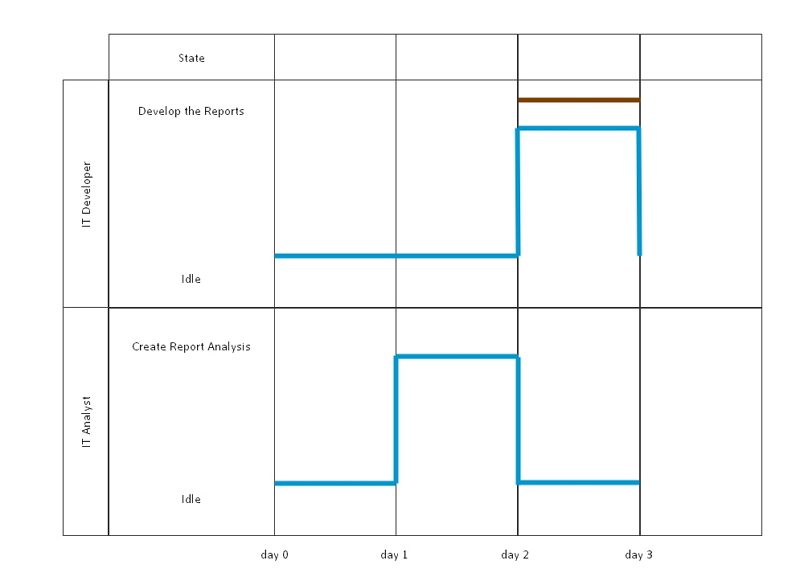
2.4 IT People Timing Diagram
This diagram tracks how an analyst and a developer switch between working and waiting during a project. The analyst dives into the report analysis first, getting things started before the developer builds the final output. You can spot where their tasks line up and where each one leans on the other to keep the project moving.

3. How to Create Timing Diagrams with EdrawMax?
Step1 Sign In to EdrawMax
- Open EdrawMax and sign in to your Wondershare account.
- You can log in using Google, Apple, Facebook, or email.
- Finish the sign-in so you unlock every editing feature.

Step2 Open a UML Modeling File
- On the left panel, hit the New button.
- When the menu pops up, choose UML Modeling.
- That sets up a fresh workspace, ready for you to start building your timing diagram with all the right tools.

Step3 Pick a Timing Diagram Template
- Next, look for the Templates section on the left.
- Type “timing diagram” into the search bar.
- Scroll through the options, pick a template you like, and click Use Immediately to open it in the editor.

Step4 Customize the Diagram with the Toolbar
- Click on any line or shape to pull up the floating bar.
- Tweak arrows, update text, or switch up the line style.
- Change labels, adjust timings, or move things around.

Step5 Export Your Timing Diagram
- When you’re ready to save, hit the Export button up in the top right.
- Pick the format you want: image, PDF, Word, or PowerPoint.
- Then save it to your computer so you can use it in your project or send it to someone else.

FAQ:
-
Why is a timing diagram important?
A Timing diagram defines the behavior of different objects within a time scale. It provides a visual representation of objects changing state and interacting over time. You can use it to: Define hardware-driven or embedded software components; for example, those used in a fuel injection system or a microwave controller. -
What is timing closure?
Timing closure is the process that determines a chip's speed by satisfying its timing constraints (opens in a new tab). It ensures that all the signals arrive at the correct time for smoother chip operation. -
What is a time sequence diagram?
A time sequence diagram is a UML diagram that illustrates how objects or parts of a system interact over time. It shows the order of messages exchanged between participants, with time progressing vertically down the diagram and participating objects or components arranged horizontally. These diagrams are helpful for modeling system behavior in software development and for visualizing workflows like online checkouts or customer support processes.
AI Diagram Generator
Enter your prompt. Upload files if needed. Generate diagrams, charts, or slides instantly.


