




To make a genogram, begin with the index person, decide how many generations you need, gather the family information relevant to your purpose, and then build the family structure before adding relationship, health, or emotional-pattern details. A three-generation layout is a common starting point because it makes recurring family patterns easier to see without overcrowding the page.
Use one notation system consistently. Common genogram conventions use standardized person shapes, family-structure lines, and relationship markers, but specialized clinical or academic settings may use additional symbols or local conventions. Add a legend whenever a symbol, color, or line style could be ambiguous.
In this article
Quick answer: Build a genogram from structure to detail: index person → family members by generation → couple and parent-child connections → relevant relationship or health information → labels and legend → final review.
What Should You Prepare Before Making a Genogram?
Decide the purpose before collecting every available family detail. A family-history genogram, therapy genogram, and medical genogram may share the same structure but emphasize different information. Limiting the scope makes the diagram easier to read and reduces unnecessary sensitive data.
Choose the Index Person and Family Scope
Be it social or medical, every genogram begins with one individual, called the index person. The index person is the main subject of the diagram. It can be a counseling client, medical patient, or a research study subject. After the index person, figure out whether you want a nuclear family or prefer to build outward to two or three generations.
Collect Three Generations of Family Information
A conventional genogram maps to three generations of your extended family. This is where the generational (medical and social) patterns become visible. Hence, it’s better to have the following family information before you jump into assembling the symbols.
Maternal and paternal grandparents, their relationships with the index person, clinical details, names, and characteristics (depending on the type of genogram).
Maternal and paternal aunts, uncles, and their children. You must include their relationships in reference to the index person, relevant clinical details, and traits.
Handle Sensitive Medical and Relationship Details Carefully
Genograms have different purposes. Medical charts help you spot physical health issues, psychological conditions, and substance use patterns. Whereas social genograms are a way to understand major events that shaped family dynamics. This could be major relocations, military service, career changes, trauma, and so on.
For this reason, some genograms have sensitive medical and relationship family history. And you must handle it carefully, following some protocols.
You must clearly state who will see the diagram and use it for explicitly stated purposes.
If the case is undiagnosed or only suspected, label it accordingly rather than treating it as a fact.
Focus on members that are most relevant to the current issues, influence the index person, and show similar medical conditions.
Do not draw attention to specific relations in an attempt to sensationalize them.
How to Make a Genogram Step by Step?
Build the structural family map first, then add meaning. Start with the index person and generation rows, connect family relationships, label people, and only after the structure is stable add emotional, medical, or other contextual information.
Add Family Members by Generation
The first step is about positioning your family members by generation.
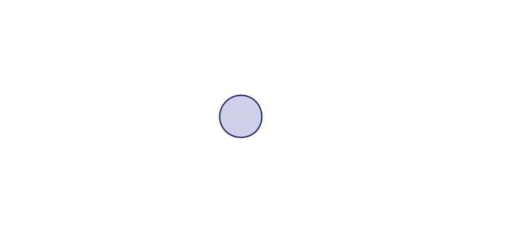
Index Person Positioning
Begin by positioning the index person in the center of your canvas. Use the right gender symbol. If it is a male, use a square and a circle for a female.
The index person is the reference point of the genogram. Highlight that role using the notation convention required for your setting, and label the person clearly with the identifying details relevant to the purpose of the diagram.
Nuclear Family Positioning
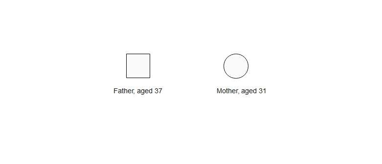
It’s time to expand to the nuclear family, which includes parents, siblings, spouses, and children. Start by locating the parents above the index person. Place a circle (for the mother) on the right and a square (for the father) on the left, following the conventional positioning. Include their information, as you did for the index person.
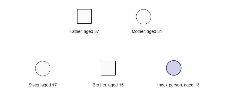
When arranging siblings, place them from oldest (left) to youngest (right) using conventional symbols. Siblings always share the same line as the index person. Add their ages and names accordingly.
Now come the spouses and children. The spouses share the same horizontal space as the siblings and the index person. And the children come just below the couple. Once positioned, add their information as well.
Extended Family Positioning
Once you have established the nuclear family, it’s time to expand the genogram to two or three generations. Here is how to do it.
Grandparent Generation
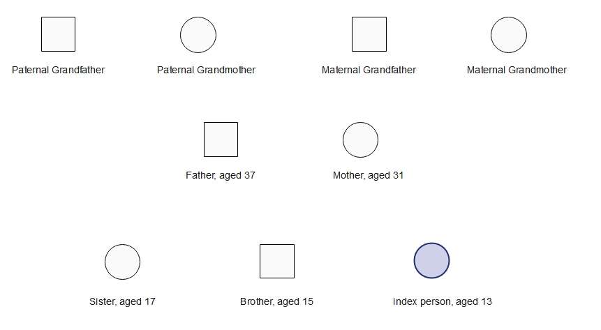
Position the grandparents above the parents' generation. The maternal grandparents go above the mother, while the paternal grandparents go above the father. Once positioned, enter their names and ages.
Aunts, Uncles, and Cousins
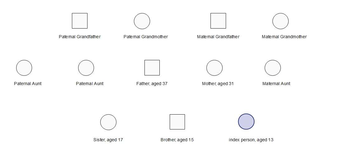
After grandparents, come their kids: the index person’s uncles and aunts. They share horizontal space with the index person’s parents. Plot them from oldest to youngest, left to right. Accordingly, include their details.
Use Standard Symbols and Relationship Lines
Genograms are built on standard symbols. These symbols show genders, life events, emotional bonds, relationships, and more within the family. So, anyone making this diagram must be familiar with these conventional symbols. Some commonly used symbols are
Genders
Males = square
Females = circle
Gay person = inverted triangle inside a square
Lesbian person = inverted triangle inside a circle
Unknown = diamond
Life Status
Alive = no overlay
Deceased = X inside a big square
Pregnancy = triangle
Miscarriage = X passing through a triangle
Stillbirth = small square with X
Childless = circle with a diagonal slash
Family Relationships
Use relationship lines consistently to show couple, parent-child, and other family connections. Because line conventions can vary between references and specialties, include a legend whenever the meaning is not obvious.
Marriage = thin solid line
Life partner = thicker solid line
Cohabitation = thick dashed line
Engagement = dotted line
Dating = thin dashed line
Divorce = a line with double slash crossing it
Separation = a line with a single slash crossing it
Living apart = a dashed line with a single slash crossing it
Widowed = line with an X mark on it
Children Connectors
Vertical lines within the genogram depict parents’ relation with their child. Here are a few common parent-child connectors.
Biological = solid vertical line
Adopted = long vertical dashes
Foster = short vertical dashes
Stepchild = recurring dash-dot vertical pattern
Surrogate = medium-sized vertical dashes
Emotional Dynamics
A few characteristics between family members, such as wavy and colored lines, show the emotional quality of the relationship. This shows positive bonds, conflicts, distance, abuse, and so on. Some of them are
Harmony = green horizontal line
Friendship = two horizontal parallel green lines
Close = two horizontal parallel blue lines
Conflict = three parallel red lines with a zig-zag line crossing them
Violence = three parallel red lines with two zig-zag lines crossing them
Hostile = an ECG-like pattern in red color with a gray dashed line passing through it.
Distant = red-colored dashed line
Indifferent = grey-colored dashed line
Estranged = a red line with two vertical lines passing through it
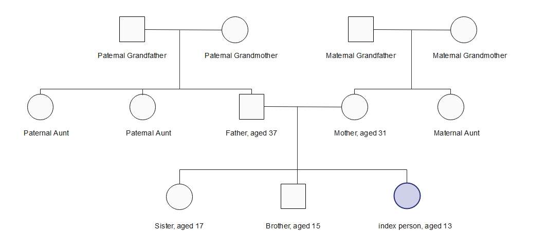
Now that you have a clear idea of how genogram symbols and relationship connectors look, proceed and implement them on your diagram. Here is how it should look after this step.
Add Notes for Health, Mental Health, or Emotional Patterns
We’re almost there; hang on a little. At this stage, you have the most crucial job: adding notes for medical conditions, emotional situations, and social circumstances. These notes help the reader better understand potential medical risks and family patterns. You can choose to follow different practices to represent different categories.
Inside symbols - use abbreviations within symbols, such as D for depression, PD for personality disorders, DA for drug addiction, and so on.
Color coding - use different colors to depict conditions. Examples include red for heart disease, purple for cancer, and green for diabetes.
Supplementary text - small boxes with notes including alcohol abuse, drug addiction, depression, cause of death, current health status, generic conditions, and more.
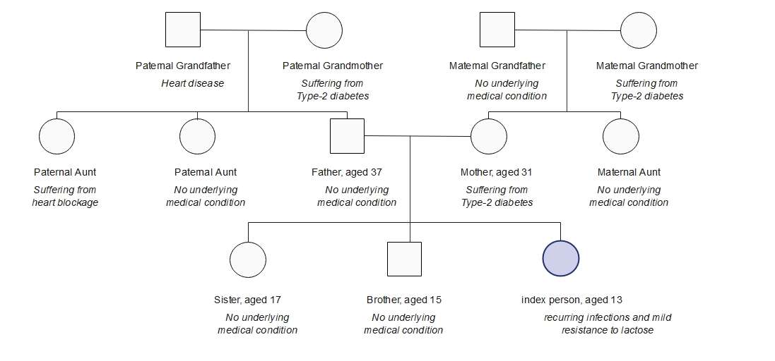
A few examples of these notes include
After adding these health, social, and emotional pattern notes, your diagram should look something like this.
Review the Diagram for Clarity and Privacy
You are done and have a functional genogram for education, counseling, and diagnosis. But don’t stop here; it’s always a good idea to revisit and review the diagram from scratch.
Double-check whether the symbols are correct.
Review if the legends have the relevant information (age, birth/ death indication, and medical notes).
See if the relationship lines clearly indicate the association between family members.
Spot any information that is irrelevant to the current issue. Removing it can help you declutter the diagram and improve its clarity.
Double-check if you have followed ethical conduct and respected boundaries when establishing connections and adding notes. Do not try to sensationalize any data.
How to Make a 3-Generation Genogram?
Do not expect to master plotting a perfectly functional genogram in one go. It’s not humanly possible. So, the first thing you should do is practice plotting symbols, establishing relationships, and showcasing emotional links.
A good way to do this is to use a blank canvas. Here is how you can do it using a digital genogram maker, EdrawMax.
Go to EdrawMax online/ desktop and register with your email. Once on the dashboard, click New and choose a blank drawing to enter the canvas space.
Grandparents, Parents, Siblings, and Children
Go ahead and start plotting the index person. Imagine Maria, a 34-year-old woman with an anxiety disorder, is our index person. Now, let’s start plotting.
Position the Index Person First
EdrawMax has labelled symbols for all kinds of genders, relationships, and emotional patterns. You can visit the symbol library, find genogram symbols, hover the cursor over the symbol, and see what it stands for. Drag and drop it directly onto the canvas.
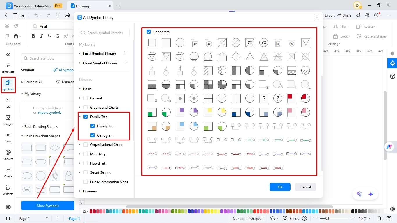
Place Maria in the appropriate generation row and mark her as the index person using the convention you have chosen. Add her name and any relevant age or date information beside the symbol so the chart can be read without relying on color alone.

Add Maria’s Generation: Siblings, Spouse, and Children
Start by gathering their information.
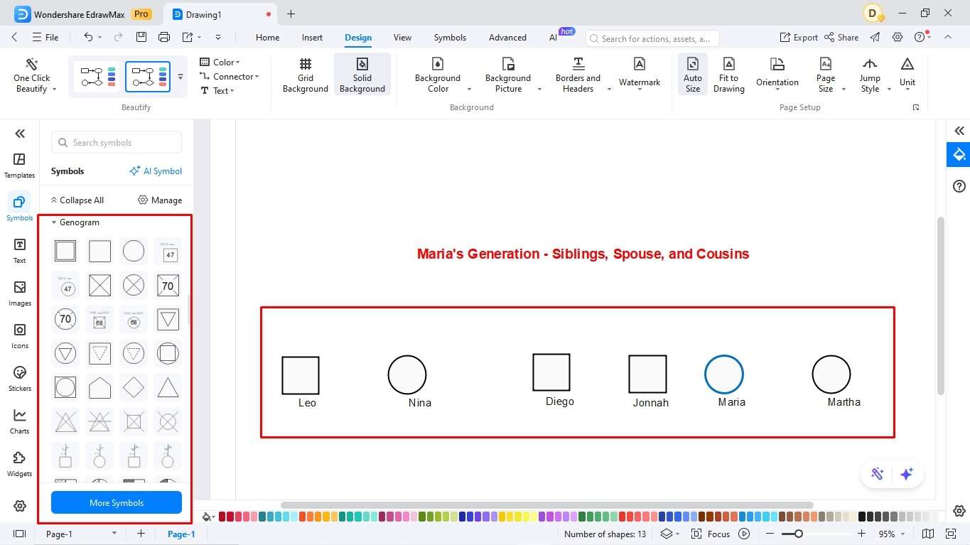
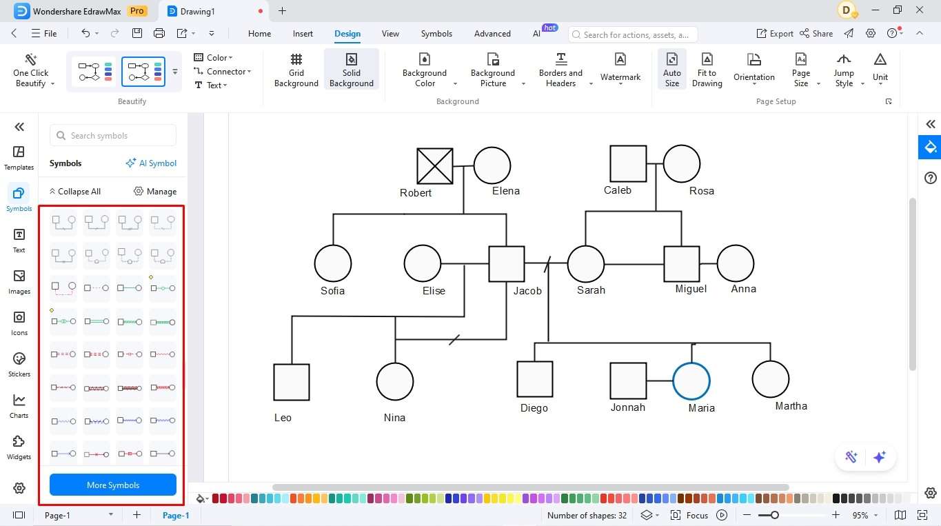
Get relevant symbols from each member in Maria’s generation from the library and position them accordingly. Place siblings from oldest to youngest, left to right: Diego comes first, then Maria, and then Martha. Jonnah is right beside Maria. The step-siblings also go side-by-side.
Add the Second Generation: Parents, Uncles, and Aunts
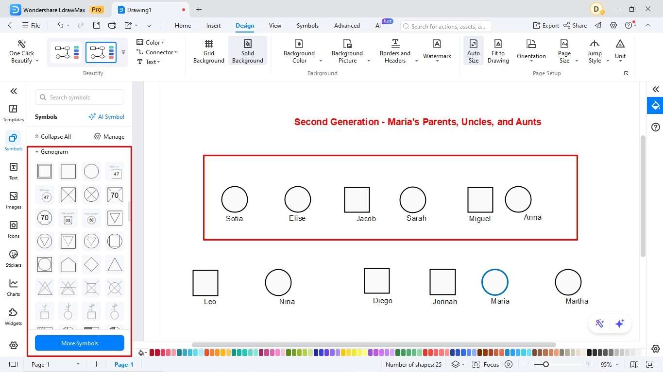
Here’s everyone included in this generation.
Repeat the first step with this generation’s members. Elise and Sarah go beside Jacob. Place Jacob and Sarah directly above Maria, Diego, and Matha to show a children-parent relationship. As Sofia is Jacob’s sister, they share the same horizontal space. The same goes for Sarah and Miguel. Anna is right beside Miguel.
Add the Third Generation: Grandparents
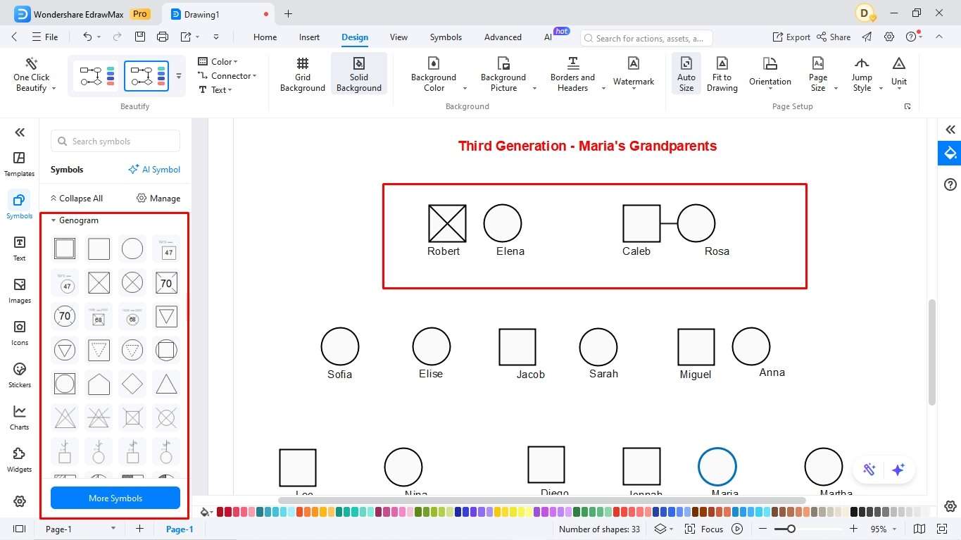
Here are all the grandparents in the family with their medical conditions.
Robert and Elena sit right above Jacob and Sofia, while Caleb and Rosa sit on top of Sarah and Miguel. Since Robert is no more, we will add an X through his square.
Build Relationships - Divorce, Separation, & Blended Family Structures
Once you’ve already positioned members across the three generations, it’s time to show “who’s related to whom”. Here is how you do it.
Draw a horizontal marriage line between Maria and her husband, Jonnah. The same goes for other married couples, including Miguel and Anna, Jacob and Elise, and the grandparents.
As for the divorced couples, we have Maria’s aunt, Sofia. However, as we have not gathered her husband’s information, her circle will be standalone.
Moreover, Maria’s parents, Jacob and Sarah, are separated. So, they will be joined with a horizontal line with a slash passing through it.
For the siblings, add vertical lines for Maria, Martha, and Diego, which are joined by a union line below Jacob and Sarah. The same goes for all the other siblings.
It’s a blended family, meaning some married people have children from prior relationships. In this case, this child is Nina from Elise’s prior relationship. She will be joined by a vertical line from Elise and a vertical line with a dash from Jacob.
After building these relationships, your genogram will look something like this.
Repeated Family Patterns Across Generations
The last stage is making sense of the family’s medical history and emotional bonds. For this, we will be using supplementary notes. These notes will include
A person’s age and their relationship with Maria.
Add medical or behavioral information only when it is relevant to the purpose of the genogram. Use a consistent label, note, shading, or legend rather than relying on decorative formatting that another reader may interpret differently.
To do this, double-click on the canvas where you want to add the note and start typing. Use the floating menu to change color, italicize, etc. After this, the genogram appears as follows.
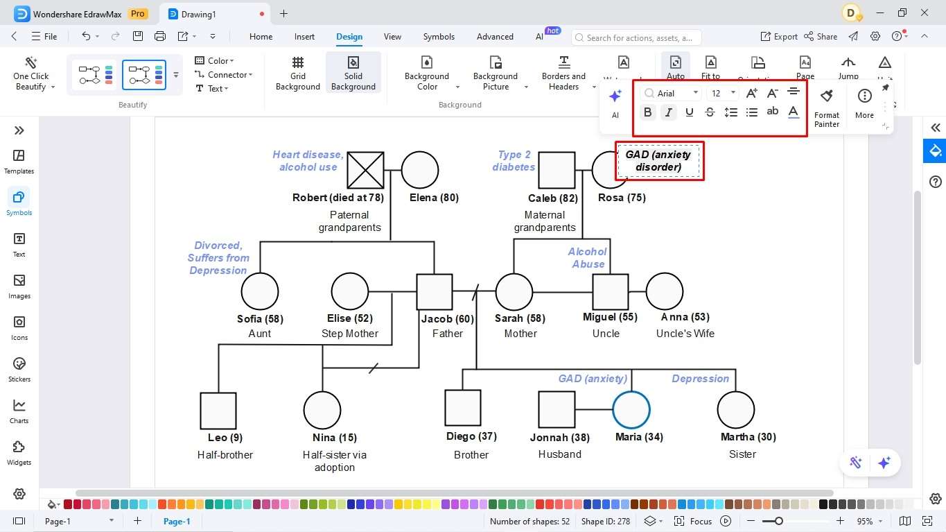
This is where the genogram helps you identify multi-generational patterns at a glance.
For instance, Rosa (Maria’s maternal grandmother) and Maria both suffer from generalized anxiety disorder. But the condition has skipped one generation: Maria’s mother. The relationship instability in the second generation could also have translated into Maria’s sister, Martha, getting depression, which is nowhere to be found in older generations.
How Genogram Details Change by Use Case
Check out the following social work, medical, and counseling genogram examples to understand how to plot them effectively.
Social Work Assessment Focus
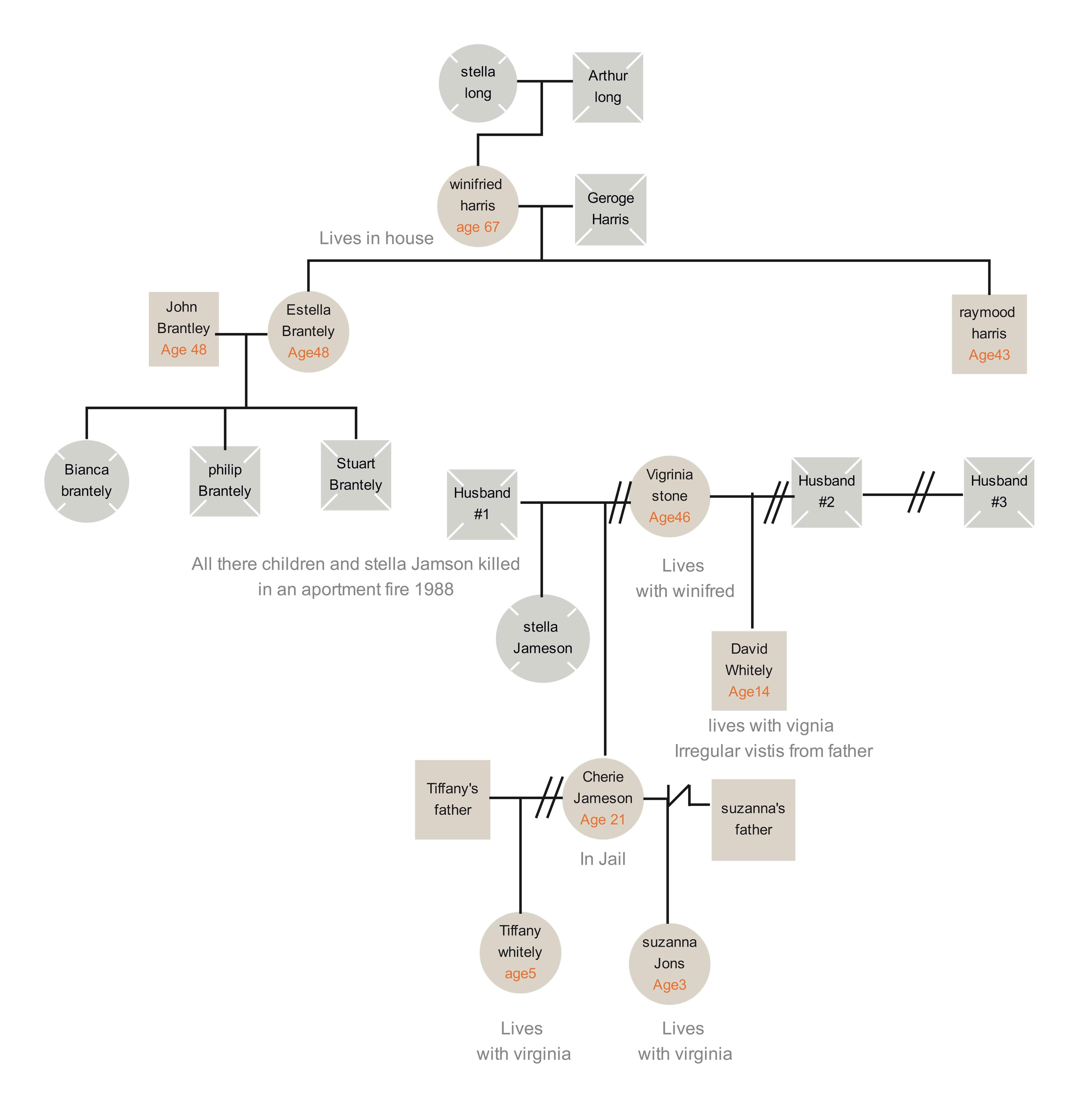
social work genogram example


This genogram is a typical example of what social workers use for focus assessment. It showcases four generations, a few blended and some conflicted. Within this chart, issues like relationship stability, custody issues, and potential risk factors are surfaced.
Beyond color-coding and relationship lines, the diagram includes text case notes. These notes convey information about people, such as “in jail” or “irregular visits from father”.
Therapy and Counseling Focus
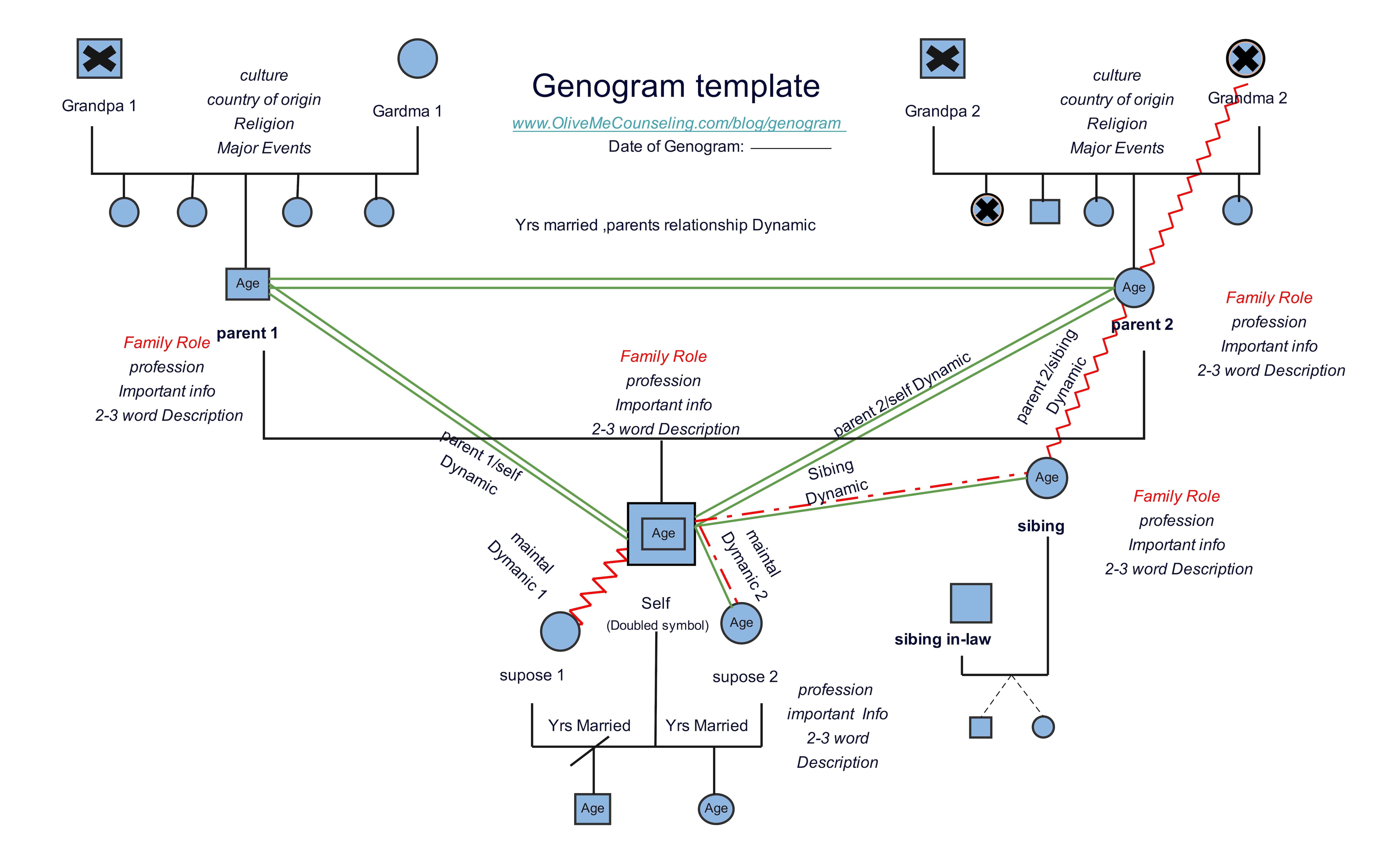
therapy and counseling genogram example
Here is a genogram designed in an attempt to explain counseling focus genograms. It is a fillable template that emphasises relationship qualities within the family. By structure, this genogram follows the typical three-to-four generation layout.
Emotional-relationship lines can add useful context, but their meaning must be consistent. Use only the relationship types you need and provide a legend if the line style or color is not self-explanatory.
Nursing Health-History Focus

nursing medical genogram example
This pedigree-style genogram gives an insight into a family’s Down syndrome history and how it has travelled within generations. The entire vocabulary with terms like “carrier” or " Down syndrome male” is centered around tracking the condition and identifying its impact.
This genogram also uses symbols and colors creatively. Within the top-down pedigree, you will notice the age-in-the-circle format, birth-death years arranged, and half-shaded symbols. This gives medical professionals insights for a careful diagnosis.
Genogram vs Ecomap: Keep the Difference Clear
A genogram is a visual depiction of a family’s structure across two or more generations, their relationship, medical, and social history. In comparison, an ecological map visually maps out a family’s relationship against their external environment (people in the community, friends, schoolmates, and healthcare providers).
Counselors, social workers, and medical professionals use genograms to understand inherited traits, spot intergenerational medical and genetic conditions, and gain insights into a family history. Whereas ecosystems help care providers and counselors assess support systems, plan targeted interventions, and improve communication.
Genograms Show Family History and Relationship Patterns
In a genogram, you will typically find
Family members - parents, children, grandparents, and so on.
Relationships - marital status, divorces, parent-child links, and more.
Generational data/ Hereditary patterns - health conditions, traits passed down through generations, occupation, and life-altering events.
Emotional dynamics - closeness, estrangement, romance, abuse, etc.
Ecomaps Show External Supports and Stressors
In an ecomap, you will usually find
Social networks - people and groups in a person’s life, including friends, family, colleagues, etc.
Resource mapping - resources like schools, support groups, healthcare providers.
External systems - government, religious organizations, social services, and other community resources.
How Do Both Diagrams Work Together in Case Assessment?
Both genograms and ecomaps are powerful visual analysis tools. However, when used together, they give a deeper understanding of someone’s life. While a genogram focuses on a person’s familial relationships and medical conditions, an ecomap shows how this person interacts with the world outside their family.
For example, professionals use them together in case assessment to connect how a patient’s history is influencing the current stress levels. They can also verify whether the patient has support links to break this cycle.
Create a Clear Genogram, Then Add Detail Only When Needed
A readable genogram is built in layers. Establish the family structure first, use one notation system consistently, add only the relationship or health information relevant to the purpose, and provide a legend for anything that could be interpreted more than one way. If the diagram contains sensitive information, review what needs to be shared before exporting or presenting it.
FAQs
What is the easiest way to create a genogram?
The most straightforward way to create a genogram is with an advanced genogram tool, such as Canva, GenogramAI, or EdrawMax. These tools have pre-made symbols and labels that help you plot hierarchies easily.
Can I make a genogram using Word?
Of course, you can make a genogram in MS Word using shapes. However, everything needs to be done manually, which takes time.
What does the squiggly line represent in a genogram?
In a genogram, a squiggly line means a conflicting or strained relationship.
What does a triangle mean in a genogram?
A triangle in the genogram indicates a pregnancy. If this triangle has a cross passing through, it signifies a miscarriage.
AI Diagram Generator
Enter your prompt. Upload files if needed. Generate diagrams, charts, or slides instantly.




 (AI & Web)