




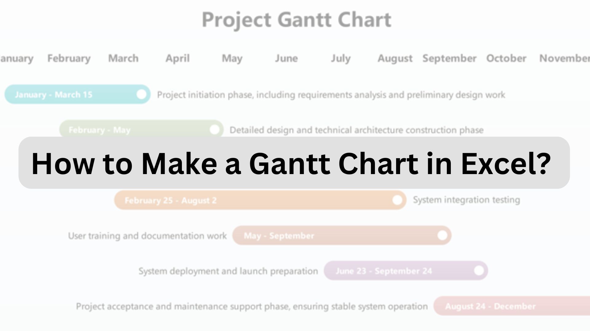
A Gantt chart in Excel is usually built from a task table plus a horizontal timeline. Because Excel does not provide a dedicated Gantt chart type, the most common method is to format a stacked bar chart so the start-date series becomes invisible and the duration series appears as the task bars.
If your goal is to make a Gantt chart in Excel, start with five fields: task name, start date, end date or duration, owner, and progress. Then turn the date and duration data into a timeline, add milestones or dependencies only when the project needs them, and keep the chart simple enough to update without rebuilding it.
In this article
Quick answer: In Excel, create a task table, calculate or enter duration, insert a stacked bar chart, hide the start-date series, reverse the task order, and format the duration series as the visible Gantt bars. Add milestones, progress, or dependencies only if they improve project tracking.
What Columns Should an Excel Gantt Chart Include?
For an Excel Gantt chart, keep the source table compact. Task name, start date, duration, owner, and progress cover most practical schedules. End date can be entered directly or calculated; milestones and dependencies belong in the chart only when they affect sequence or reporting.
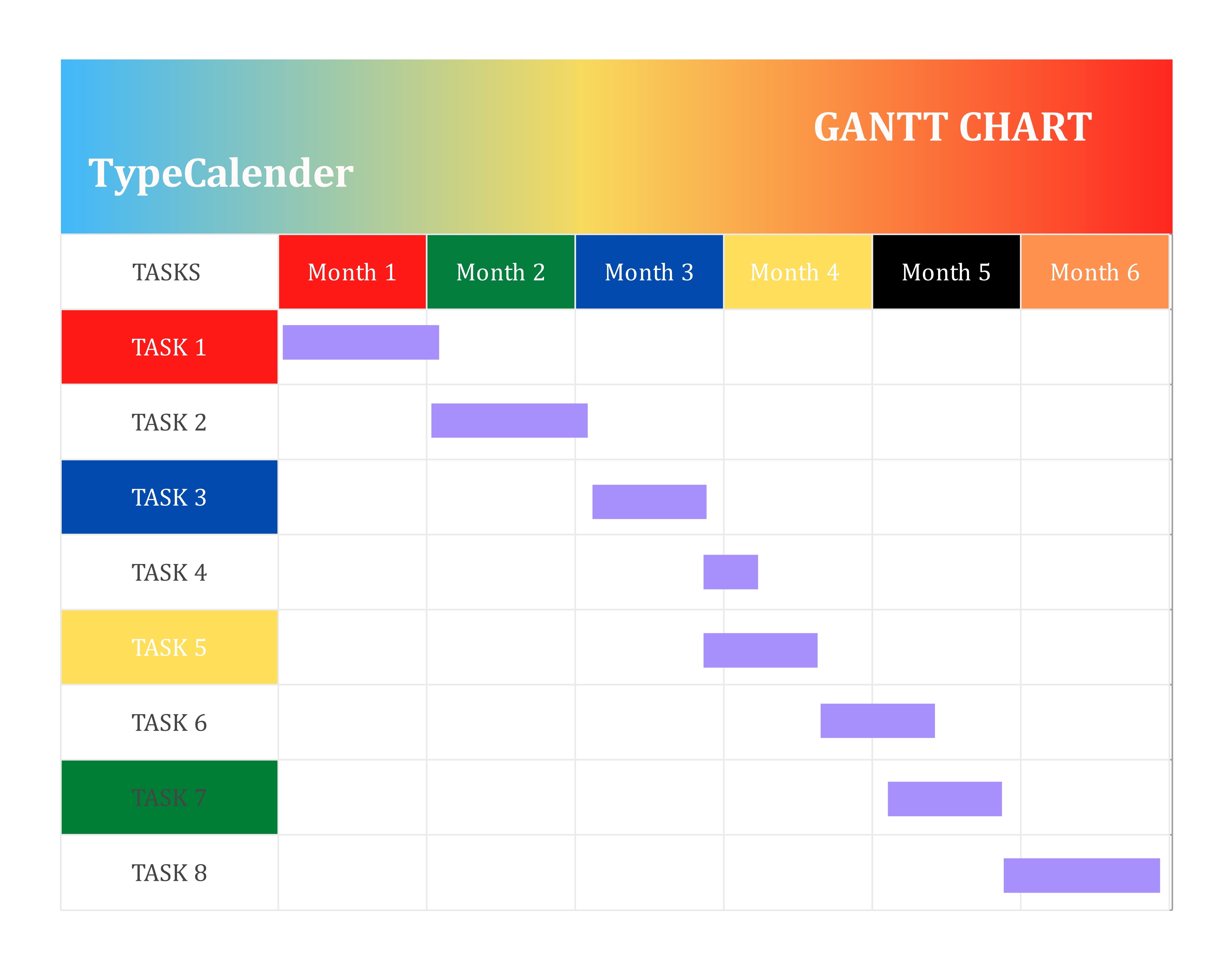
gantt chart format in excel


Task Name, Owner, Start Date, and End Date
At the structural level, a Gantt chart plots tasks in a project. So, the first column always goes to the task list, also called task names. It enlists all the tasks or activities involved in the project, so the team can easily identify them. Place it on the left side of the chart.
The next column stands for the task or resource owner. These are the people and teams project managers assign specific tasks to. Owners are accountable for deliverables at each stage.
After the task owners come the next two columns, representing the start and end dates for individual tasks. These dates give you a clear idea of your task breakdown: when an activity starts/finishes, the operational sequence, and so on.
Duration, Status, and Percent Complete
Now that we’ve covered the basics, it’s time to include the project status as anticipated. Here, three things matter the most.
The fifth column in the Gantt chart starts from task duration. It is the time between the start and end date, indicating how long each activity lasts.
After duration, we have task bars. These are horizontal task markers that show how complete a project or task is. Project managers use color-coding techniques or percentages to represent progress. This helps the team measure their progress at each stage.
Some Gantt charts also show a vertical current-date or “today” line across the timeline. It helps readers compare planned task bars with the point the project has reached, but it is optional for a basic Excel schedule.
Milestone and Dependency Columns
Finally, milestones and task dependencies are built on top of the task bars and your project timeline instead of having separate columns. But what do each represent?
Project milestones are diamond-shaped markers on the timeline. These diamonds indicate completion of a specific phase, major progress, or deliverable. Often included in formal Gantt charts, milestones allow clients and stakeholders to see progress as the project moves.
After milestones, Gantt charts have task dependencies, represented by an arrow line linking two or more task bars. Dependencies show how tasks are related and which activities need to be completed before the next ones start.
How to Build a Gantt Chart Format in Excel?
Excel can simulate a Gantt chart by using a stacked bar chart. Build the task table first, then use start dates as the hidden offset and duration as the visible bar length. This keeps the visual tied to worksheet values instead of manually drawn shapes.
Create the Task Table
Almost every Gantt chart format in Excel starts with a well-organized task structure. Within this task structure, you have the task names/ lists, task owners, start and end dates, and duration. So, let’s plot them one by one.
From the left side, the first column should list the project’s tasks or phases, with one row per task. We’ll be building a software launch Gantt chart. As it is a longer and more complicated project, we will be dividing the work structure into different phases, including
Planning - outline goals, define audience, and collect data.
Discussion - gather feedback and set performance metrics.
Design - transform product ideas into a system blueprint.
Development - programmers write code and build features.
Testing - check the program for bugs and errors.
So, once on the Excel sheet, title the first column Task List and add one phase per row. You may also include a short description for each phase (optional). To make an edit, you double-click any cell on the Excel sheet and start typing.
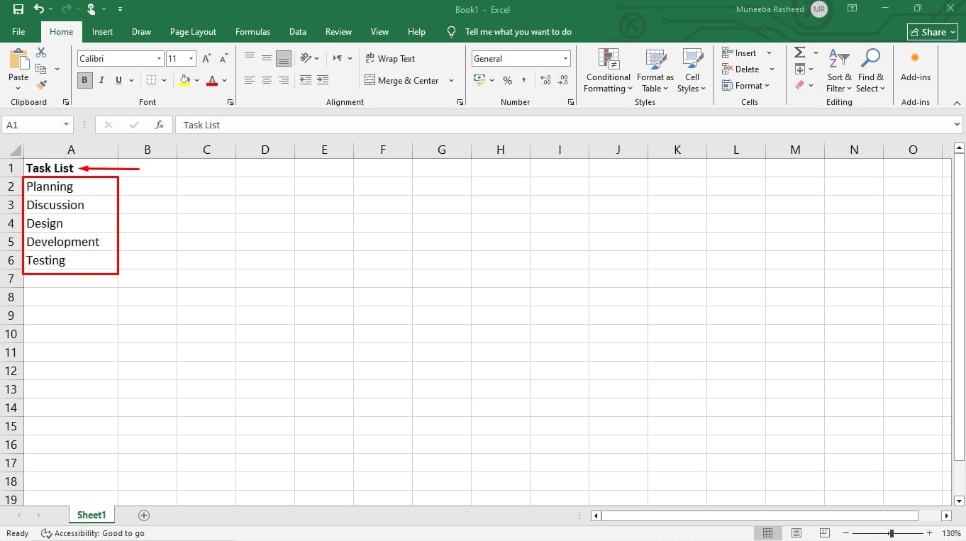
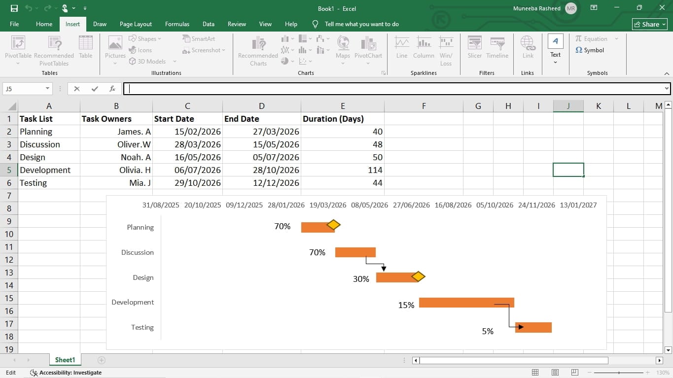
Proceed to the next column and label it Task Owners. In front of each phase row, mention the name of the task assignee responsible for managing that phase. By the end, the task table should look something like this.
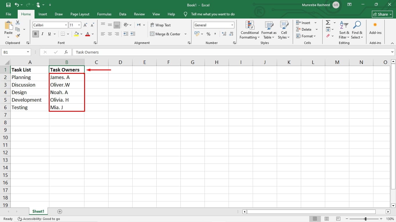
The next columns would be labelled Start Date and End Date. Type dates into these two columns in front of each phase/ task row.
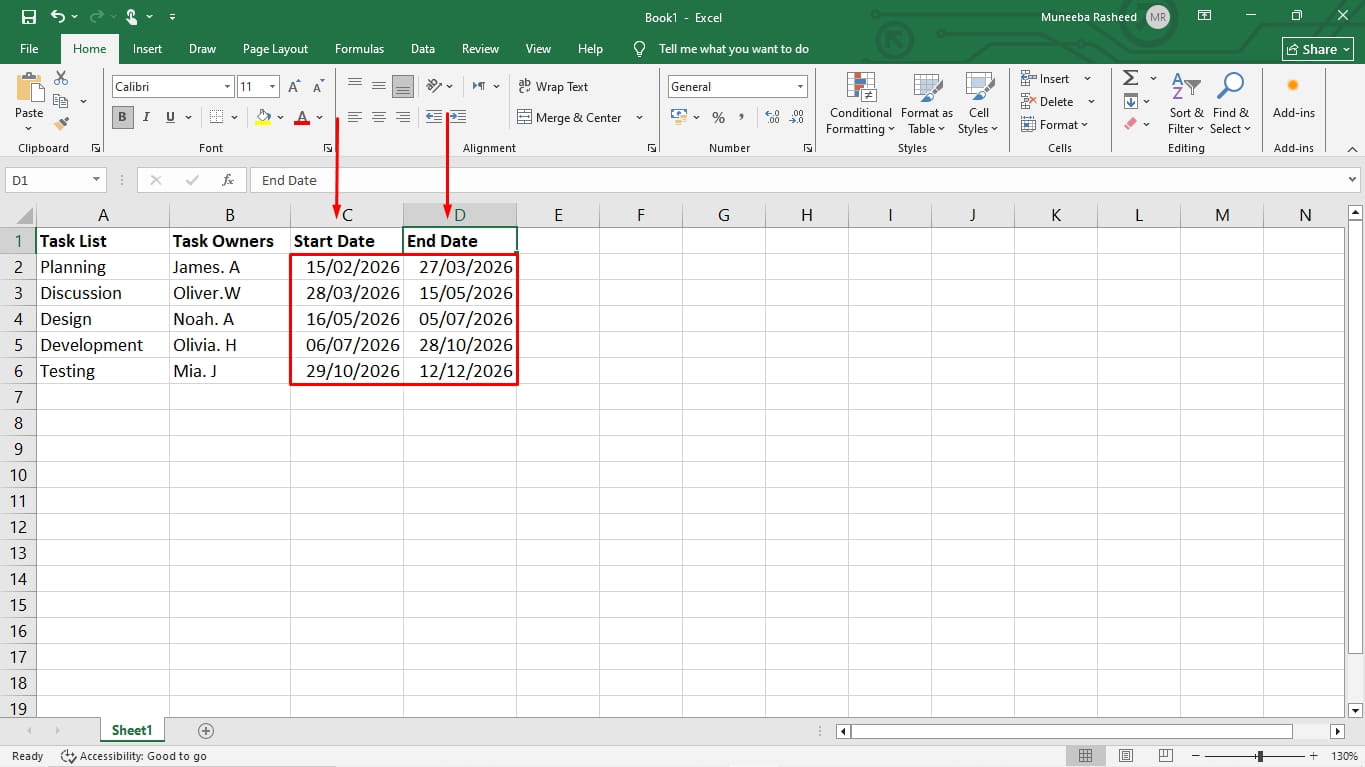
After dates, add a column for Duration. This column determines how long each phase takes. You can add it manually or use an Excel formula.
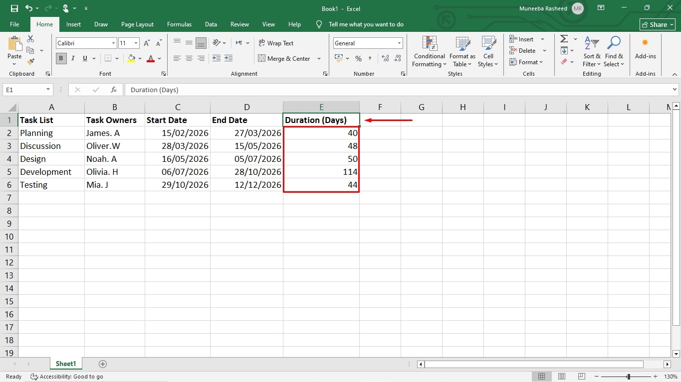
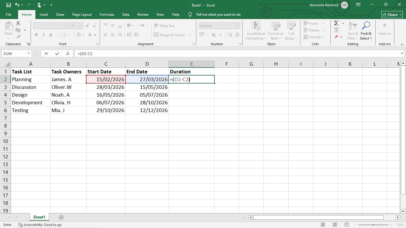
Pro Tip: To use an Excel formula for duration, go to the first task row and enter (=end date - start date). Drag the cursor down till the last task row, and it will automatically update the duration.
Set the Timeline Scale
The next step is where you build a visual timeline beside the task table. Before we jump into building the Gantt chart, decide the scale of your timeline. Since the software launch is a longer project, we will opt for a month-based scale. Hence, our unit of time would be months.
The opposite logic applies to the shorter and fast-paced projects. For instance, if you are planning a study assignment or launching a small blog project, a daily or weekly timeline scale would do the job.
Format Bars Across Date Ranges
Now that everything’s decided, we can start data visualization. For this step, we will create the Excel stacked bar chart from the created spreadsheet. Here is how it goes.
First, select the C column, which represents the Start Dates.
While it’s selected, go to the Insert tab, click Chart, and choose Stacked Bar Chart under the Bar section.
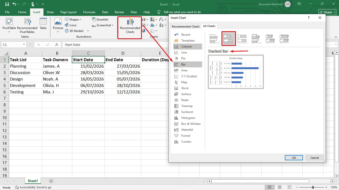
This will generate a stacked bar graph with your start dates on the X-axis. The next step is to add other series into this graph. So, let’s begin with task duration.
Right-click anywhere on the graph and choose Select Data from the menu.
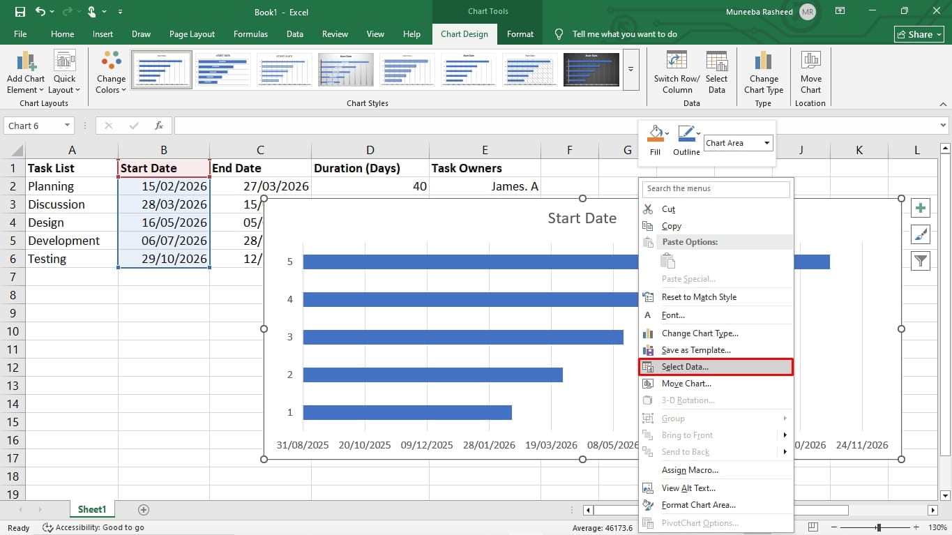
A new pop-up window will open. Notice that Start Date is already listed in this window as a series. Click Add from this window under the Legend Entries, and a new pop-up will open.
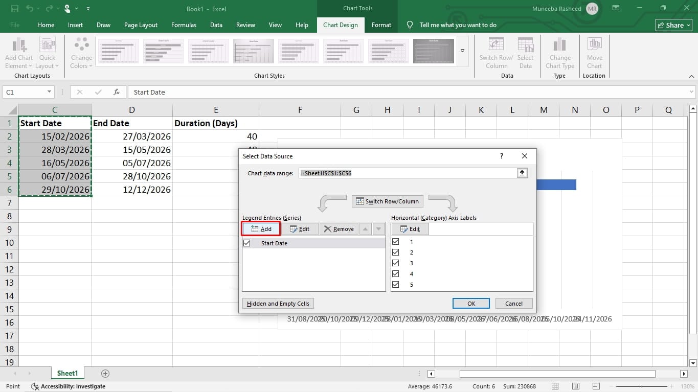
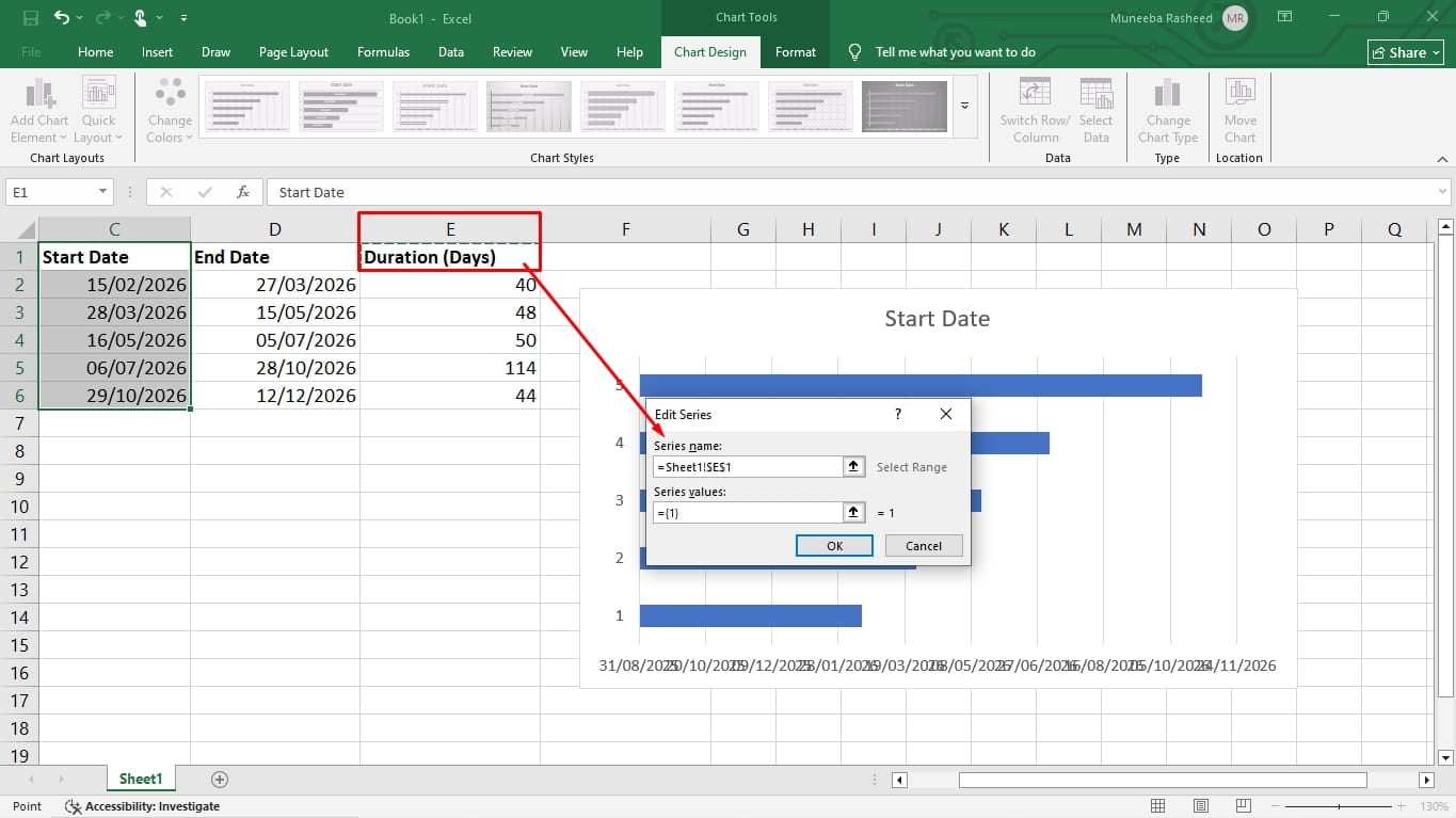
It’s time to name the new series. For this, place your cursor in the series name field and click the header of the Duration column, which in this case is E. Also, click the Upward Arrow icon in the Series Values field, and you will see a new Edit Series menu.
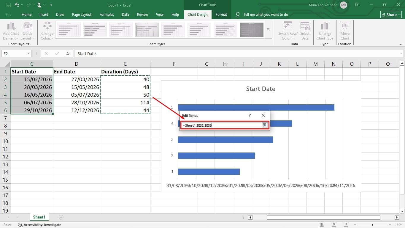
While it’s open, select all the cells in the Duration column. Do not include the header or any empty cells in your selection. Click OK to close the window.
You will be reverted to the Data Source window. Once you see the Duration series added, click OK.
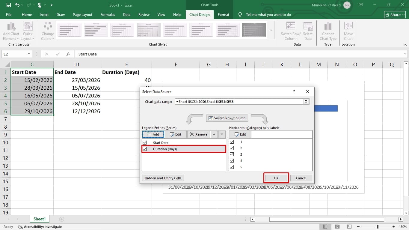
Repeat these steps for any other series you want to include in your Gantt chart, such as task description, end date, etc.
Notice that the vertical axis shows digits instead of task names.
To fix this, open the Data Source window by right-clicking the chart and clicking Select Data. Once in the Data Source window, locate the Horizontal (Category) Axis Label and click Edit.
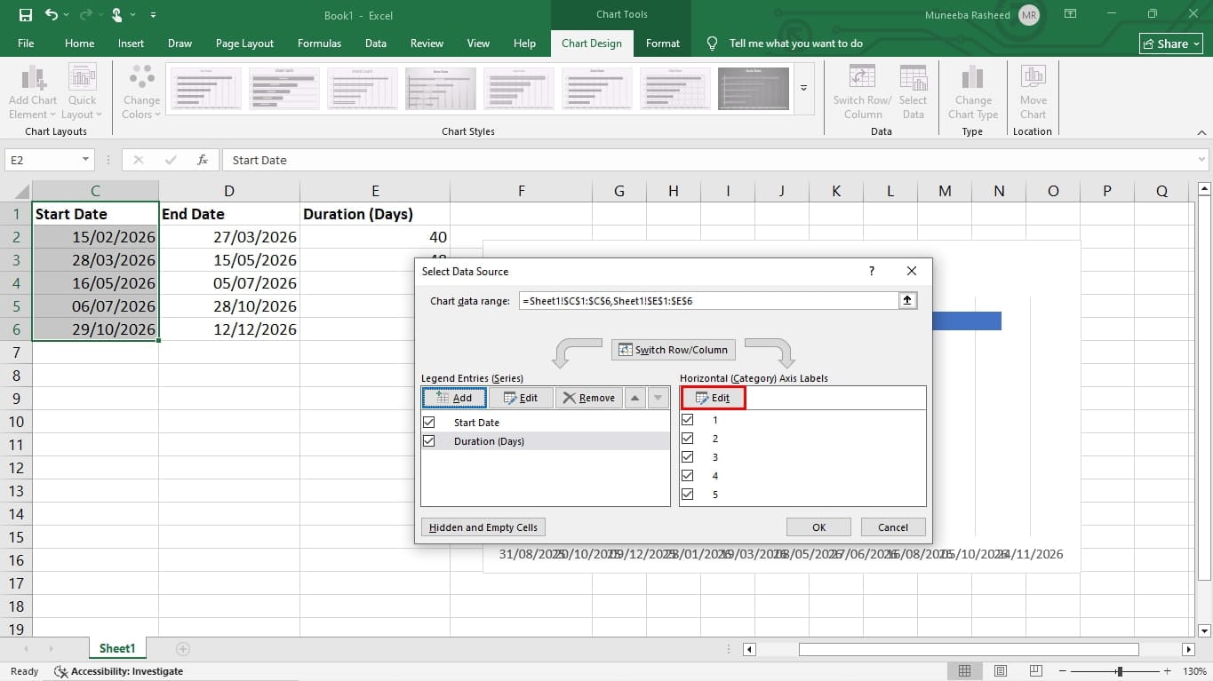
A new Axis Label Range window will open. While your cursor is on the range field, select the Task list from your spreadsheet data. Click OK to continue.
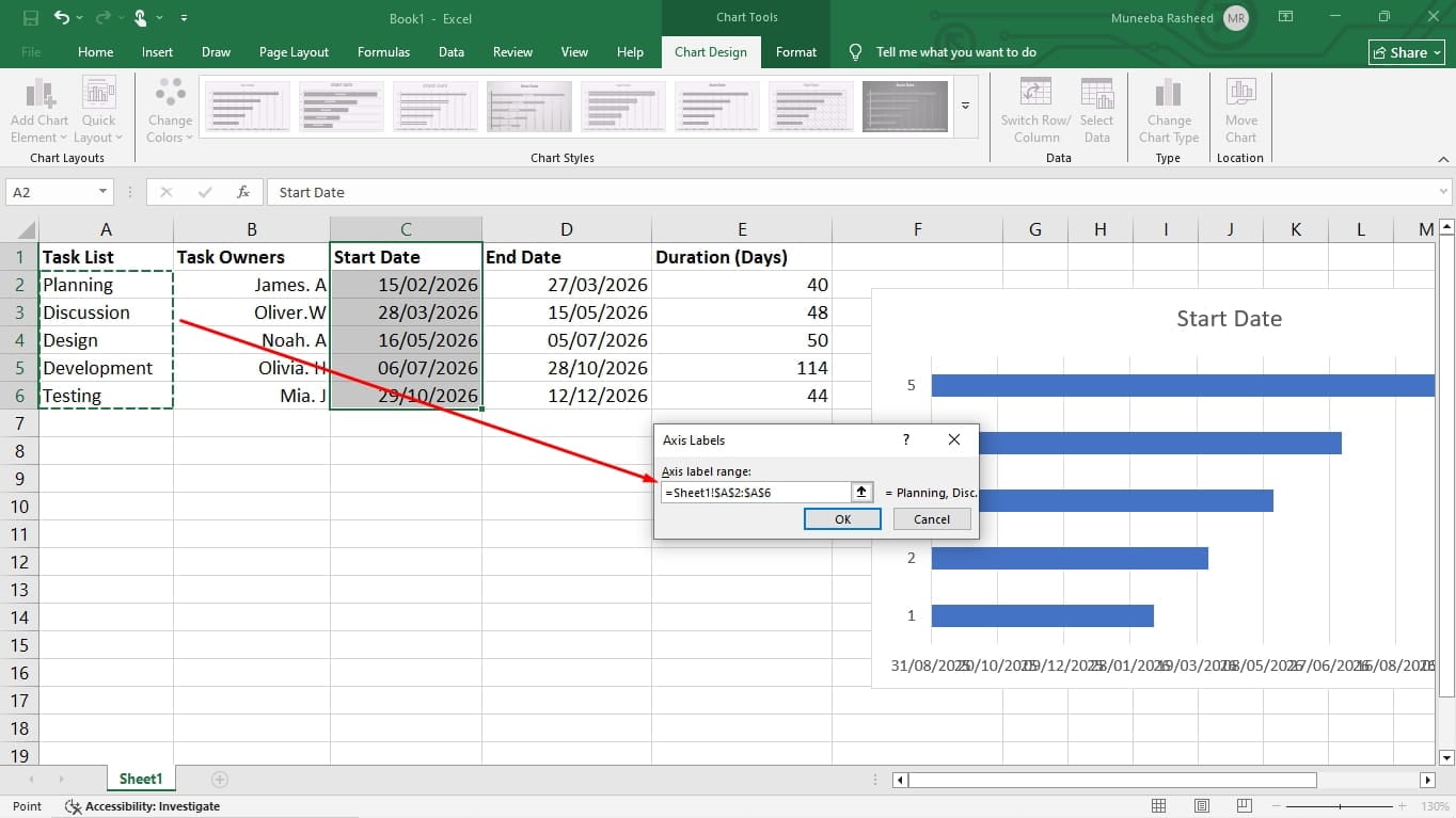
Now, you have an Excel bar that lists your tasks and dates in reverse order.
To solve this issue, right-click the task list on the left side of the chart and click Format Axis.
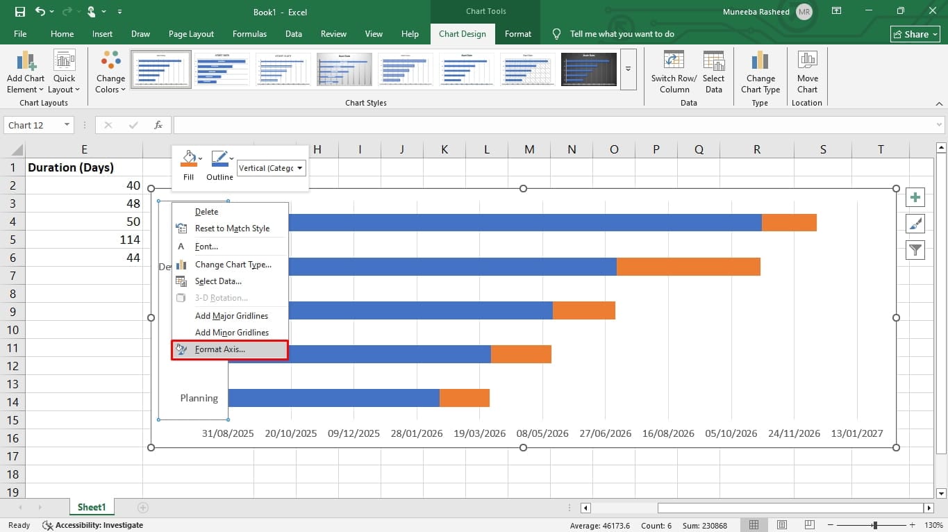
Now, go to the Axis options from the right-side tab and click Categories in Reverse Order. That’s it.
Finally, it’s time to convert this bar graph into a functional Gantt chart. Here is how it goes.
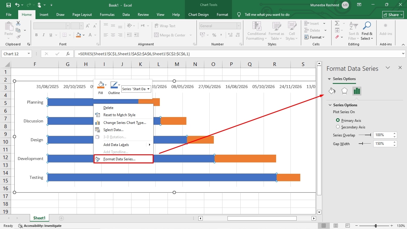
Begin by removing the bar representing the Start Date. For this, click any bar in the chart; it will select all of them. Right-click and click Format Data Series.
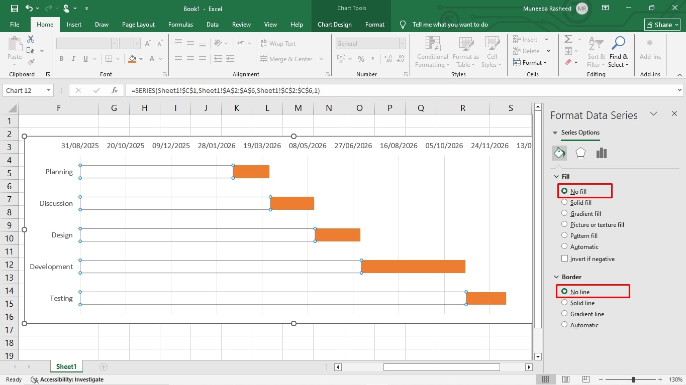
From the menu on the right side of your screen, click Fill and select No Fill. Likewise, choose No Line under the Border Color section.
Add Milestones, Dependencies, and Progress
It’s time to add key details in the Excel Gantt chart. For this, we will use the Shapes function.
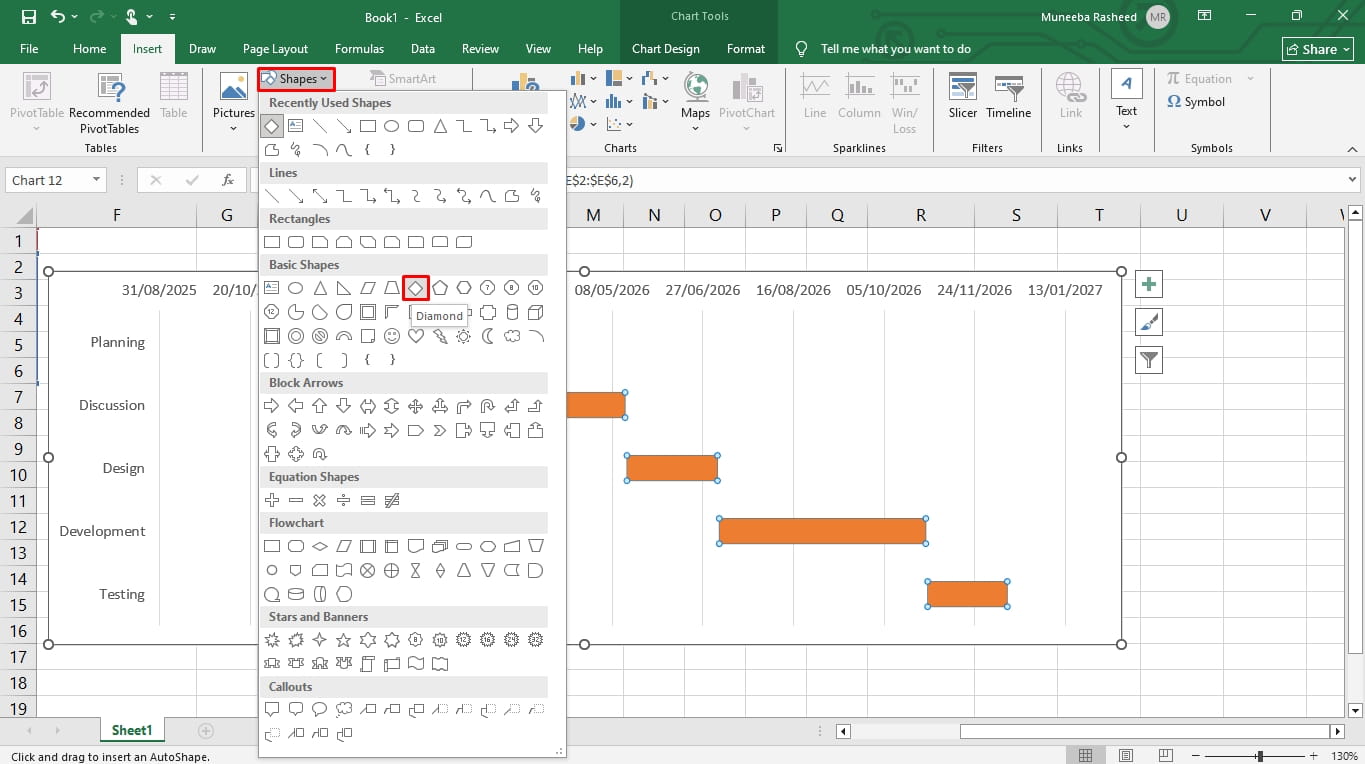
Go to the Insert tab, click Shapes, and choose a Diamond to represent milestones in the Gantt chart.
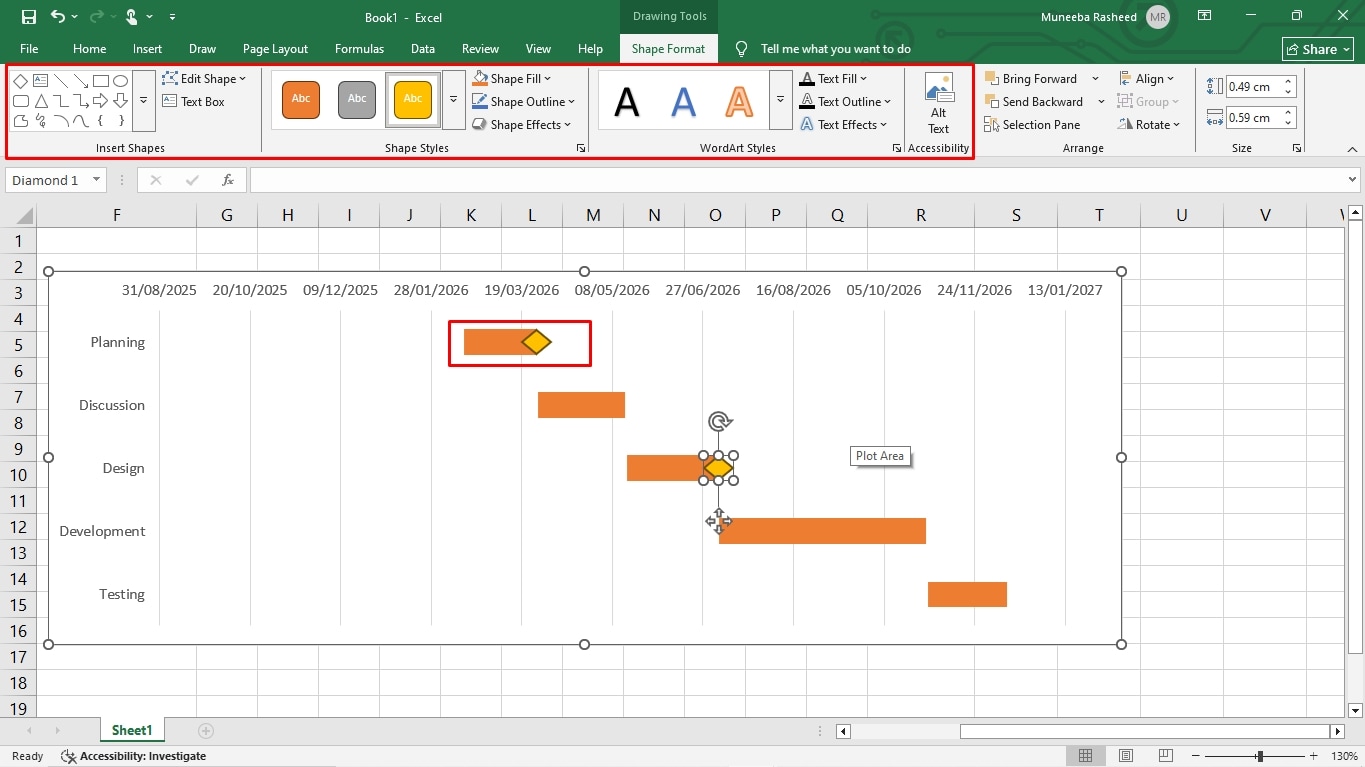
Draw this milestone anywhere you want to indicate major progress or completion of a task. You can format the color, style, and size of this shape from the top menu.
Repeat this step for adding task dependencies. This time, we will replace the milestone with arrow connectors. These connectors will link tasks that are dependent on each other.
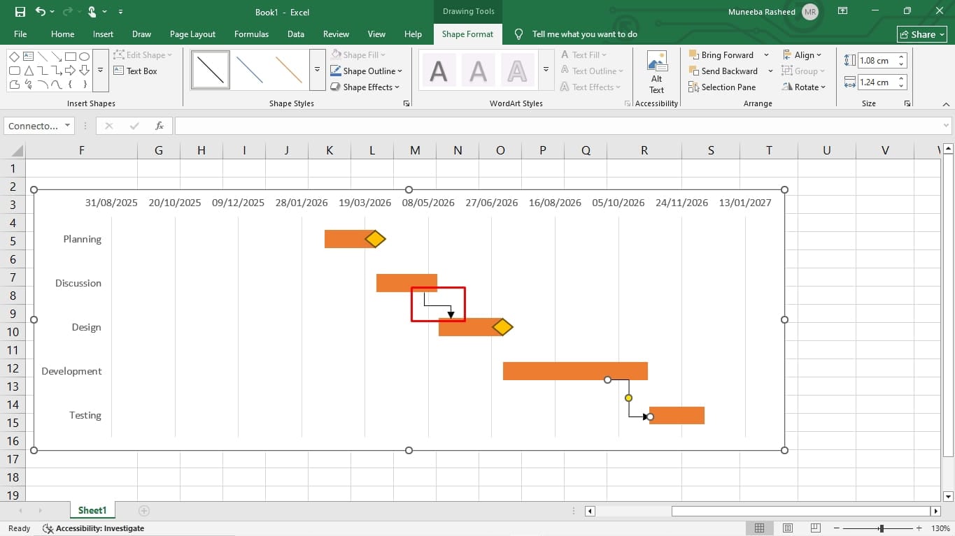
Finally, it’s time to add progress percentages for every task bar. These percentages tell the audience how much of a task has been completed. For this,
Go to the Insert tab, locate the Text icon, and click Text Box. Draw this text box right beside the task bars and type the progress percentage accordingly. Repeat this for every phase.
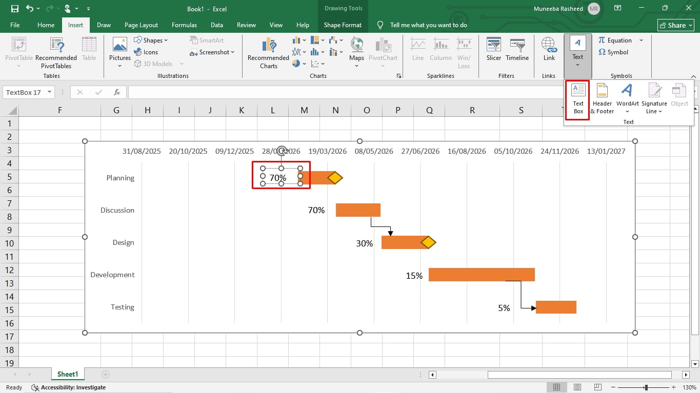
There you have it, a complete Gantt chart format created in Microsoft Excel. You can download it in an XLSL format.
Excel Gantt Chart Examples
Don’t know which format best suits your project’s scope? Check out these Excel Gantt chart examples and learn what to include in your project plans.
Construction Project Timeline Example
gantt chart format in excel
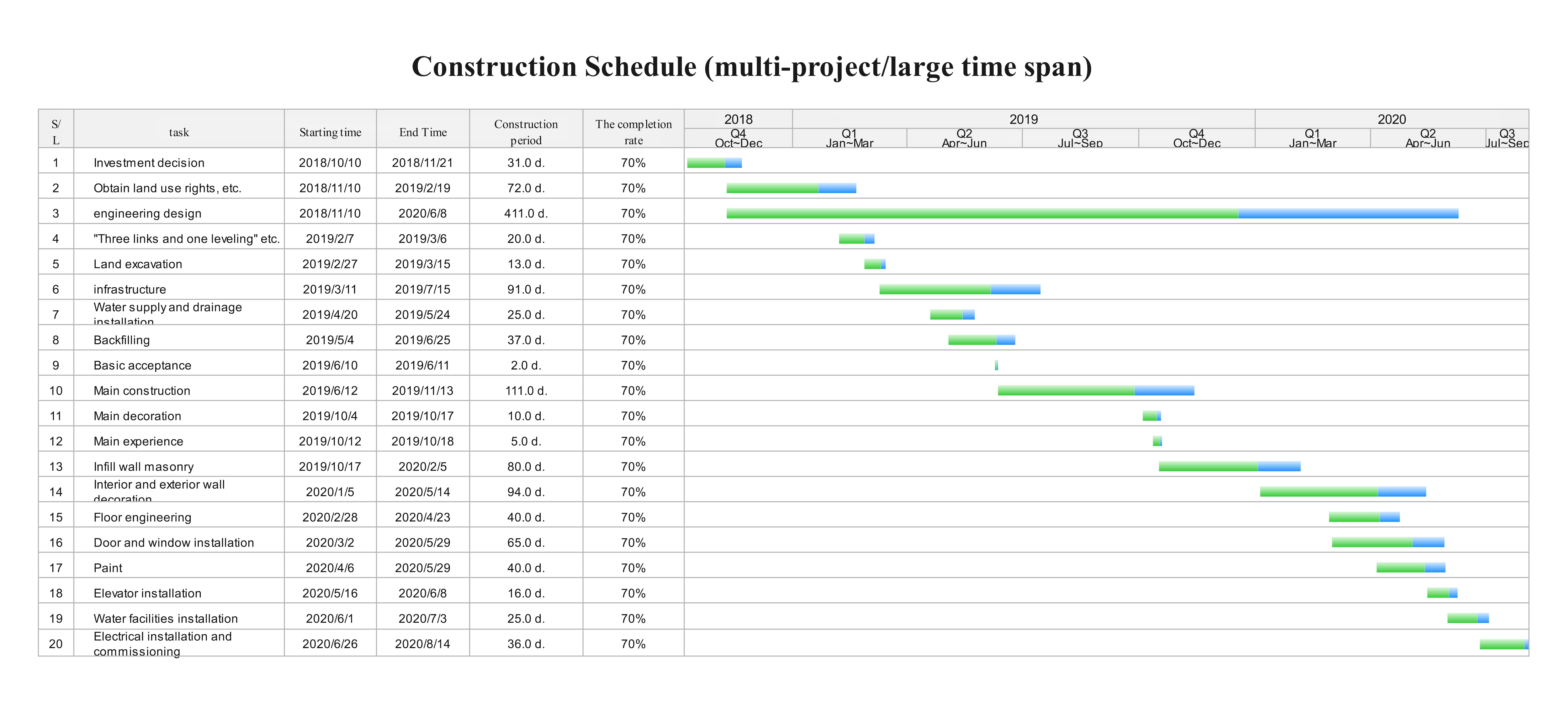
Here is a depiction of a complex, long-term Gantt chart construction project that covers two years. The designer has intentionally taken a minimalist approach for data visualization to manage a higher number of task sequences and dependencies. For this reason, the timeline is also broken into quarters. In addition, the chart has two-toned bars, which is a common method to separate the task duration from actual progress.
Marketing Campaign Schedule Example
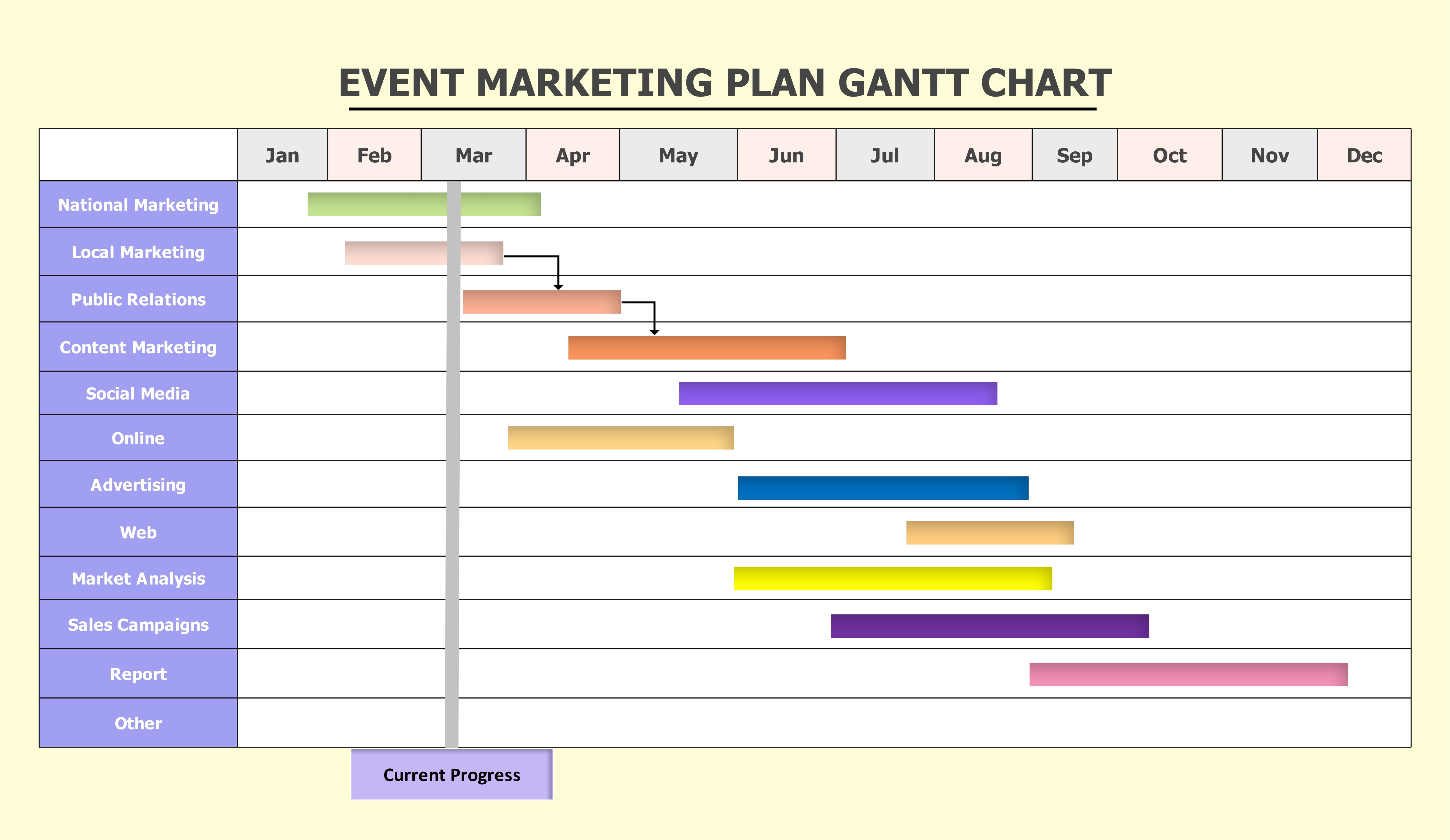
Here is a project-based Gantt chart showcasing a marketing campaign, which spans over a year and includes multiple channels running in parallel. At first glance, you can spot the order of operations and how activities link with their pre-requisite tasks. The current progress line and vibrant color codes suggest that this chart is designed for formal presentations and engaging stakeholders.
Product Launch Plan Example
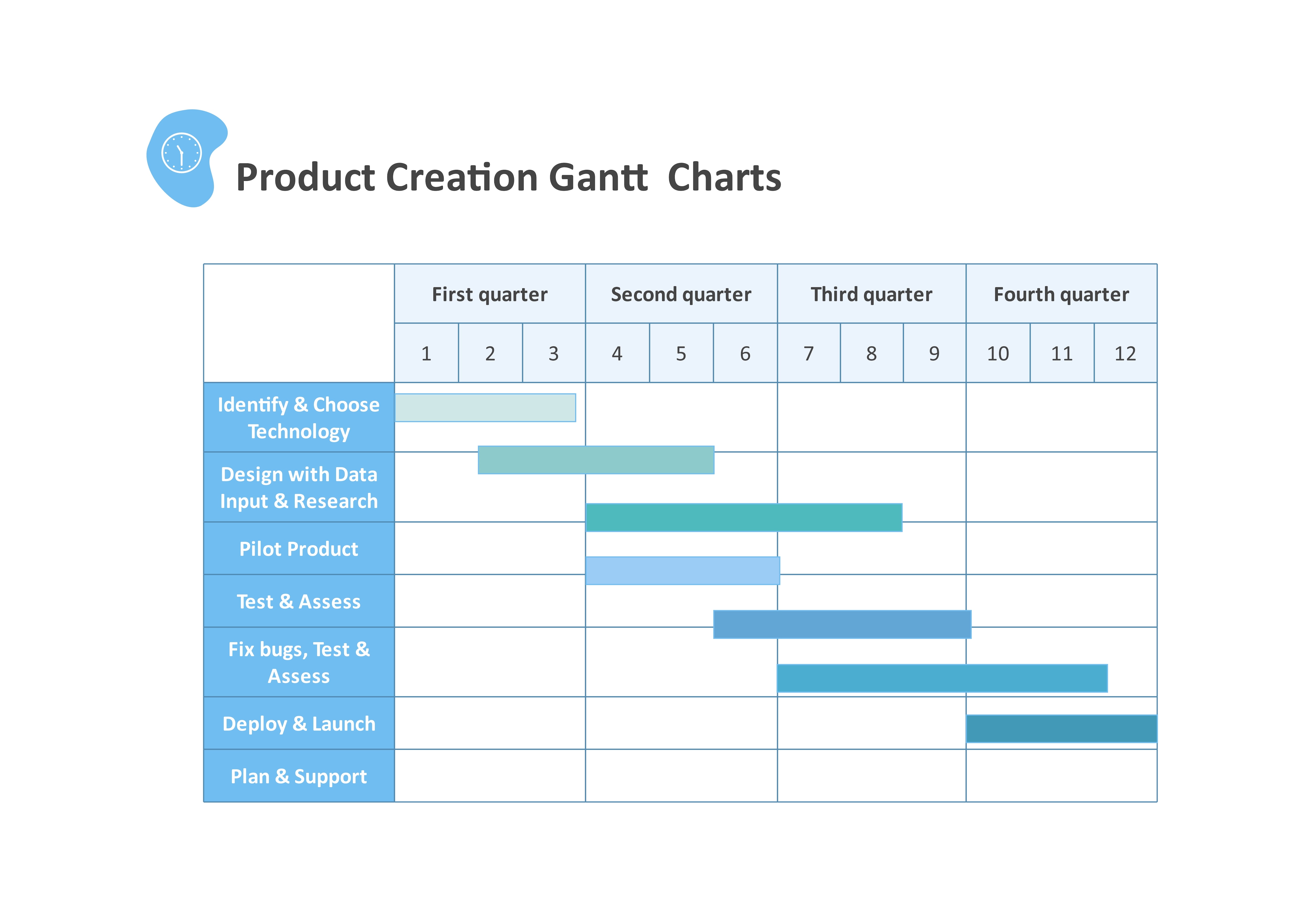
Here is a typical product development cycle Gantt chart Excel template. Because the project spans over the year and has multiple phases, the timeline follows a quarterly scale rather than weeks or months. As for structure, this chart follows a clean color-coding strategy. It uses different shades of teals to differentiate phases while maintaining clarity and a polished look.
Student Assignment Timeline Example
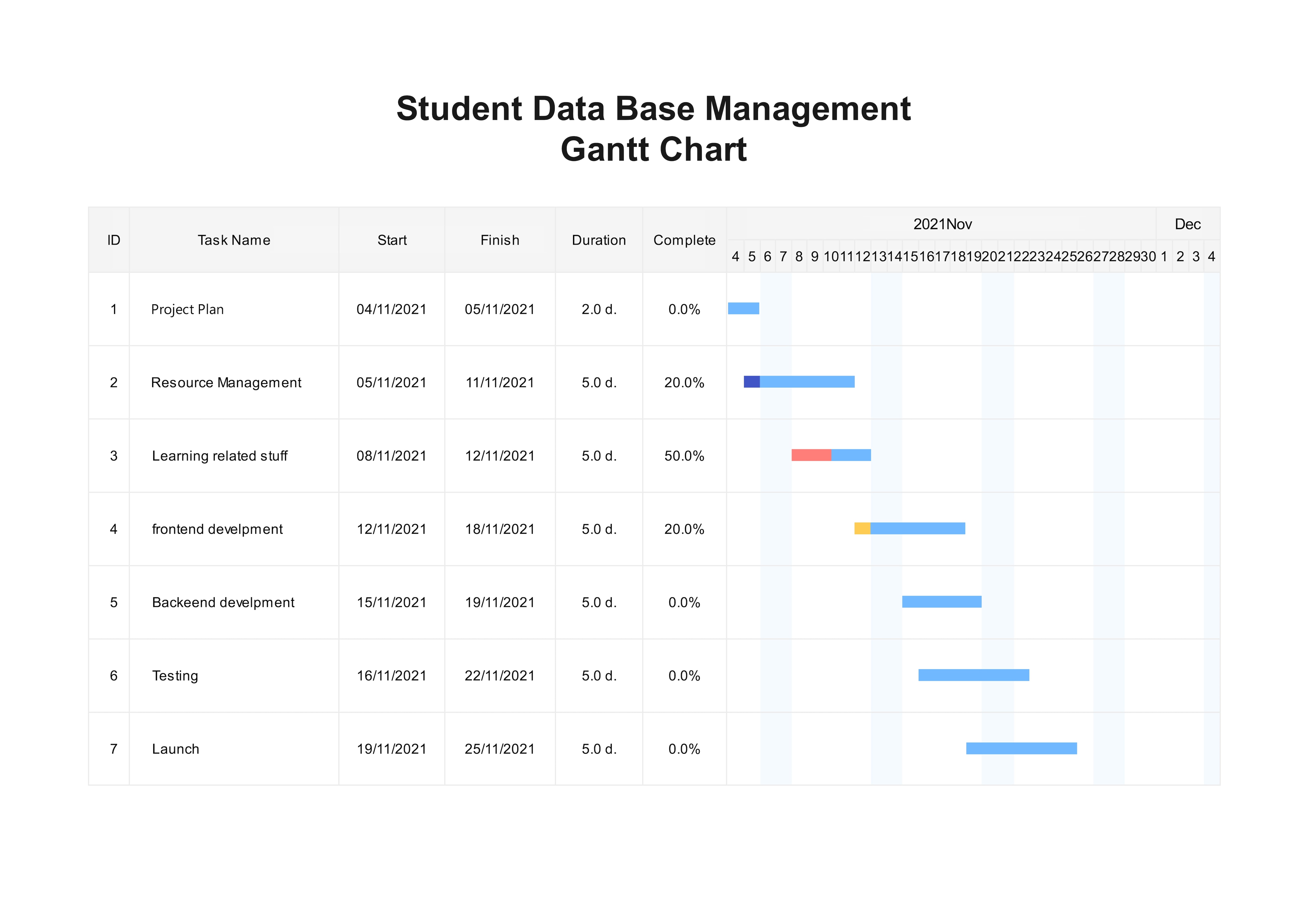
Unlike previous examples, this Gantt chart Microsoft Excel template is built for smaller academic or personal projects. It shows a few activities plotted over two months, with key details like task name, start and end date, duration, and the progress bar. The chart uses a single blue color for every horizontal bar. Doing so keeps your attention focused on the data rather than aesthetics, which works best for such projects.
What Are the Limitations of Excel Gantt Charts?
Excel is flexible, but the schedule becomes increasingly manual as projects add dependencies, frequent date changes, multiple editors, or portfolio-level reporting. Know where the spreadsheet is still helping and where it is creating maintenance work.
Manual Updates and Formatting Errors
Excel is not meant for a project management tool; it is essentially a data entry tool. So, it’s foolish to expect advanced formatting and automated updates from it, like a dedicated platform. You can produce a detailed project plan in Excel, and that’s it.
While your team is executing this plan and changes occur, someone will have to go and modify the chart manually. This manual upkeep can quickly become overwhelming with larger projects.
The same goes for formatting. Individually changing shapes, managing dependency arrows, and task bars is effort-consuming. A small mistake and everything goes down the hill.
Dependency Tracking Challenges
Excel does not have built-in task dependency. It has arrow connectors you can use to link interdependent activities. However, when tasks run parallel across multiple departments, handling these connectors can become a burden. Imagine a task relies on three other tasks that are finishing earlier. Having multiple connectors to show these dependencies becomes hard.
Sharing, Version Control, and Collaboration Issues
Typically, a single individual handles Excel Gantt charts, considering they are mostly designed for smaller or personal projects. As soon as you scale it to three or even five people, the system collapses.
Colleagues have to go back and forth emailing spreadsheets and using extra tools to co-edit the chart. This approach makes project planning infeasible. No one knows who is making edits, what has changed, and how to progress further.
Download or Customize a Gantt Chart Template
Have no time to build a Gantt chart from scratch? Check out these Gantt chart templates, edit them, and save your time.
Simple Gantt Chart Excel Template
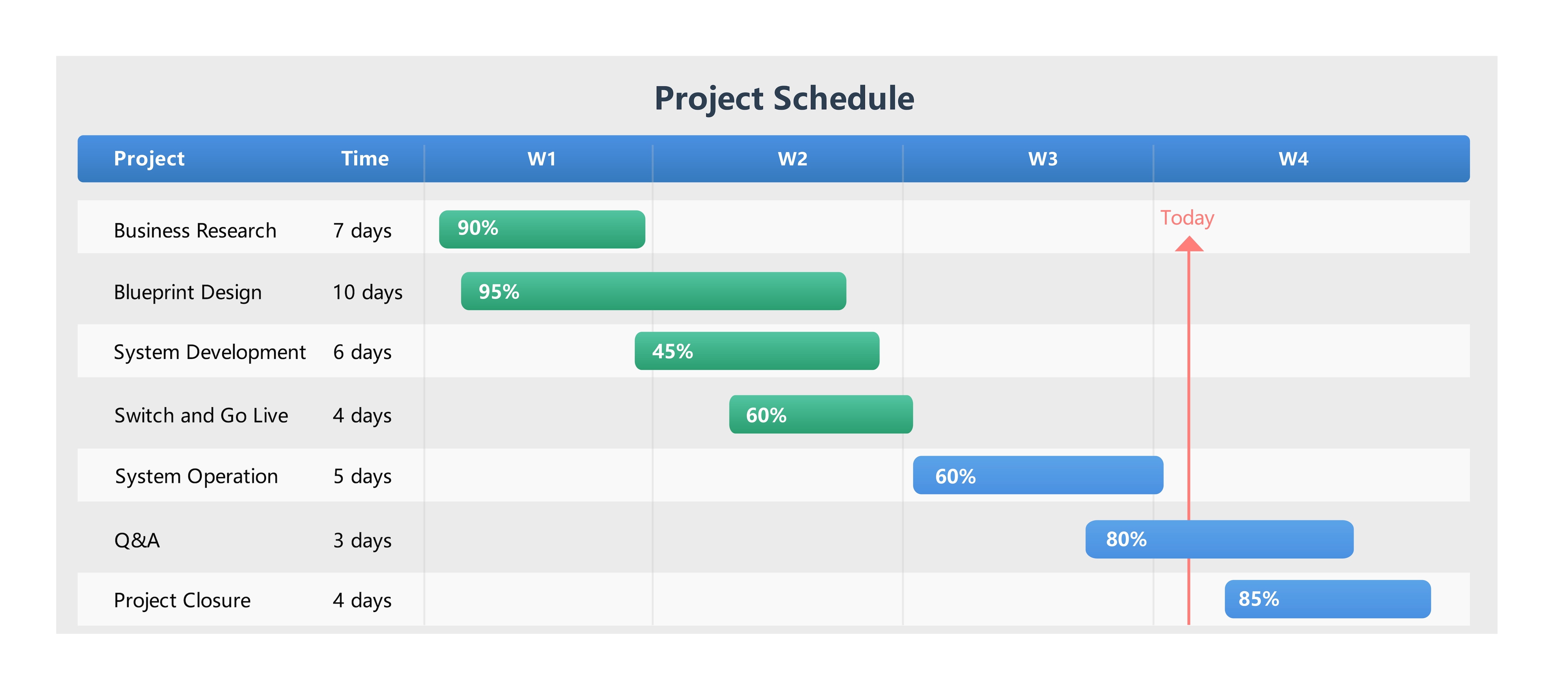
Anyone just stepping into the project management world can use this Gantt chart format for Excel. It follows a fast-paced, shorter project that spans over four weeks. By structure, this chart combines a vertical dateline showing the current status of the project, progress percentages, and shorter implementation cycles. Overall, it’s minimal and easy to digest for beginners.
Monthly Gantt Chart Excel Template
Work ID: 1071679
Eddx File
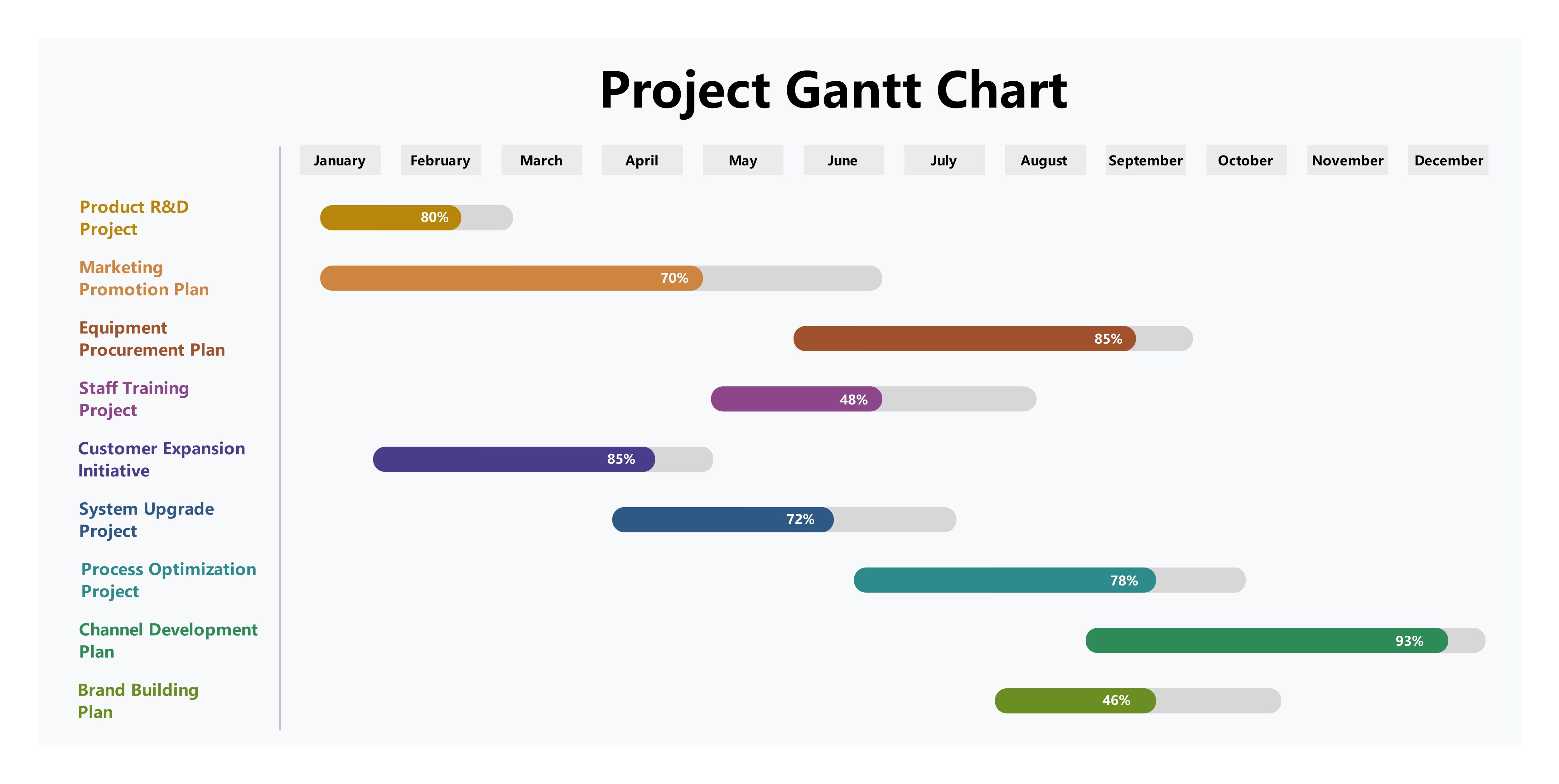
Here is a conventional month-based Gantt chart, representing a large-scale project with parallel task sequences. It gives clients and stakeholders an overview of multiple project phases in one diagram. The creator has used vibrant colors to separate task bars from progress. It’s great for team leads managing a portfolio of projects for progress tracking and clarity on projects.
Online Gantt Chart Template Alternative
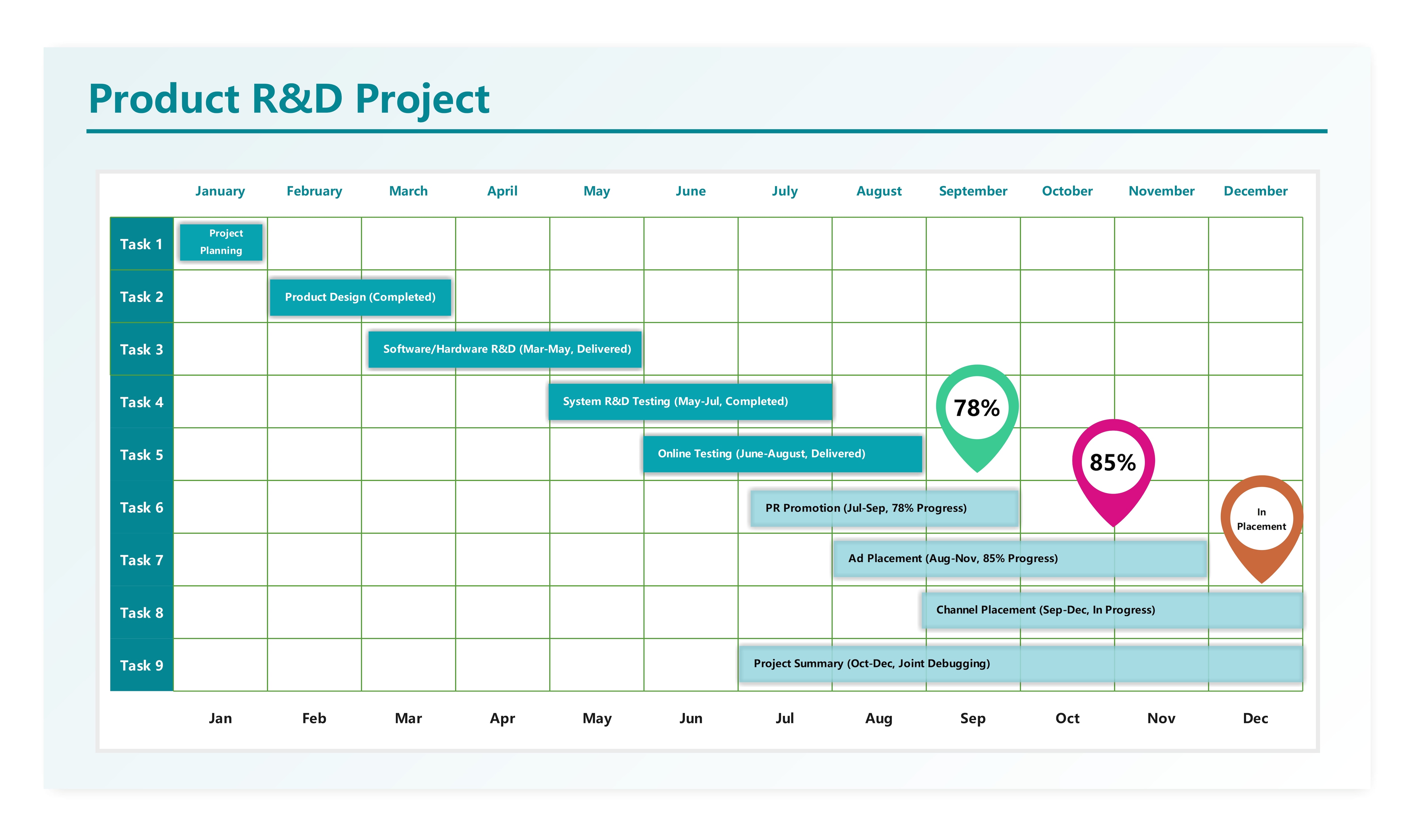
This R&D Excel Gantt chart format gives you a detailed overview of the multi-departmental research project. The chart follows a monthly timeline with a complex work breakdown structure. Anyone who wants a combination of well-structured tasks, progress percentages, and activity labels can edit this chart. Plus, the white background works best for formal projects.
Wrapping Up!
Excel works well for a Gantt chart when the schedule is small enough to update manually. Keep the worksheet structure clean, use dates and duration as the source of truth, and avoid adding fields that do not affect a decision. If updates, dependencies, or collaboration become difficult to maintain, move the schedule into a purpose-built project tool rather than making the spreadsheet more complicated.
FAQs
What are the main components of a Gantt chart?
The main components of a Gantt chart are the timeline, task lists, task bars, dates, duration, milestones, dependencies, and progress percentage bars.
Does Microsoft Excel come with a Gantt chart template built in?
Microsoft Excel does not have pre-defined, editable Gantt chart templates. You can use a stacked bar chart to create one manually.
Can I make a Gantt chart for free?
Yes, of course. Excel is a great way to create a basic Gantt chart for personal projects. However, if you want to save time, digital platforms like EdrawMax have free editable Gantt chart templates.
Can Excel automatically create a Gantt chart?
No, Excel does not have a built-in Gantt chart type. You can build one manually by using a stacked bar chart and a column-based spreadsheet design. However, with these methods, you have to arrange all the elements by hand.
How do I create a Gantt chart in Excel?
To make a Gantt chart in Excel, build a task table with key details, such as task labels, dates, owner, and duration. After this, use the start dates column to build a stacked bar chart. Add other series like duration, task description, and progress tabs. Finally, format the chart, and you are done.
AI Diagram Generator
Enter your prompt. Upload files if needed. Generate diagrams, charts, or slides instantly.





 (AI & Web)